Multitasking updated in iOS 7 with new card-style interface | iMore.com.
Gyahhhh!!!! "Who needs multi-tasking?" the webOS naysayers and Apple fanboys said when dismissing webOS. Apparently, you did, and you didn't know it, and Apple wasn't going to be able to give it to you until four years after webOS released their first phone with it on June 6, 2009.
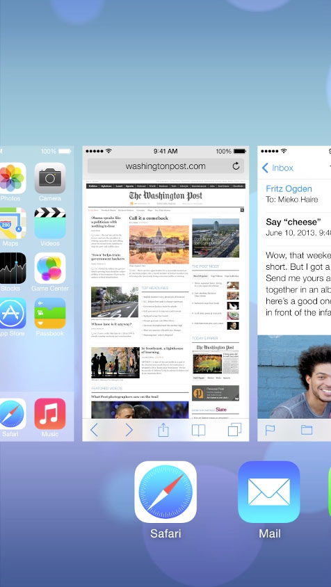
It appears to still require a double-tap of the Home button to invoke that multi-tasking view, a gesture that I find much more onerous than it should be given how much I want to switch between my open apps. But to dismiss a card? Swipe the card up off the screen. That latter should be familiar to anyone with any familiarity with webOS! See for yourself in Apple's iOS 7 video--watch it from the 4:20 mark.
I'm not the only one to notice this, of course. GigaOm's article Much iOS 7 design inspiration came from others but Apple elegantly puts it all together notes this parallel with webOS as well, though they missed the swipe-up parallel for dismissing a card.
I'm venting, and this state of affairs only brings this bitter, hilarious bit of genius back to mind (warning: video contains offensive language):
...and yes, I was in attendance at HP's Think Beyond event to which the above video was a reaction.
Source: I first read about this on a webOS Nation Forum thread. Thanks to user virtualkyr who started that thread.
September 30, 2013
iOS 7: First Impressions [UX Think-Aloud 1]
This first UX Think-Aloud article focuses on my first week with iOS 7 on my iPhone 4S, noting my impressions and reactions during actual usage after updating my iPhone 4S on September 20, 2013 (two days after it’s official release). I note UX flaws, design choices I would have made differently myself, places where the drive towards “flat design” degrades the iOS UX from its more “skeuomorphic” predecessors (e.g., unmarked text, tappable or not? Sometimes!), bugs, and more. Observations include how to get to the weather app and the new calendar widget in the Notification Center, pros and cons in the changes to the the presentation of launcher folders (one step forward and three steps back) and the most recently used app list (webOS-like, but not enough), and changes in Messages (timestamps! finally!). Certainly, iOS 7 has UX flaws and other bugs, but all OSes do. It may not be revolutionary, but I doubt iOS 7 is a death knell for its users’ ability to use their iPhones.
Read more