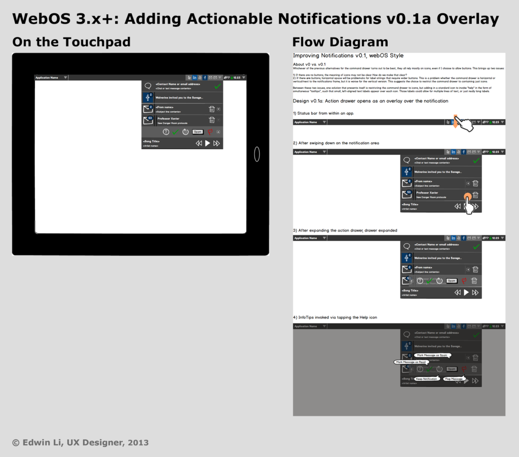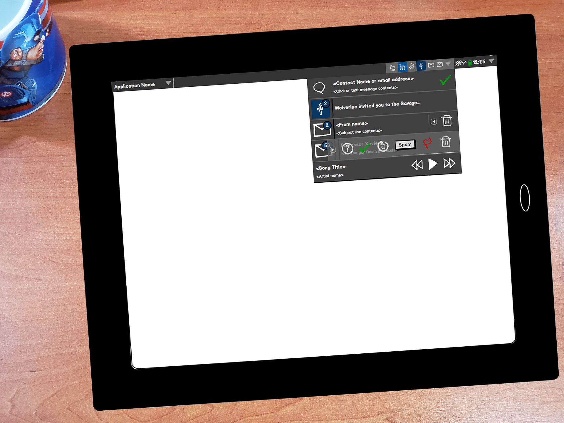
From the opening of my downloadable UX Vision and Design PDF (April 11, 2013):
Overview
Notifications—here meaning those provided on smartphones, tablets, and computers—are, by definition, intended to interrupt users’ attention and are meant to inform users of things that they presumably care about as they occur.
Benefits to a useful notification system include:
- Only as obtrusive as required by the importance of the notification. This suggests more than one level of interruption, from a modal alert (one that demands that users interact with it before going on), to a notification that perhaps doesn’t even call for users’ attention, perhaps being only available when users seek them out. The less intrusive the notification, the greater the freedom users will have in controlling their own flow of activity in using the device or ecosystem in question.
- Persistence until dismissed by users—this allows the notification to serve as a reminder of something that users will want to do. In this way, notifications can serve as a list of things to do for users.
- Ability to go from a notification to the context within which users can interact fully with the subject of the notification, e.g., an email notification would enable users to view and react to the particular email that triggered the notification.
- User control. Ideally, users can customize which conditions, apps, or services, are allowed to provide notifications and at what level of obtrusiveness.
All designs can be improved, and the purpose of this design exercise is to propose designs that improve on the current state of notification systems (as seen primarily in webOS v3.0.x, iOS v6.1.2, with a limited view of Android OS v4.1.2), exploring first “actionable notifications,” and then taking a peek beyond.
Objectives
The objective of this design exercise is to create designs that explore how notification systems in mobile OSes and beyond can be improved. The first phase in that exploration, and the phase described in this document, will be fleshing out a design for “actionable notifications”, seen as part of Android OS v4.2 Jelly Bean, and presaged by other examples from which the design explored here draws its primary inspiration.
Left to further work, I believe that a larger shift in how notification systems could be designed will come from re-conceptualizing notifications as new entries in the time stream of a user’s digital ecosystem, something I’ve taken to calling their “personal digital infrastructure” to denote individual and heterogeneous collection of hardware, software, content, and services that they use that is probably not aligned with any single mobile OS.
