April 17, 2014

Matias Duarte’s “Mobile is Dead” Emphasizes Designing for PDIs

In a video interview with Josh Topolsky for The Verge, Matias Duarte, Head of Design at Android, and formerly of webOS fame, said, "Mobile is dead."

...Duarte’s point is that in an age in which users seamlessly transition from one screen size to another during their day, the idea that designers should consider mobile as a distinct category is outdated.

via Matias Duarte, Head of Android Design on the Death of Mobile — Our blog.

There've been a number of articles recently that resonate with this idea, and the core of it is the need for design to be more user-focused than ever, but with the expanded vision of their activities and experiences being distributed throughout their lives, days, devices, and environments.

That's the idea behind my "Personal Digital Infrastructures (PDIs)"—which I first mentioned in User Experience of Ecosystems—and, with the forthcoming mainstreaming of wearables and The Internet of Things, it's an idea that will only become more important.

October 2, 2013

iOS 7: Apple Removed Text Message Options in Messages

iOS 7: Apple Removes Text Messaging Options in Messages
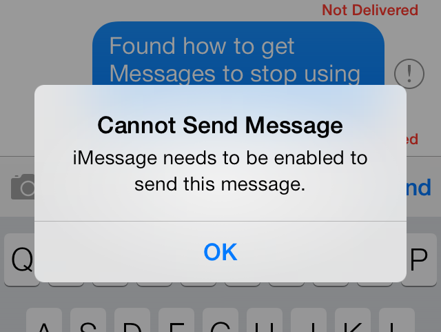
No Text Messages For iDevices! iMessage or the Highway!

There are numerous stories reporting on an iMessage bug or outage that meant that iMessages failed to send or took a long time to send. In iOS 6, this wasn't too big a problem, because users could pretty easily just resend that failed message as a text message. Not in iOS 7, at least based on my own iPhone 4S.

When iMessage failed in iOS 6, resending a message as text message could be done two ways. One way to invoke that was to long-press on a sending message, then tap "Send as Text Message" from the context menu. That was also an option when an iMessage failed to send. Tapping on the red exclamation point next to the failed iMessage would bring up a dialog box with the option to "Send as Text Message".

Neither of those options seem to be available anymore. So, Apple has stripped away the abilty to choose to use normal text messaging between Apple's devices (iPhone, iPads, Macs?) when iMessage fails. The only way to send text messages between two "i-devices" is when one of them has iMessage turned off in Settings > Messages.

Sending messages to those without iMessage (so, all non-Apple phones) continues to be available as it should be.

Read more
October 2, 2013

iOS 7: Make Messages Stop Using Nicknames

iOS 7: Make Messages Stop Using Nicknames

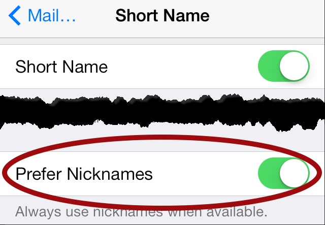
I was wrong in my iOS7 First Impressions article. There is a way to get Messages to use normal names instead of nicknames!. The answer is on the Short Names page in Settings > Mail, Contacts, Calendars [look in the Contacts section] > Short Names.

iOS7-Messages-nickname-settings-2013-10-02-180414-v1

Once to that page, flip the toggle labelled "Prefer Nicknames" from the "on position" (green background) to the "off" position (white background), et voila!

I saw this setting while reading an iMore article by Allyson Kazmucha on how to change Messages from using first names to using full names for contacts: "Don't like how iOS 7 only shows first names in the Messages and Mail apps? Here's how to fix it!". The screenshot she offered or her solution also showed the "Prefer Nicknames" toggle.

September 30, 2013

iOS 7: First Impressions [UX Think-Aloud 1]

This first UX Think-Aloud article focuses on my first week with iOS 7 on my iPhone 4S, noting my impressions and reactions during actual usage after updating my iPhone 4S on September 20, 2013 (two days after it’s official release). I note UX flaws, design choices I would have made differently myself, places where the drive towards “flat design” degrades the iOS UX from its more “skeuomorphic” predecessors (e.g., unmarked text, tappable or not? Sometimes!), bugs, and more. Observations include how to get to the weather app and the new calendar widget in the Notification Center, pros and cons in the changes to the the presentation of launcher folders (one step forward and three steps back) and the most recently used app list (webOS-like, but not enough), and changes in Messages (timestamps! finally!). Certainly, iOS 7 has UX flaws and other bugs, but all OSes do. It may not be revolutionary, but I doubt iOS 7 is a death knell for its users’ ability to use their iPhones.

Read more

June 10, 2013

Multitasking updated in iOS 7 with new card-style interface | iMore.com

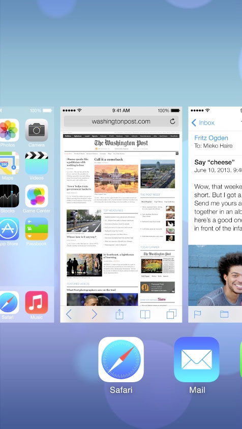
Apple's iOS7 multi-tasking: a bit reminiscent of webOS v1.0's cards from 2009. And how are they dismissed? The same way, a swipe of the card up off the screen.

Multitasking updated in iOS 7 with new card-style interface | iMore.com.

Gyahhhh!!!! "Who needs multi-tasking?" the webOS naysayers and Apple fanboys said when dismissing webOS. Apparently, you did, and you didn't know it, and Apple wasn't going to be able to give it to you until four years after webOS released their first phone with it on June 6, 2009.

It appears to still require a double-tap of the Home button to invoke that multi-tasking view, a gesture that I find much more onerous than it should be given how much I want to switch between my open apps. But to dismiss a card? Swipe the card up off the screen. That latter should be familiar to anyone with any familiarity with webOS! See for yourself in Apple's iOS 7 video--watch it from the 4:20 mark.

I'm not the only one to notice this, of course. GigaOm's article Much iOS 7 design inspiration came from others but Apple elegantly puts it all together notes this parallel with webOS as well, though they missed the swipe-up parallel for dismissing a card.

I'm venting, and this state of affairs only brings this bitter, hilarious bit of genius back to mind (warning: video contains offensive language):

...and yes, I was in attendance at HP's Think Beyond event to which the above video was a reaction.

Source: I first read about this on a webOS Nation Forum thread. Thanks to user virtualkyr who started that thread.