
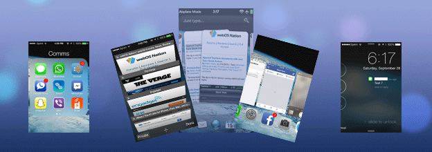
Summary: This first UX Think-Aloud article focuses on my first week with iOS 7 on my iPhone 4S, noting my impressions and reactions during actual usage after updating my iPhone 4S on September 20, 2013 (two days after it’s official release). I note UX flaws, design choices I would have made differently myself, places where the drive towards “flat design” degrades the iOS UX from its more “skeuomorphic” predecessors (e.g., unmarked text, tappable or not? Sometimes!), bugs, and more. Observations include how to get to the weather app and the new calendar widget in the Notification Center, pros and cons in the changes to the the presentation of launcher folders (one step forward and three steps back) and the most recently used app list (webOS-like, but not enough), and changes in Messages (timestamps! finally!). Certainly, iOS 7 has UX flaws and other bugs, but all OSes do. It may not be revolutionary, but I doubt iOS 7 is a death knell for its users’ ability to use their iPhones.
(more…)
Comments are closed.