With Newly Mapped-Out End-To-End Business Processes For IX Port Orders, We Created A New, Complete Web Checkout
Experience Design To Build In Business Processes And Center Users Reduced Order to Activation Time from 45 days to 1 day → Results summary: 98% Faster, 187% Revenue
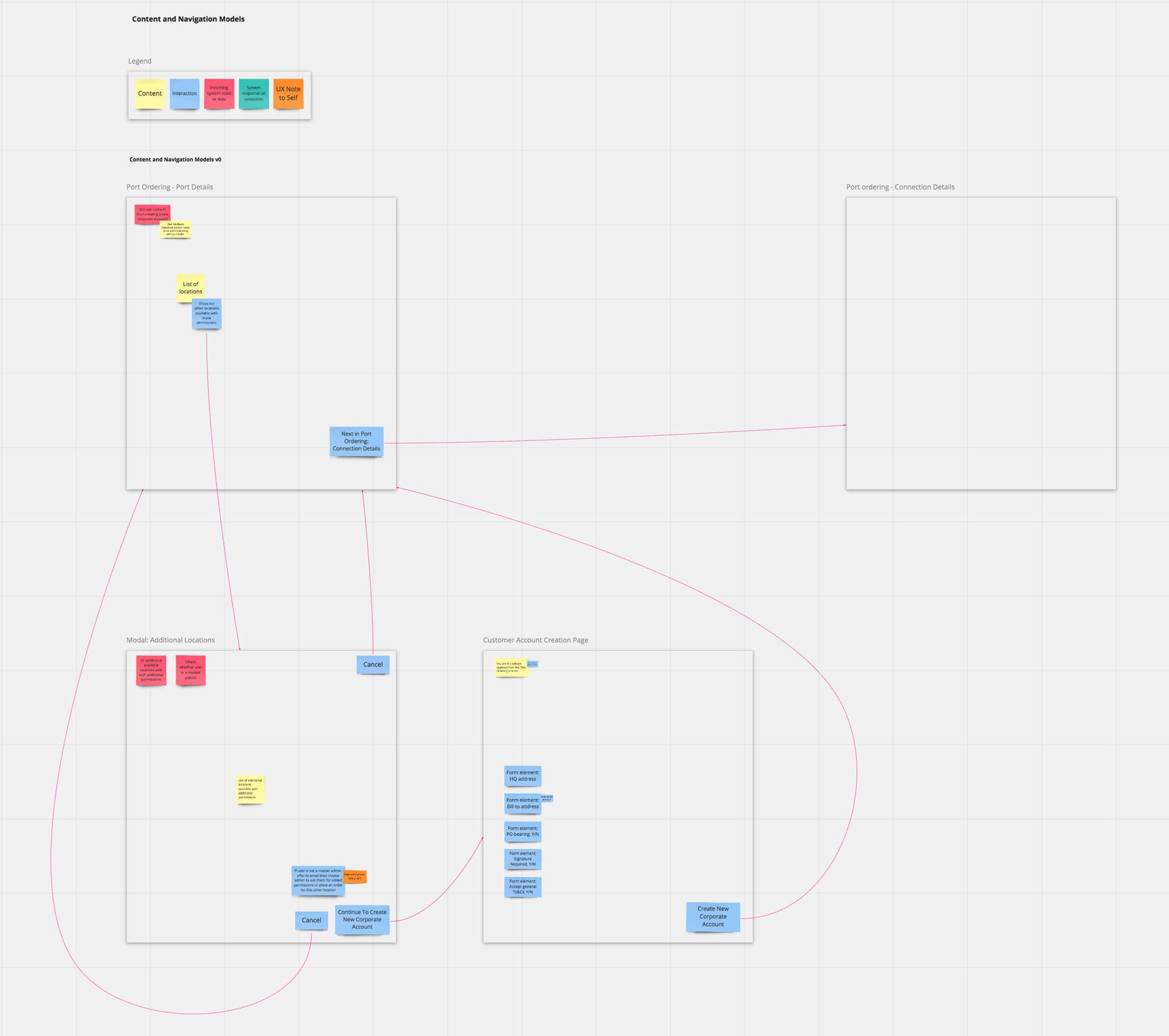
The UX engine, from abstract models to Sketch: Content+Navigation model on the left, screen+interaction flows in Sketch on the right
Role & Contribution
UX Designer
UX design for a new wizard powered by new back-end process--reducing average order fulfillment time from 45 days to less than 24 hours (in one reported case): from task flows to low and high fidelity mockups.
UX Resources
- Design system: new and sparse
- Visual designer
- External design consultancy
Stakeholders, non-UX
- Product owner, product manager, technical product manager, remote engineering team
- Users: external enterprise and business customers
Project Goal
The goal of this project was to shorten the time between submitting an order for an internet exchange port in one of our data centers to activation of that ordered port; business analysis had established that Equinix's average order to activation time was 45 days.
In order to do that, we needed:
- A new online ordering process that collected all the information that the fulfillment process would need, from information to create new accounts along the way to ways to collect signed documents, steps that, previously, required separate manual processes following an initial ordering form submission.
- New back-end processes to minimize the need for any manual handling, whether to ask for additional information or to manage the signing of documents or additional authorizations.
My responsibility as the UX Designer was focused on 1) providing an online ordering experience that allowed our customers to place their orders easily, completely, and accurately, and 2) providing the new back-end business processes everything they needed to fulfill the order in much less time than our average order to activation time prior to this project.
Key Results
187%
Monthly revenue to $21.7M/mo
173%
Ports sold per month
98%
Reduced order to activation time
"...activation in < 24 hours"
Customer/user testimonial
Summary of Process
Ideally, a UX practice is grounded in ongoing observations and data about user behavior in the actual context of their social, task, and tool ecosystems.
Owing to an unfortunate Equinix policy, our project could not get direct access to users, so we drew heavily from other parts of the User Insight Pyramid (see next section) to understand our users and their needs as we went through our project's process steps, each done in collaboration with cross-functional stakeholders:
- Understanding The Problem(s). Once an opportunity for improvement has been identified, create and develop product, user, and domain requirements with key stakeholders
- High Level Designs and Abstract Models. Digest into flows, maps, and abstract models
- Low Fidelity Designs. Quick and low-investment to explore before committing to designs. Output: sketches, mockups, wireframes, and prototypes
- Higher Fidelity Designs. Using design systems and other high fidelity tools - create, iterate, and polish. Output: screens, specs, clickable prototypes
- Develop Application. Work with development to catch and smooth out any wrinkles
- Release the product to benefit users!
- Look For Usage Data And Feedback. Watch for data indicating how the design is doing
Design Guidance: Triangulating To Understand Users
Cognitive Science at UC San Diego is an interdisciplinary approach to understanding how we think--using any discipline, evidence, or level of analysis as part of a holistic effort to triangulate and learn everything we can about cognition.
In the same way, understanding our users can be approached from many levels, in addition to direct observation in their natural environments using your specific tool to do exactly the tasks of specific interest to your project. While such a situation has the high potential to provide the most directly relevant design inspiration, guidance, and constraints, other approaches can also provide great design input.
I often think of these sorts of input in terms of what I call a User Insight Pyramid.
User Insight Pyramid
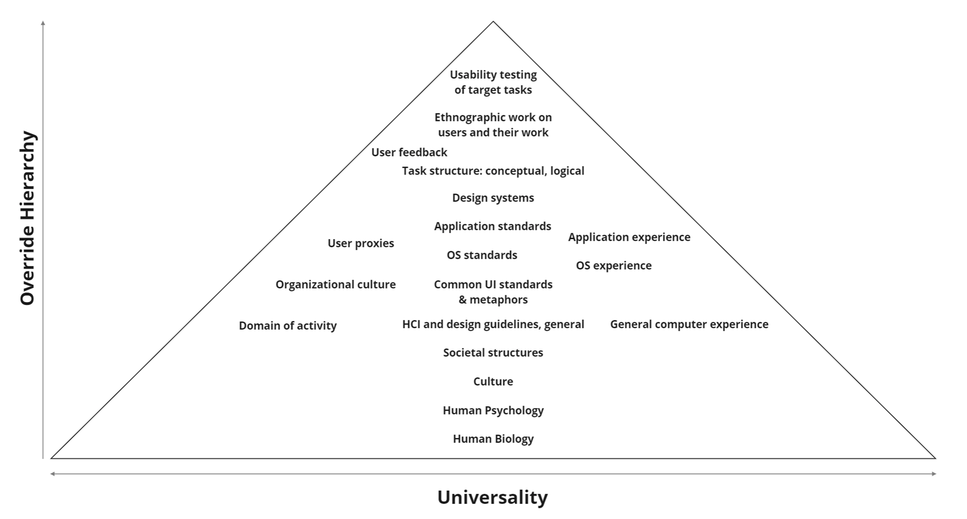
About the User Insight Pyramid
The elements listed in the pyramid graphic are, of course, neither complete nor definitive. Some of the ones mentioned have sub-categories that merit recursive examination. Their placement is also not meant to be exact. Rather, they are meant to be markers of neighborthoods and approximate levels, some more certain than others.
The universality dimension is meant to reflect the variety of "user populations" to which that level or topic's insight would apply. Thus, insights gained from the base of the pyramid, human biology, such as width of foveal attention and timescales of visual perception would be applicable to any design that depends on the human visual system, regardless of whether this was a first person shooter video game or a Google Home Hub screen. On the other hand, insights from usability tests done on with a participant who is drawn from a carefully identified sub-population of doctors who have x condition, trying to do a specific task with a specific medical device would be much less obviously generalizable to an internet exchange port ordering web application.
The specificity dimension is meant to suggest a hierarchy for any refinement or resolving of any conflicting or uncertain data. If, for instance, the human biology level suggested a range of reaction time, but your usability tests for a new cockpit item for US Air Force stealth fighter pilots found that they generally were on the fastest end of that human reaction time range to a statistically significant enough degree, then one could reasonably design to that smaller, faster reaction time range if your new cockpit item were to be designed exclusively for those fighters' use.
That said, the pyramid is also a rubric for understanding how one can proceed in a design effort when some of these levels of insight are unavailable in a project.
Use what's available to glean whatever design insight you can.
The Nielsen Norman Group suggests something in a similar spirit in their September 10, 2021 video, "Triangulation: Combine Findings from Multiple User Research Methods" (opens in a new window).
Learning About Our Internet Exchange Port Ordering Users
Especially since we were not allowed access to users for this project, I drew from other parts of the pyramid for design guidance:
- User proxies (informants): Product Owner, Product Manager, Technical Product Manager
- User feedback
- Task structure
- Our design system
- "Application experience," as represented by existing ordering forms
- Application standards: browsers, common web patterns
- OS standards
- Common UI standards & metaphors
- Organizational culture
- Domain of activity
- Culture
- Human psychology
- Human biology

Good designers never start by trying to solve the problem given to them: they start by trying to understand what the real issues are.
Don Norman
The Design of Everyday Things: Revised and Expanded Edition (p. 218). Basic Books. Kindle Edition.
Step 1: Understanding The Problem(s)
Domain Research
Our order to activation process averaged about 45 days between initial order submission and port activation. On this metric, our competition was much, much better than us.
Our Technical Product Manager mapped out most of the steps and processes behind that, and I worked with him to identify additional steps and needs as the project went on--allowing us to build our new ordering process to cover all the bases and include all the necessary information, eliminating the back and forth that took the bulk of those 45 days.
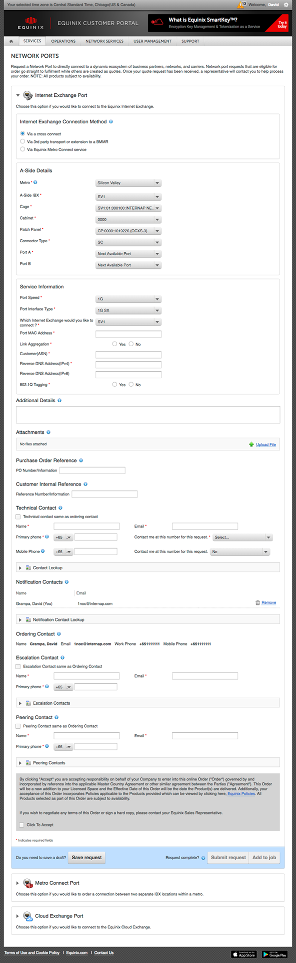
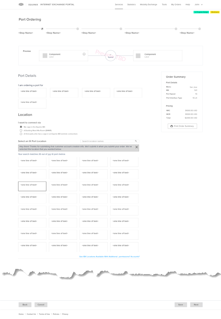
Learning the IX product domain included understanding the existing ordering and fulfullment process. This includes examining the existing order form.
This is a screenshot of that order form. It is a long form with branching logic as customers go down the page, with dropdown choices progressively affecting the contents of the page below it and in subsequent dropdown.
One of the challenges with progressive dropdowns is that the effect of each dropdown's choice on later dropdowns' contents can be very difficult to notice and see; the extent of the changes can be obscured within a dropdown's invisible alternative choices, not to mention that text changes even in the selected option in the next dropdown or the next bunch of dropdowns can easily be missed.
These types of changes are easily missed for a number of reasons, including: 1) human eyes' limited foveal area of attention--approximately 2 cm at distances typical of computer screens (from Jeff Johnson's "Designing with the Mind in Mind: Simple Guide to Understanding User Interface Design Guidelines"), and 2) text changes are not the kinds of visual changes that catch visual attention and that our visual systems process as primary features for parallel processing (based on memories of visual information processing research from my UC San Diego Cognitive Science education).
Identifying Areas For Design Focus and Setting Design Directions
Working with key stakeholders to come to a shared understanding of our goals for the UX, we identified key design questions and directions:
- More "User"-centric and less "Equinix"-centric
- Build the branching logical structure of port configuration options into the UX
- Use our new design system and extend it as appropriate.
- Provide a visible overview of the order as they progress through the wizard
...solving a problem simply means representing it so as to make the solution transparent.
Herbert A. Simon
The Sciences of the Artificial (The MIT Press) (p. 132). The MIT Press. Kindle Edition.
Designing
I usually approach designing at a few different levels:
- High level workflows and abstract models
- Low fidelity designs for key screens and others as necessary
- Increasingly higher fidelity designs to whatever level enables the easiest collaboration with our visual designer and/or developers
Step 2: High Level Design And Abstract Models: Foundations
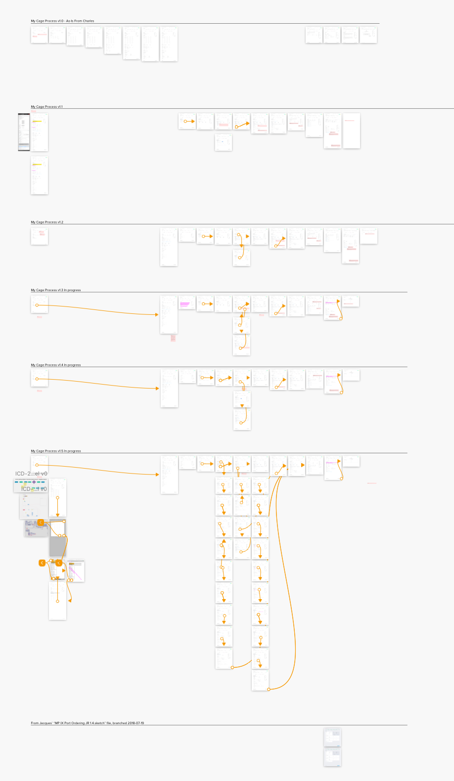
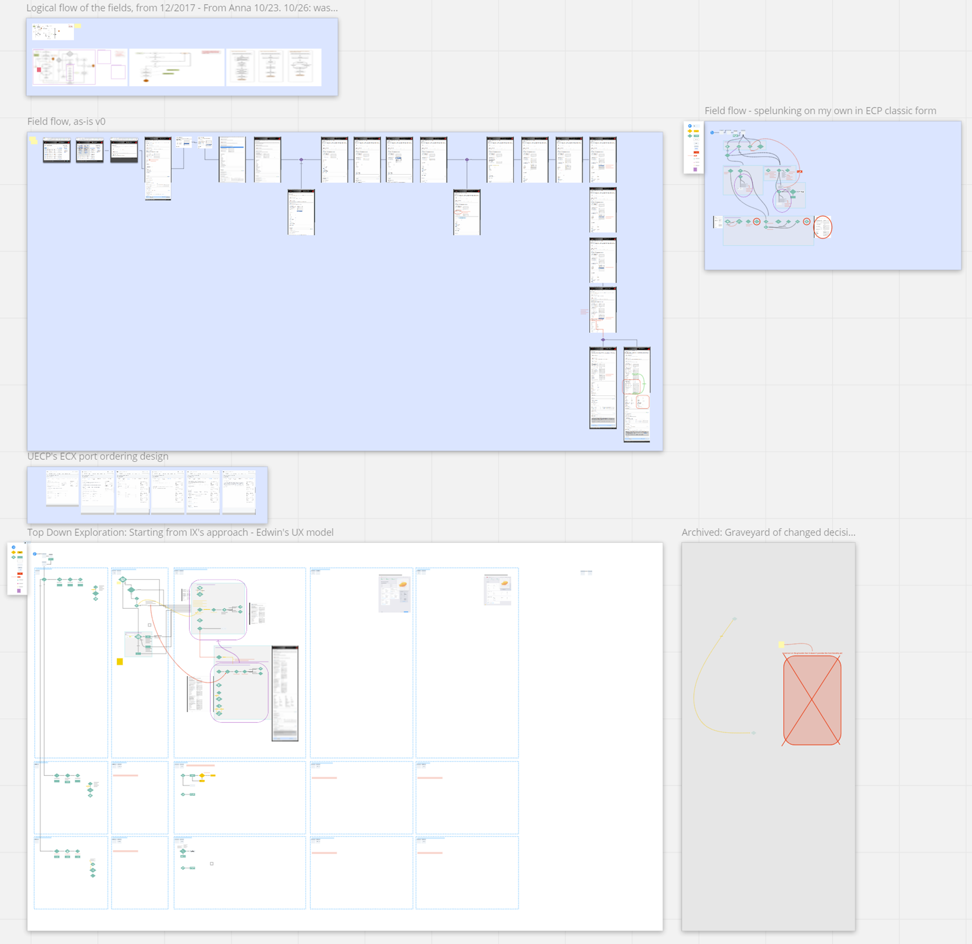
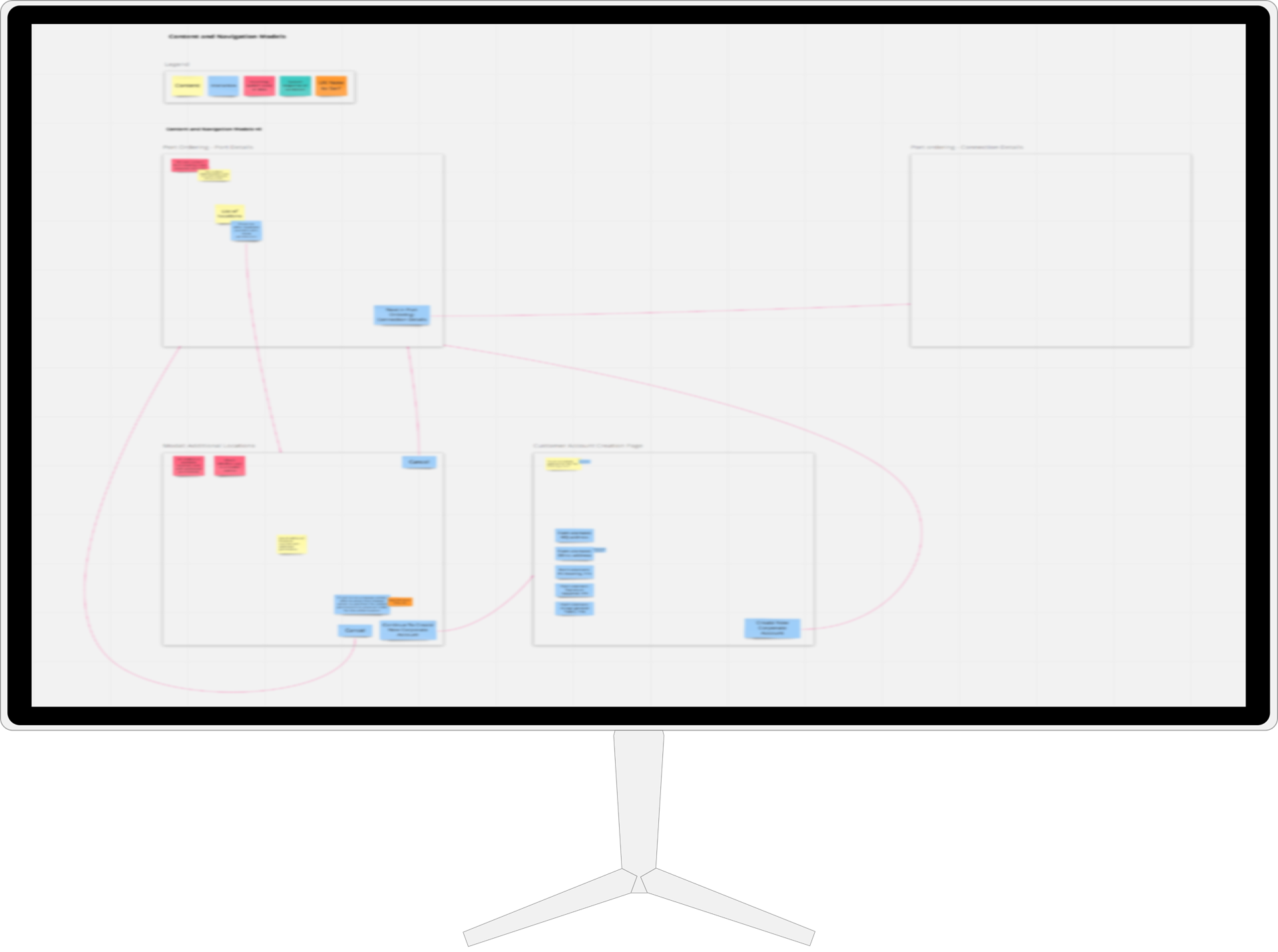
I build abstract models (content and navigation models, described in Constantine and Lockwood's Software for Use (commission-free Amazon link)) and task flows as the foundation of any designs with any task complexity.
Working at the right level of abstraction: flow charts, content models, and navigation maps.
Committing too early to UI details makes it hard to see the forest for the trees.
It also creates resistance to any adjustments to take advantage of ongoing paradigm shifts in understanding, as it increases the inertia of the anticipated UI.
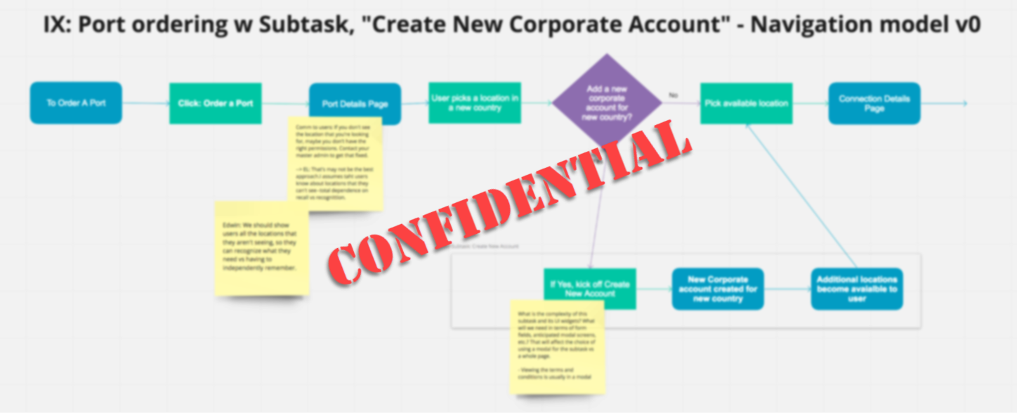
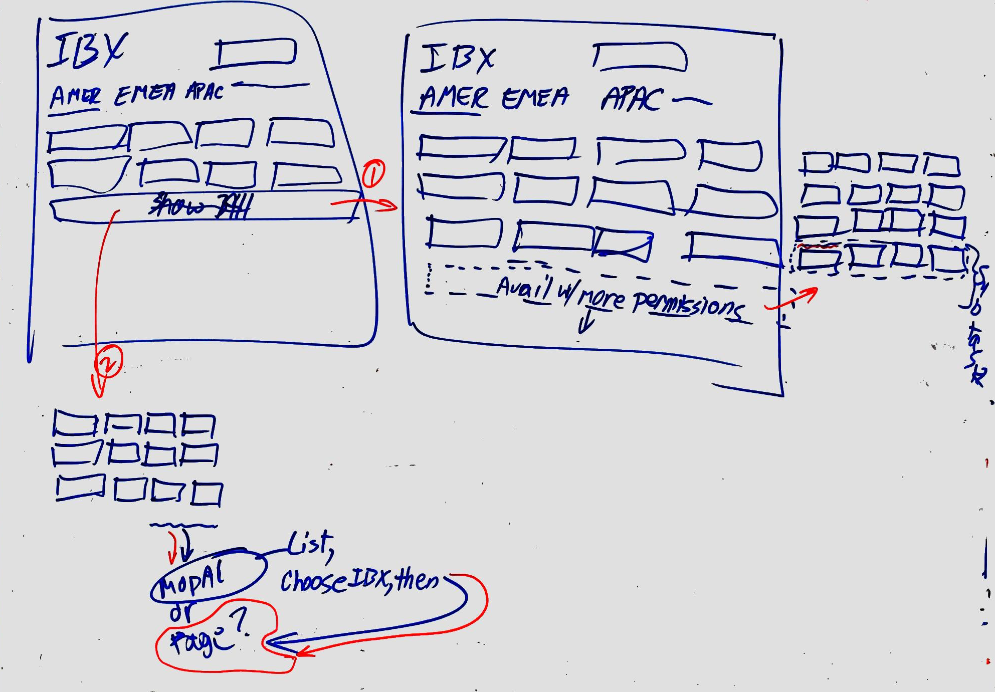
Flow Chart: I reworked a subtask that some customers would face--having to create a new "corporate account." Previously handled by account representatives, this process was mapped in very particular account representative terms, driven by their documentation needs. This decision and information collection flow had to be redone from the customers' perspective, including translating account rep terminology and concepts into ones that would make more sense to customers and the information that they would most likely have easily available.
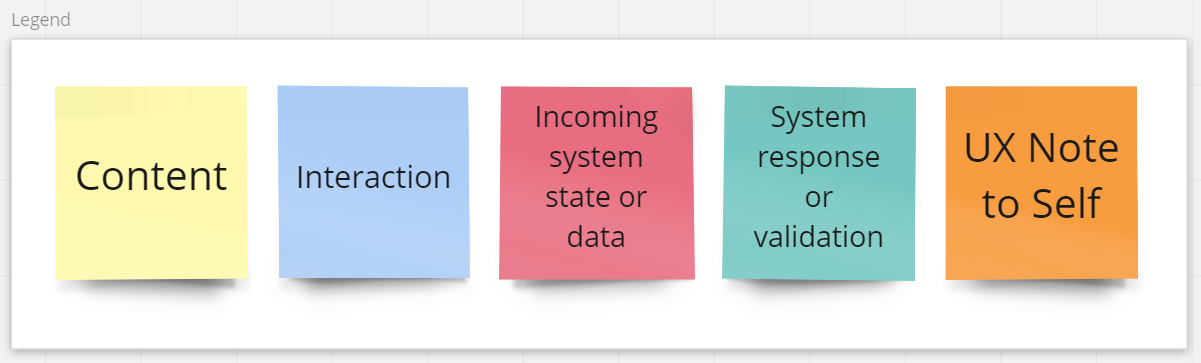
Content models and navigation map: Content models show what belongs in each "interaction context" (e.g., page, dialog box, screen): content and user data, interaction widgets (e.g. one-of-n selectors, submit command, navigation), system data, system responses and validations, questions, help functions, and other such abstractions.
A navigation map is a map of how the interaction contexts are connected and how users navigate between them.
Step 3: Low Fidelity Prototypes
Low fidelity designs are quick and low-investment to better support exploring possible designs without premature commitment to any particular design. Output: sketches, mockups, wireframes, and prototyping.
Wireframing The Task Flows
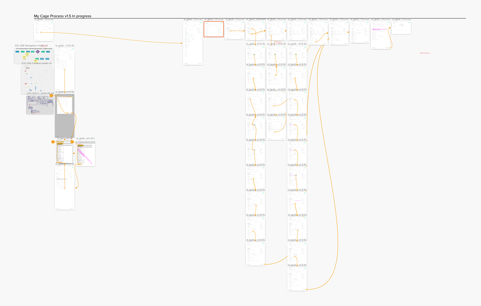
With the TPM's process map, the content models, and the navigation map, it was possible to enumerate a list of customer scenarios, goals/tasks, and "use cases" that we were intending to include in our project's release.
This allowed me to draw out a progression of screens and states that a customer would encounter as they went through the proces to place an order corresponding to each of those scenarios, what we sometimes referred to as a task flow.
An overview of some of task flows through our IX port ordering wizard.
Look For Patterns In Design System
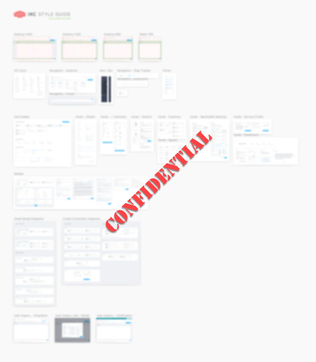
A New, Forked Design Library. [Blurred to protect IP.] Based on a new design library then actively being created and iterated upon by the main UX group at Equinix, the product department to which I had been splintered off hired an external consultancy to fork and develop our own design library from that foundation.
This project being among of the first being undertaken along this new product direction/design fork, our design library was new, sparse, and growing, much as the main product department's library was.

Tiles. In an aesthetic choice, our external design consultancy had committed to the use of tiles and tile arrays as a UI widgets to represent 1-of-n or n-of-n choices.
At the time when I started work with this project, our design system only had one type of tile--as exemplified here, the tiles and our design system were intended to communicate spaciousness and simplicity, with a single tile type, designed to contain a single line of text.
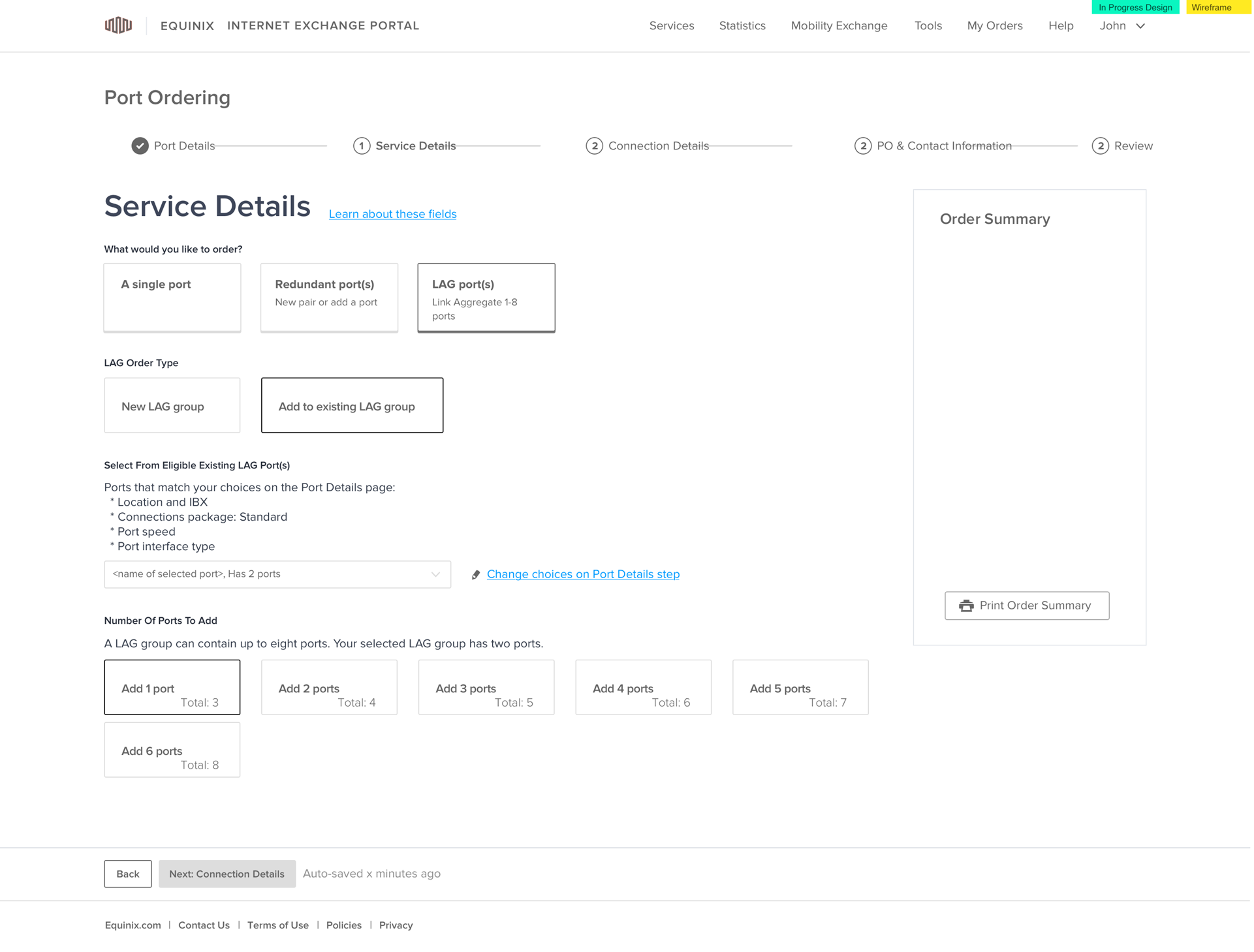
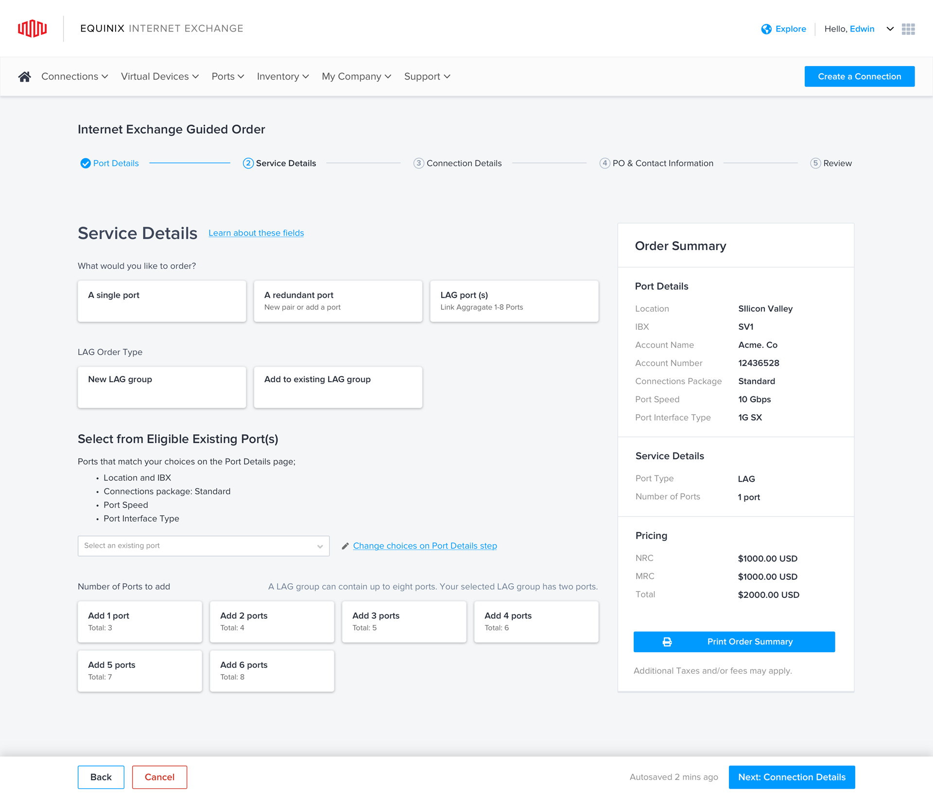
Step Indicator. Intended originally to enumerate the steps in a long, single-page form. This project would be the first widespread use of a multiple page ordering experience.
Recognizing New Design Pattern Needs
Hopefully, most of the time, what you need is covered by the design system. If not, a new design pattern may be needed.
Identifying New Problems
Abstract models and task flows enable us to identify new problems for which we don't yet have solutions.
It saves design and project time to identify multiple common problem instances in overview rather than trying to design screen by screen.
This allows me to allocate more time up front to find a generalized solution rather than multiple idiosyncratic ones, each costing unforeseen time and consistency for the UX.
"There is no such thing as a problem without a gift for you in its hands. You seek problems because you need their gifts."
- Richard Bach, Illusions
Steps on the ladder of fidelity
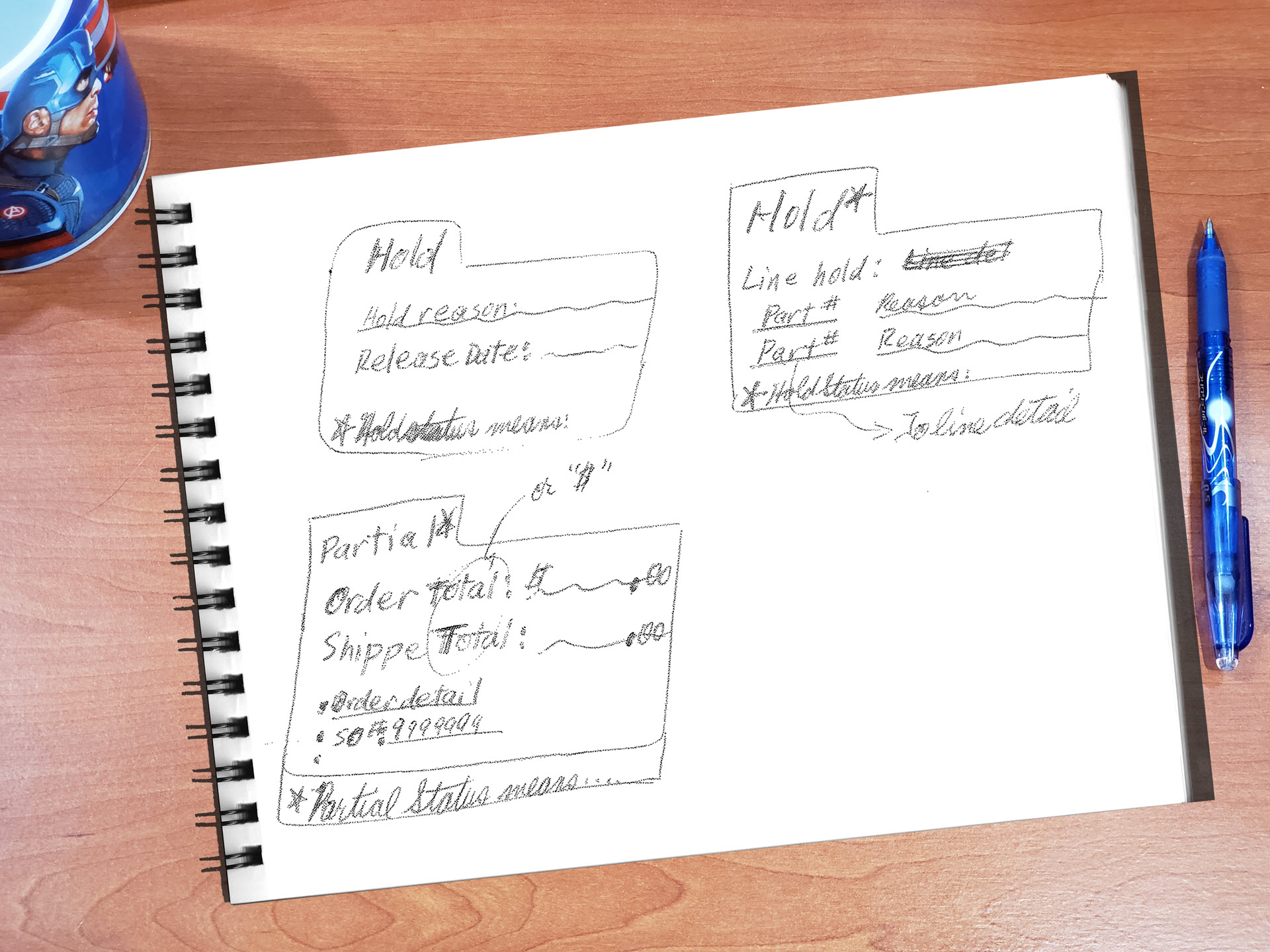
Tool: Whiteboard. Brainstorming and exploring ideas--expanding on the page, various button types, opening in a modal, etc.
Tool: Sketch. After narrowing down from our brainstormed approaches, this is an artboard from within Sketch, in which I was able to draw from existing wireframe components.
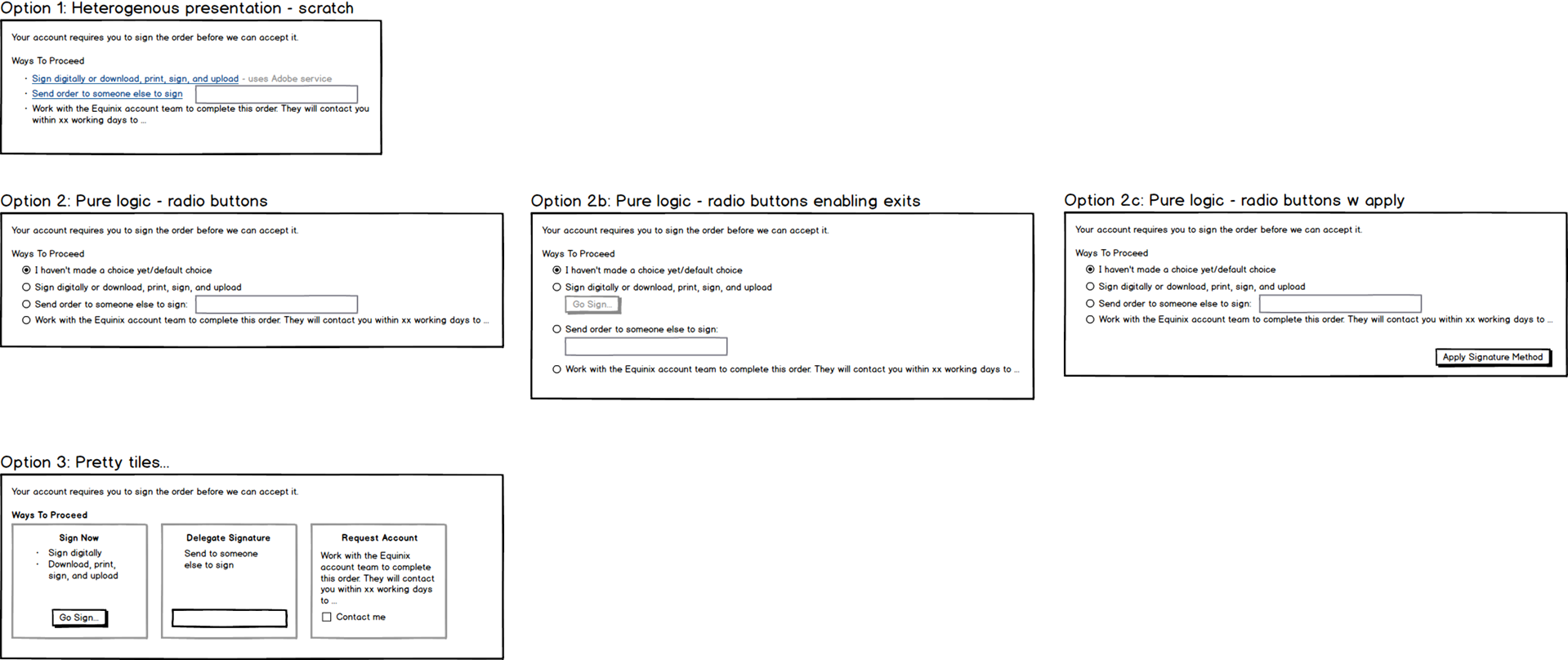
Tool: Balsamiq Wireframes. Brainstorming different approaches to offering options for signing documents. I wanted to explore using common UI widgets beyond those that were in our design library. This, to me meant that I could give up some of the freedom of form of whiteboards and paper and pencil, but to use Sketch with or without our design libraries would have been to constraining and encourage too much detail.
Balsamiq Wireframes offered a perfect abstraction/detail trade-off level. Its "Sketch" skin helps keep everyone aware that this is not a high fidelity UX artifact.
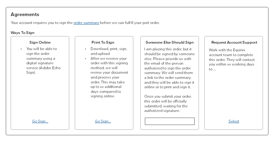
Tool: Balsamiq Wireframes. As I iterated and narrowed down my focus on fewer approaches, I could add more detail to it, switching to the "Wireframe" skin when things started to feel more solid. I wouldn't aim to go much lower level of abstraction than this in Wireframes, as the next step would be to go to Sketch, and the more detail and effort I put in to get much less abstract here, the more I would then be just replicating in Sketch.
Step 4: Higher Fidelity Designs
I developed medium fidelity wireframes with a few high fidelity parts/screens for new UI (though I did generally send those to our visual designer for final polish).
I also produced annotated UX specifications, with particular attention paid to describing any new, richer interactions and the details of any animation in coordination with the visual designer.
Where helpful for illustrating the intent of the UX, I produced clickable versions.
Low Fidelity + Design System --> Visual Designer = High Fidelity
One of the project's two design libraries.
A pixel-perfect mockup: I designed the wireframe with some new, high fidelity UI elements, then coordinated with our visual designer to apply the full design system polish.
Step 5: Develop Application
Working With Remote Development Team
While working across big time zone differences can be a challenge, we used our reasonable overlap in work times to coordinate using video conferencing with all stakeholders, adjusting our frequency to the needs of the project.
Iterations: Tuning
The back and forth between UX and development gave both the design and implementation of the application the opportunity to benefit from continued iteration and tuning.
Sometimes, that involved adjusting either the design or the implementation to accommodate a constraint here or there, or as unanticipated issues were identified.
Step 6: Release
Ultimately, we released the new Internet Exchange all-online port ordering capability to our customers.
The release went smoothly, and while we didn't have a program in place to assess its success directly, we did have our normal channels for receiving feedback from our users.
Time for a little celebration!
...and maybe some UX documentation...
New UX Elements: Update Design System


Created additional tile types and layouts. In considering users' tasks and goals, I drove recognition of information that would be useful for users in making their decisions between options, then found ways to include them into the tiles. Previously, the tiles were designed only to include a single line of text, but the design library was new. Designing new layouts increases the vocabulary and flexibility of that library in a principled way.
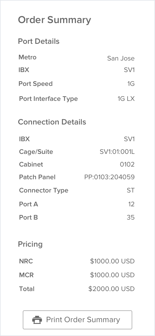
Order Summary module. To give our users a persistent view of their order as they went through the five pages of the wizard, we created a module that appeared on each page, retaining key choices that they'd made along the way and the cost of the order that they were building.
Novel step indicator usage. Establishing a baseline set of port ordering steps. Using the step indicator from our design library to a multi-page process.
Step 7: Look For Usage Data And Feedback
We didn't have a formal feedback collection process, but I was constantly in touch with and working with this project's TPM and PO.
Before And After
Prior Design. A single page for collecting the order information--lots of dropdowns, many whose selections invisibly change the content of later questions. The form ultimately did not cover all ordering scenarios, usually requiring account representatives to follow up many times, resulting in the average of 45 days of ordering to activation time.
New Design. Users go through a wizard comprising at least 5 screens, of which this illustrative one is the second. Adding in some sub-flows, this wizard covers almost all the ordering scenarios, allowing an order to activation time of less than 24 hours versus the prior average of 45 days.
Using tiles for 1-of-n choices and progressive disclosure to add questions onto the page as users go through them, we made question dependencies more visible and relationships between different choices and their consequences salient. We also added real-time messaging and in-context help for more detailed info when it might be needed.
I want to pass on a compliment I just got from a customer who used the new IXP ordering flow...
“the UI/UX and order flow actually worked great, much to my surprise, I think we went from ‘wouldn't it be convenient if we had a Dallas IX port?’ to activation in < 24 hours.”
Thanks for all your efforts last year to make these flows so good they’re changing perceptions of interacting with Equinix. This project is going to have a huge impact.

Greg Dendy (Product Owner)
Project Impact
Business Impact
The project was a huge business success. In shortening the order to activation from an average of 45 days to about 24 hours, we:
- Increased our revenue through a reduction in orders that were lost during the long wait and the back and forth of the previous process
- Improved our competitive edge: our sales increased, as enterprises were drawn to the much more immediate turnaround. Equinix's reputation as the market leader was already a selling point. Improving our turnaround time meant that customers who otherwise might have been tempted to consider competitors based on time to activation could now consider an internet exchange port from Equinix on even ground and get that port backed by the reputation and market dominance of Equinix's brand name.
We also got the significant side benefit of a comprehensive analysis and streamlining of the business processes required to fulfill a port order.
That laid a foundation for adding to that ordering capability.
UX Impact
On the UX side, this became a model project for revolutionizing the order-to-activation process for ports at Equinix--from business process analysis to the multi-screen wizard-based UX to specify and configure the port(s) to be ordered.
As one of the first projects to use our developing ("Interconnection team") design system, this project required clarifying our design patterns, extending them to accommodate real usage situations and data, and gave me the opportunity to set a lot of precedent for the usage of those patterns.
Documenting those clarifications, extensions, and usage added greatly to the evolution of our design system.
Inspiring Equinix's Future: Project Sequels
The business and UX benefits of this project laid a foundation upon which we built for later projects.
Covering Even More Internet Exchange Scenarios
We added to the capabilities of the IX port ordering process--supporting more user and company scenarios, like ordering an internet exchange port in countries in which that customer's company had not yet established a business agreement with Equinix.
That extended our addressable market, adding to our revenue growth opportunities.
Sequels: Bigger Stakes, Bigger Team--Unifying Port Ordering For All Of Equinix's Port Types
Equinix offers many different types of ports--at the time, each available via separate portals, and all subject to many of the same order-to-activation time challenges as Internet Exchange ports did prior to this project, meaning that it also took a long time to activate those ports.
With this project as a model, from business analysis to representing the ordering and configuration of those ports using the multi-screen wizard UX template created here in this project, I worked with great team of fellow UX designers to revamp and unify the ordering processes of those other ports.
Following that port process unification project, we had:
- Sped up the order-to-activation process of ordering those other port types, extending these same business beneifts to all of our ports
- Created a consistent port ordering process for all our ports
- Created a unified port ordering experience, in which our users could order and configure any of our port types wherever they started their ordering process. Users no longer had to log into a specific port type's portal before being able to order that specific type of port. No matter what type of port you wanted to order, you could just go to "Order a Port."
First, Maps...
The story of the "Grand Unification" sequel, like the story of this project, started with understanding the port ordering processes to be redone. Working with a whole team of UXers, we had a lot to tackle.
Life's better with a great team.
Selected Works
Research & Experience Design To Optimize Internal Web App For Finding Juniper Networks Customers’ Order Status → 800% availabilityUX research, UX design, Workflow optimization, Enterprise (B2B), Web application
Experience Design To Create Equinix's 1st Turnkey Web App Checkout For Ordering Ports → 98% Faster, 187% RevenueUX Research, UX Design, Enterprise (B2B), Web application
Design Processes, Artifacts, and Work StyleUX design, UX research, UX process, UX artifacts, Sketches, Maps, flows, and models, Low fidelity, High fidelity, Interactive prototypes
Pandora App: Driving ModeMobile, High Fidelity, Interactive Prototype, Demo Video, Personal Project