A Driving Mode For Pandora
Gesture-based, maximal tap targets, high-contrast visual feedback for safer driving
From standard tap targets to adding emphasis on gestures and larger tap targets: Transforming Pandora's playback controls, key interactions, and navigation into gesture-based controls with large visual feedback. Adding in app-level control of sound output to bring that control to the mode's surface and adding gesture control and large tap targets. All to require less attention and precision of users who are presumed to be driving.
Role & Contribution
UX Designer and Visual Designer
UX and visual design of all elements:
- Interactions
- Navigation
- Available functionality
- Navigation
- Semantics of the gestures
- Visual feedback
UX Resources
- Existing iconography within the Pandora app
- Public domain icon sources
Project Goal
The goal of this project was increase the safety of using the Pandora Android app while driving--allowing users to use the app with less attention, less visual precision and processing, and less physical precision.
The functionality and usability goals included:
- Maintain primary interactions of the Pandora experience:
- Rating current songs and potentially recently played songs
- Playback controls: play, pause, previous song, next song
- Add navigation for switching stations from the main "Now Playing" screen
- Identify and add in functionality useful while driving and make it as immediately accessible as possible
- Increase the safety of the driving experience relative to the normal mode in the app.
Summary of Process
Ideally, a UX practice is grounded in ongoing observations and data about user behavior in the actual context of their social, task, and tool ecosystems.
For this informal project, I indulged myself in in self-observation of my own behavior and introspection in exploring and understanding the domain, user needs, and the task and tool ecosystem around my Pandora use.
That said, I still used the structure of my UX design processes to guide my design approach. This is the subset of those process steps I used in this project:
- Understanding The Problem(s). Once an opportunity for improvement has been identified, create and develop product, user, and domain requirements with key stakeholders
- Low Fidelity Designs. Quick and low-investment to explore before committing to designs. Output: sketches, mockups, wireframes, and prototypes
- Higher Fidelity Designs. Using design systems and other high fidelity tools - create, iterate, and polish. Output: screens, clickable prototypes, videos of using the prototype
Step 1: Understanding The Problem(s)
Domain Research
To understand the domain and task of trying to "use" Pandora as safely as possible to play music while driving and to control the music, I started with both reflection on my own usage, behavior, and needs, as well as a heuristic analysis of the app as it stood.
Amongst the issues I identified to consider:
- Now Playing screen
- No indication of current "radio station"
- No way to change radio station from this screen
- ==> Hierarchical screens/"back" navigation is good and clean, but a bit awkward and potentially wasteful on larger screens
- Pandora core interactions are based on tapping icons: playback controls and rating songs. Because of the relatively small tap targets these icons represent, especially in the context of driving and the need to reduce the demands of time, attention, precision of hand-eye coordination and other Fitt's Law factors, limiting interactions to these small targets when phones' screens are so much larger than the icons seems inherently a danger.
Identifying Areas For Design Focus and Setting Design Directions
Reviewing the challenges identified in the heuristic and other analyses, I decided to focus on improving the UX of driving while listening to the Pandora app.
In most usage scenarios, any given app or device is only one element amongst an ecosystem of people, devices, and tools. Identifying how users' use, attention, and constraints are distributed and propagated across those elements is key to designing a tool that fits and enhances the UX across those people, device, and tool ecosystems.
Important elements to consider here in the scenario of a driver listening to Pandora while driving include situations before, during, and after driving:
- The person as a driver.
- Starting the journey/drive.
- Connection from the phone to the car's sound system, including Bluetooth or wired options.
- Connection from the phone to any headset or earbud that the driver may be using: Bluetooth or wired.
- Managing transitions: incoming phone calls.
- Managing transitions: after phone calls end.
- Ending the journey/drive: arriving at the destination and transitioning out of the car.
Storyboard Scenario. Mapping out how users might use the Pandora app on a driving journey.
From these considerations, I identified my key design questions and directions:
- Support primary Pandora interactions: play, pause, rating songs
- Consider supporting other Pandora interactions, too: rating previous songs, changing "radio" channels
- Initiating Driving Mode
- Minimize need for precise hand-eye coordination in screen interaction.
- ==> Avoid icons and tap targets as much as possible. Gestures, in a large area are more forgiving of hand-eye imprecision. When using icons, maximize the size of the tap targets to minimize the visual and attentional demands of target acquisition, hand-eye coordination to tap them, and seeing feedback.
- ==> Similarly, minimize reliance on visual feedback if possible. When necessary, maximize the on-screen size of such feedback to minimize the need for precision saccades and for foveal fixation.
- When answering the phone, especially with multiple ouput connections (car sound system, headset), switching output from car speakers to headphone or earbuds may be necessary.
- ==> Rather than make users navigate out of the app and do it via some system settings, make this immediately available from the Driving Mode screen
- ==> Rather than make users navigate out of the app and do it via some system settings, make this immediately available from the Driving Mode screen
- When ending a call, offer as low friction a way to switch output from headphone back to car sound system as possible.
- At the end of your drive...
- Exiting Driving Mode
- Stopping the music?
- Setting the output, if you want to continue listening.
- Exiting Driving Mode

...solving a problem simply means representing it so as to make the solution transparent.
Herbert A. Simon
The Sciences of the Artificial (The MIT Press) (p. 132). The MIT Press. Kindle Edition.
Designing
I usually approach designing at a few different levels:
- High level workflows and abstract models
- Low fidelity designs for key screens and others as necessary
- Increasingly higher fidelity designs to whatever level enables the easiest collaboration with our visual designer and/or developers
Step 2: High Level Design And Abstract Models: Foundations
I build abstract models (content and navigation models, described in Constantine and Lockwood's Software for Use (commission-free Amazon link)) and task flows as the foundation of any designs with any task complexity.
This personal project was fairly limited in scope in focusing on a new version of the Now Playing screen. Workflows and navigation were primarily added as means of getting to the new mode from within existing screens and navigation schemes.
Step 3: Low Fidelity Prototypes
Low fidelity designs are quick and low-investment to better support exploring possible designs without premature commitment to any particular design. Typical output: sketches, mockups, wireframes, and prototyping.
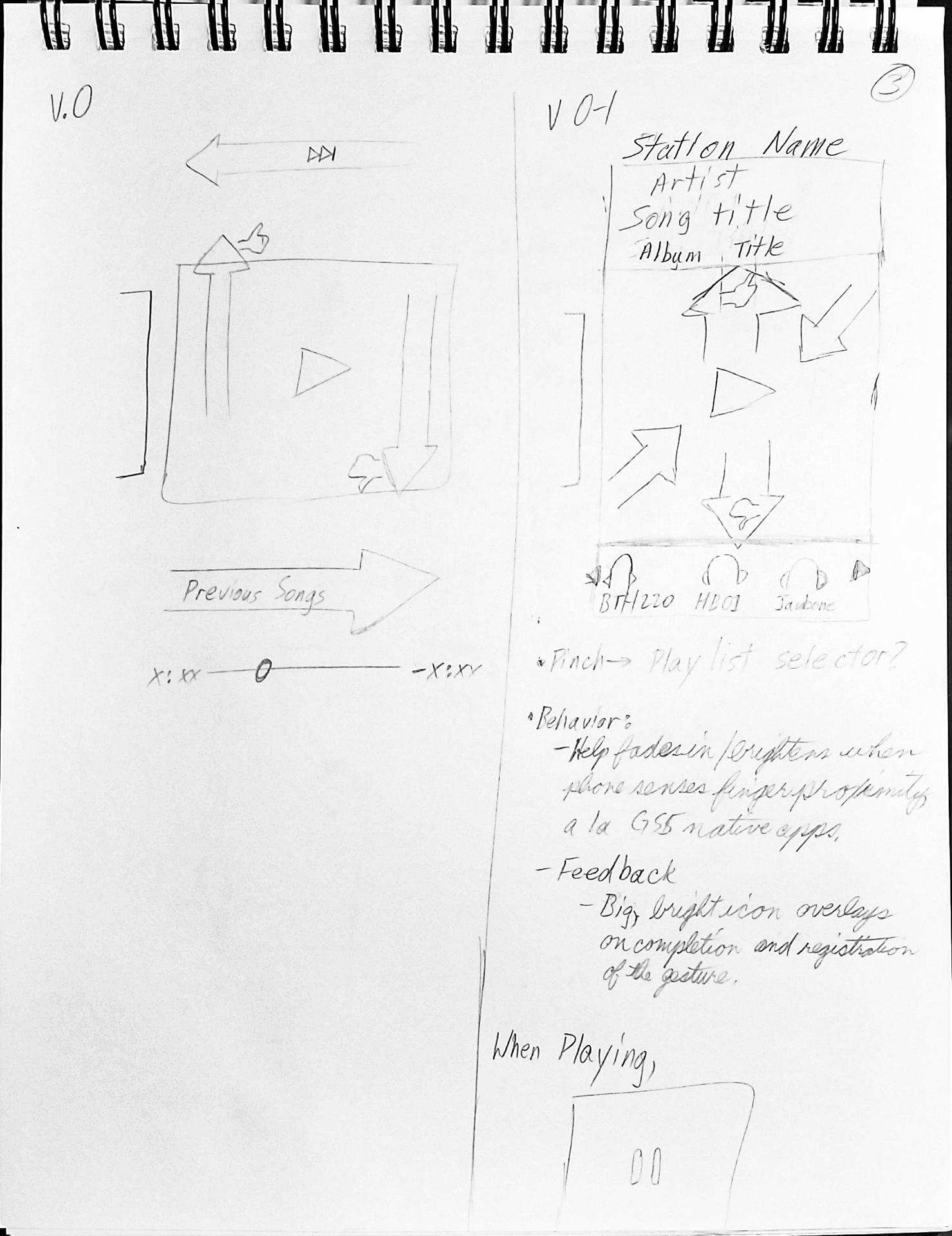
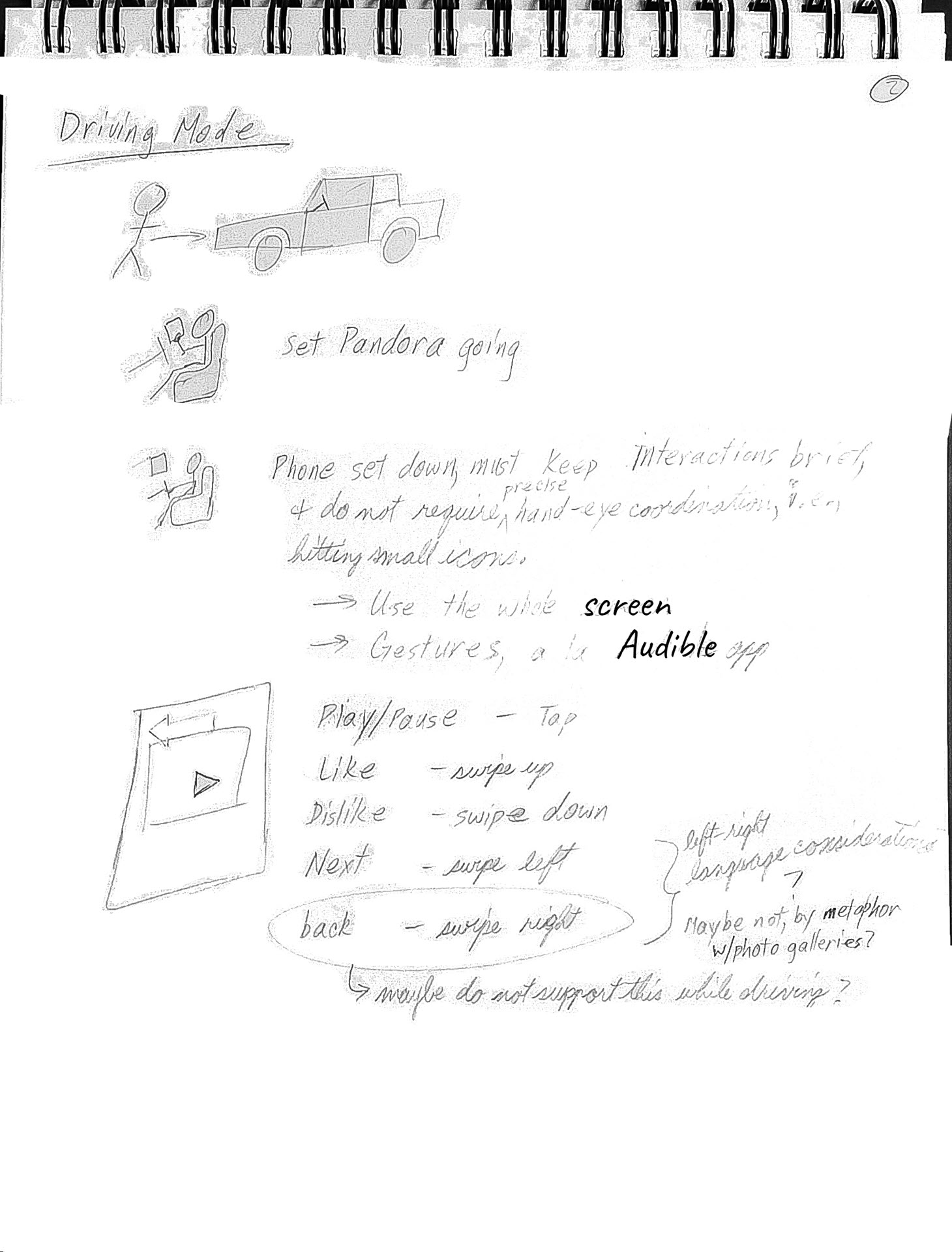
Sketching Options. A couple of options structuring gestural input and feedback about that input. Left: keeping to borders or the edges of the Now Playing area, with the potential benefit of leaving more of the song display un-occluded by the feedback. Right: using the whole song display area as a gesture-input and feedback display area, both maximizing the size of the potential feedback and reinforcing the notion that the entire area is available for gestural input.
Wireframing The Task Flows
The next steps were to identify then draw out a progression of screens and states that users would encounter as they went through various subtasks that they might encounter as sketched out and imagined in the storyboarded scenario. These can also sometimes take the form of task flows.
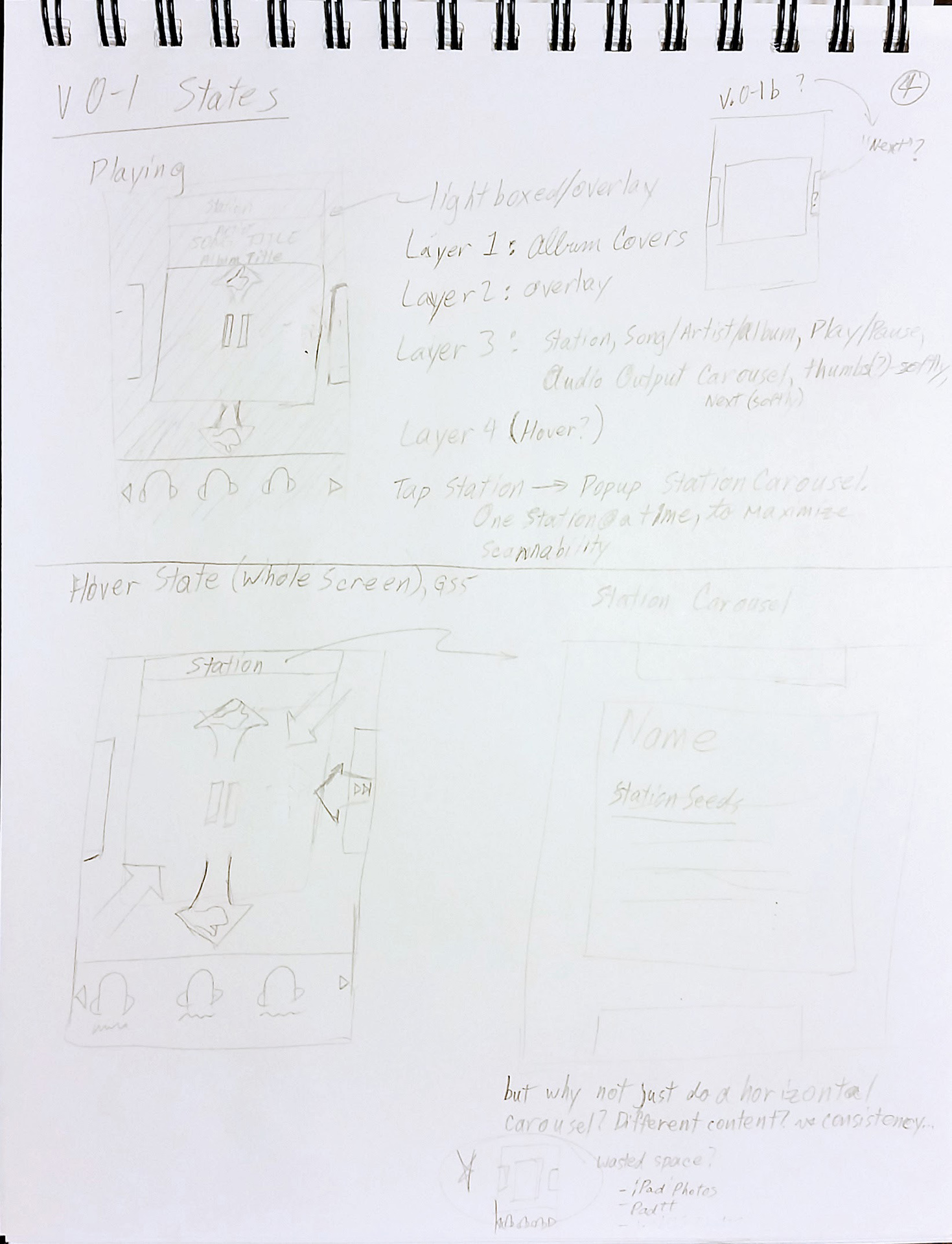
Low Fidelity Work. Sketches of various states and screens adjacent to the Now Playing screen that users might encounter as they interact with the app and navigate around the app, including a potential hover state for as a possibility for user education as to the gestures available on this screen.
Recognizing New Design Pattern Needs
Hopefully, most of the time, what you need is covered by the design system--in this case, within the design and input language of the existing app. However, as the design goal here of a brand new mode of use--a driving mode--new design patterns for input and feedback were implicated.
Identifying New Problems
Designing for a new context and scenario of use for the app meant designing for additional constraints and optimizing for different needs--as noted:
- Minimizing the need for visual attention or precise visual focus.
- Minimizing the demands for precise hand-eye coordination.
- Minimizing target acquisition
- Maximize the size of any visual feedback.
- Maximize the size of elements with which users might want to interact.
- Be forgiving for input requirements in terms of precision in location of touch input.
- Minimize the navigation necessary to complete anticipated tasks.
- Use context and the scenario to structure what's available in the interface.
"There is no such thing as a problem without a gift for you in its hands. You seek problems because you need their gifts."
- Richard Bach, Illusions
One of the challenges of gestural input is that there may be no indication of what commands and gestures are available for users to invoke and use, respectively.
One way explored in the above sketch to address that is to use the phone's sensors to identify when a finger is overing over the screen. As a brainstorm-level exploration, feasibility, hand-eye coordination precision, and visual attentional considerations were earmarked for later evaluation.
New Context > New Opportunities > New Interactions + New Functionality
The context of a driver interacting minimally with the app and with minimal visual attention and hand-finger-eye precision presented both a challenge and a new opportunity.
The challenge was to the normal way of working in the app. The existing design's restriction to tapping as input and tap targets of limited size did not meet the demands of the new context.
The opportunity was to define one or more better ways of interacting with the app that better met the needs of the new context: gestures--swipes and pinches, which was increasinglyi seen in capacitive touchscreen devices like phones and tablets running webOS, iOS, and Android. I was inclined to offer as large an area to be sensitive to gestures as I could manage to design into the app, to minimize users' need to be precise with where to use the gestures.
Bases From Lower Fidelity Sketches. Maximizing the song art display area to maximize space for the main interactions' gestures. Using carousels at different levels and parts of the screen, including at the level of songs (to support previous track and next track swipes), at the level of "radio" channels, and, at the bottom of the screen, for output devices.
The swipes in each of the four directions--up, down, left, and right--seemed pretty likely semantic matches to the core Pandora Now Playing screen actions: thumbs up, thumbs down, next track, and previous track, respectively.
That left pinches (in and out) and taps (limiting those last to large tap targets) available for other actions.
From a song, pinching in, to use semantics from other contexts with which many would be familiar, seemed a good semantic match for zooming out. From the perspective of viewing a song, and given the objects in Pandora this seemed a great candidate for zooming out to the "radio" channel level. This was a great opportunity to use another gesture and neatly avoided a conventional tap-on-an-icon input for something like that, which could be tapping on a upward pointing caret, for instance.
From my low-fidelity designs, "zooming out" to the "radio" channel level would bring users to a carousel in which each channel would be represented by a large card, most of the size of the screen, with parts of the next cards to the left and right. This allowed me to restrict the interactions to swiping and tapping on very large tap targets as the means by which to make selections at this level.
But, given my heuristic analysis of drivers' needs and as suggested by storyboarding the activity of driving while listening to the music through the app, maybe there was some way to include on the driving mode Now Playing screen a way to switch between output devices. This would be entirely new functionality to Pandora, but it seemed a good choice to include, given the new context for this usage. And so the carousel of connected output devices was brainstormed.
There were three main considerations in designing the carousel:
- Since icons representing the output devices seemed necessary, I tried to make the icons as large as I could and giving them as much space as I could in between them while reserving the main space to display the currently playing song and to be the main gesture area. Again, all to minimize the need for precision movement and visual attention.
- The large icons would limit the number of output devices that could be visible on the screen at once to about 3, possibly four, but that seemed a reasonable number. I'd anticipated that list to include at least one, possibly two that would most important--the car's sound system and the driver's headset.
- Swiping would turn/scroll the carousel. The important thing here, along with the icon size, was to maximize the area for the carousel while acknowledging that the Now Playing song display area as being a higher priority.
Step 4: Higher Fidelity Designs
Because I was working from the design and screenshots of the existing Pandora app as a base from which I was designing my additional driving mode, after the above lower fidelity work, I jumped to using using Photoshop to create the additional visual assets that I needed--from icons to all the various screens and screen states that I needed.
High Fidelity Mockups: The Path Of Usage
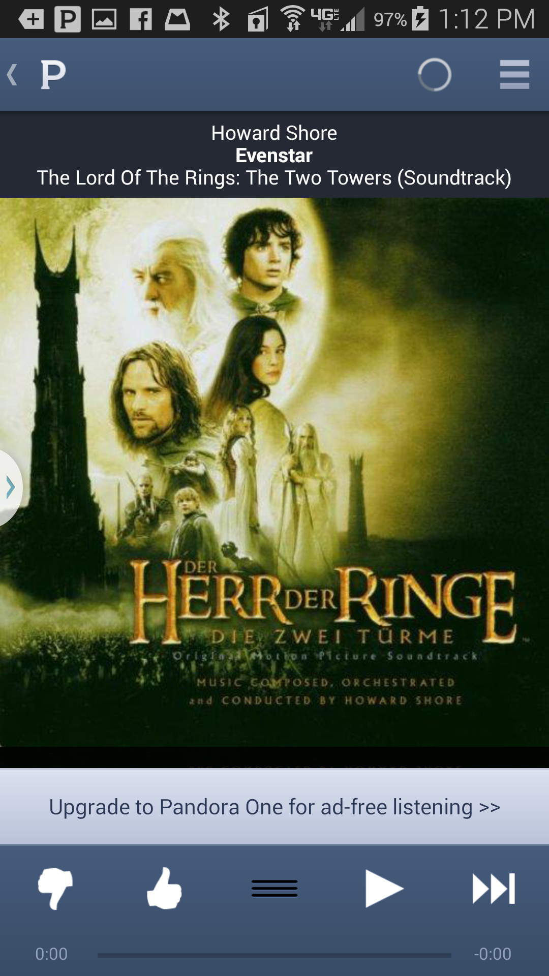
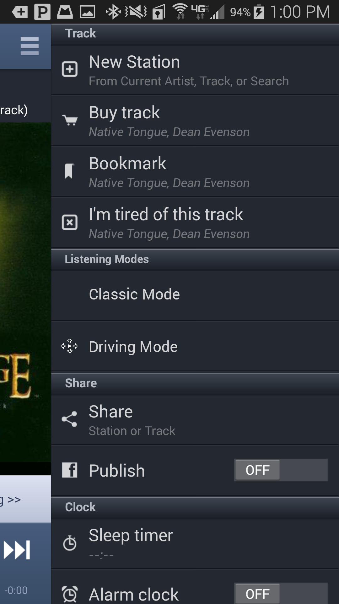
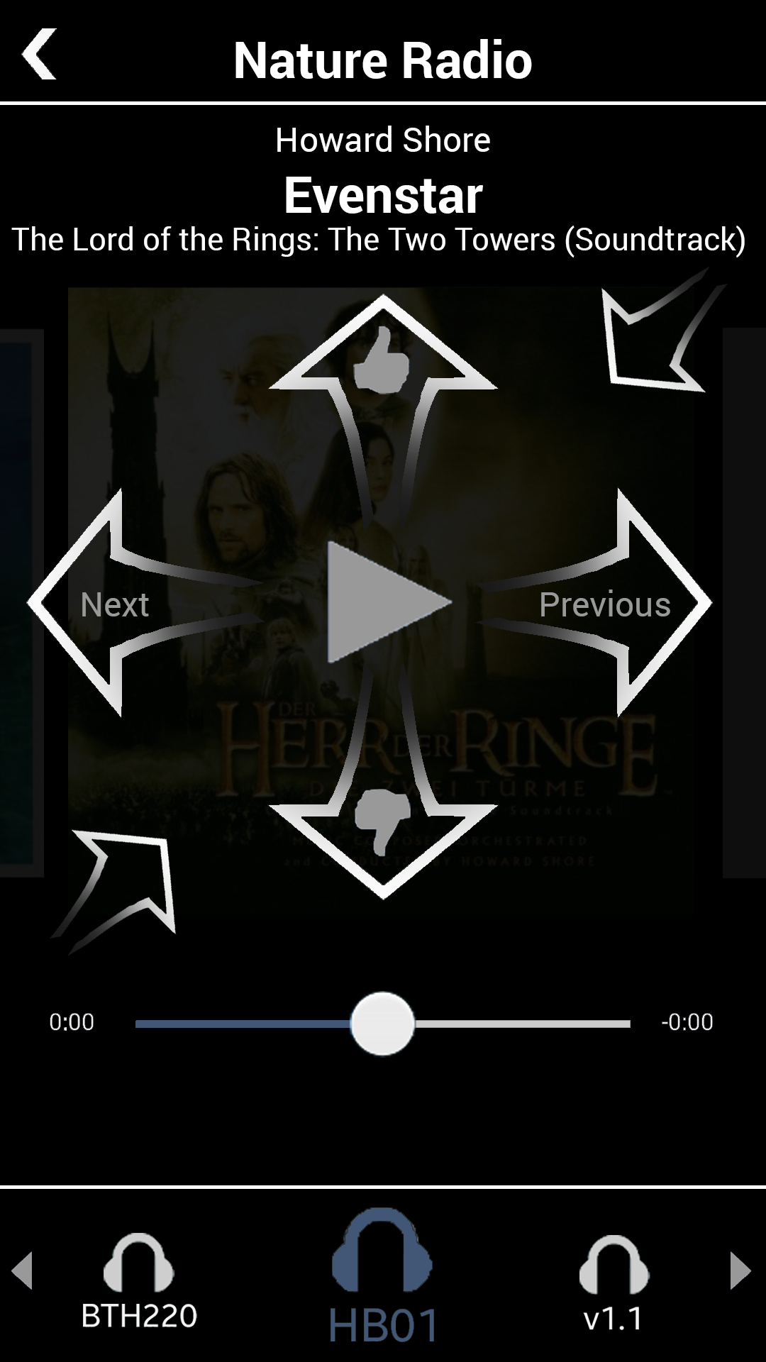
Step 1: The existing Now Playing screen, with its song art display area and dependence on too-small-for-safe-driving-usage icons and tap targets.
Step 2: Initiating Driving Mode. My design added Driving Mode to the existing hamburger menu.
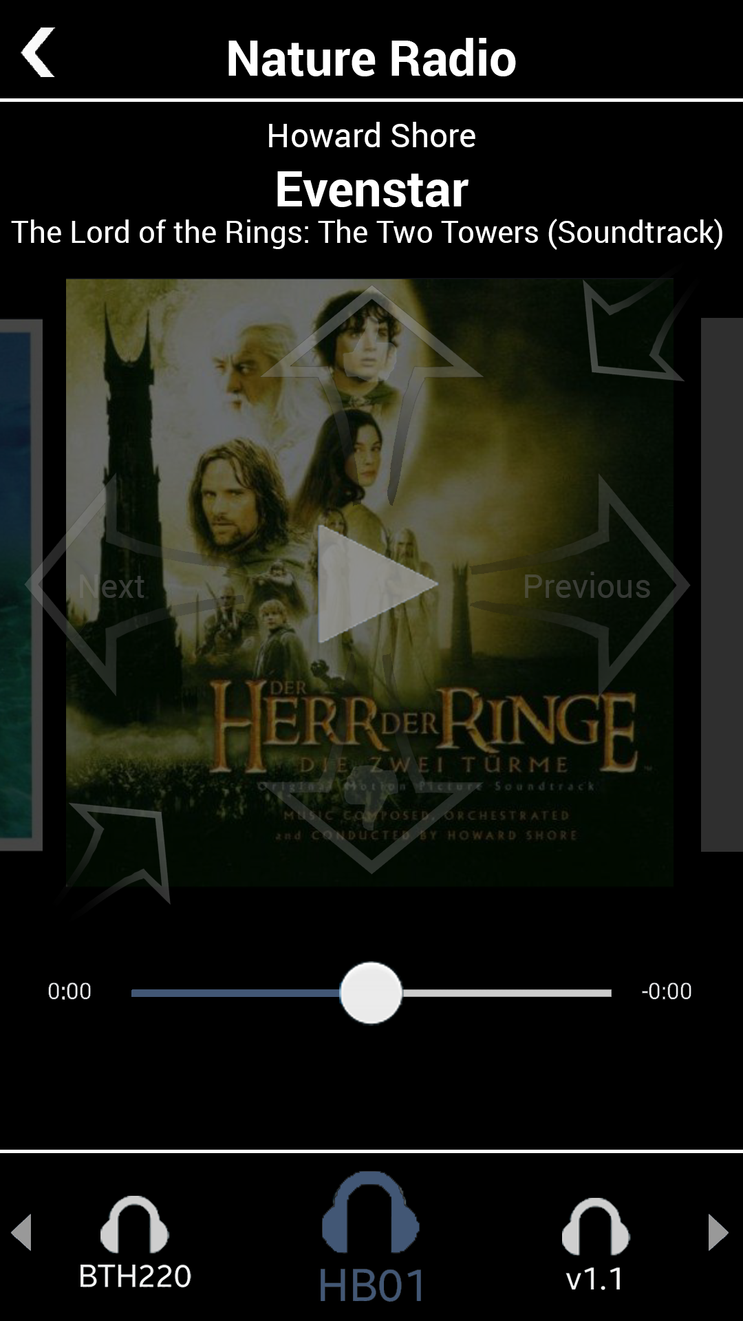
Step 3: In Driving Mode. Tapping anywhere in the entire song art display area will start the playing. Much easier and safer to do than trying to hit the small icon from the existing design.
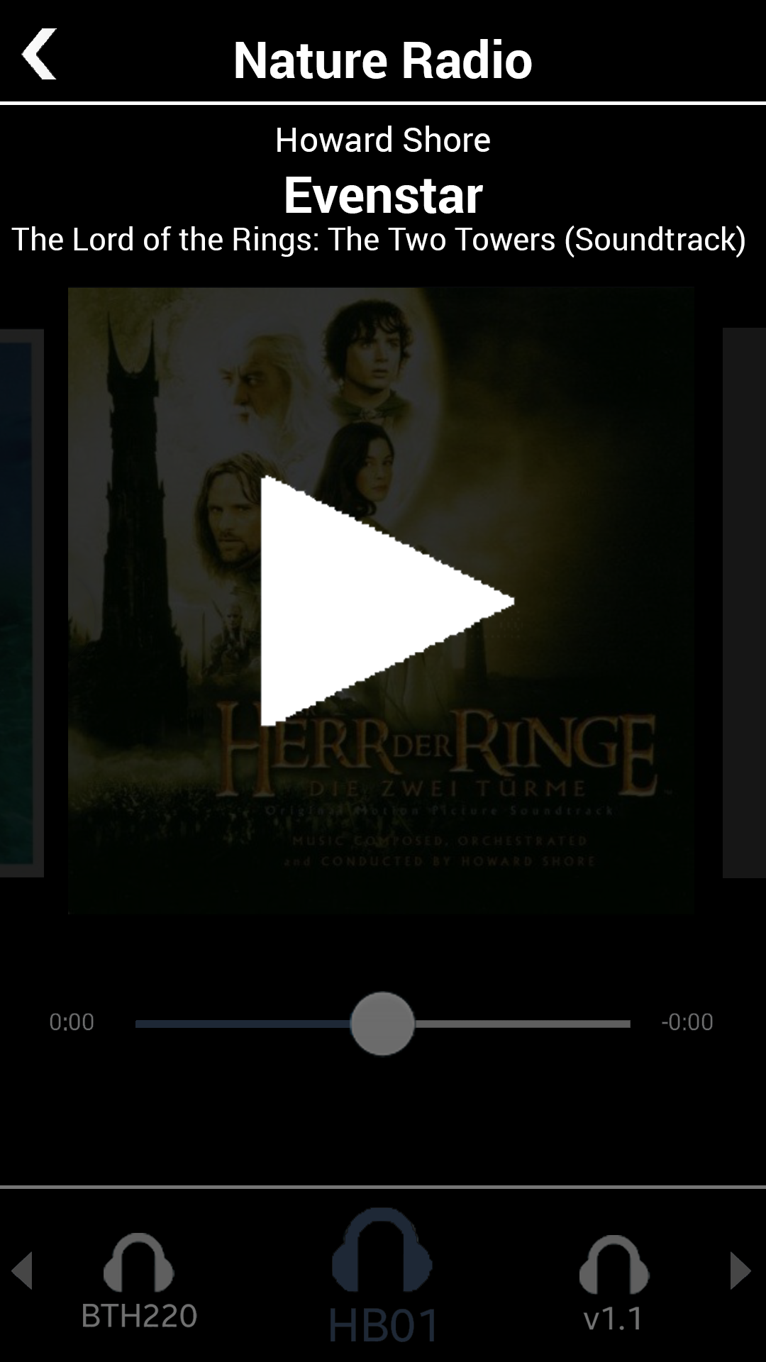
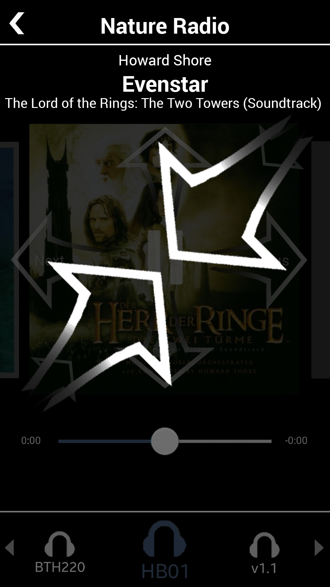
Step 4: Play--Giant Feedback To Allow Less Attention And Foveal Attention. Using a darker overlay plus a giant "Play" icon to also increase the contrast in order to enhance users' ability to note the confirmatory feedback without the screen being the focus of their visual attention.
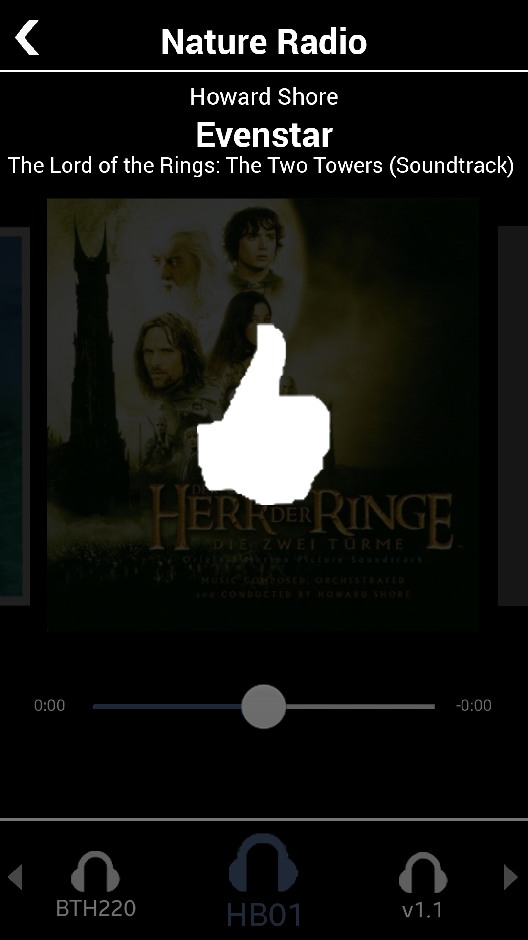
Step 5: Thumbs Up--Giant Feedback To Allow Less Attention And Foveal Attention. As with the Play feedback, again using a darker overlay plus a giant "thumbs up" icon to also increase the contrast in order to enhance users' ability to note the confirmatory feedback without the screen being the focus of their visual attention. This "thumbs up" is, of course, one of Pandora's core interactions.
Step 6: Zoom Out To Channels. As with the other visual feedback for gestures, again using a darker overlay plus a giant "pinched in" icon to also increase the contrast in order to enhance users' ability to note the confirmatory feedback without the screen being the focus of their visual attention. This "zooming out" takes the user out of the song to the level of available "Radio" channels.
Step 6: Carousel Of Radio Channels. The available radio channels are represented as cards in a carousel. Again, areas for the primary actions, whether swiping or tapping, are made as large as possible to require less visual attention and precision of movement. Users can swipe left and right anywhere on the screen to go through the channels. Once the radio channel that they want is centered, a tap anywhere in the card will select that channel and show a song in that channel in a Now Playing screen.
Changing Output Devices
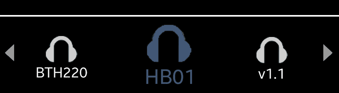
Switch Output Devices Directly On The Now Playing Screen Without Changing Contexts. While driving, users may have their phone connected to more than one output device: with their car's sound system and their headset being the most likely two. This output device carousel shows the connected devices at the bottom of the Now Playing screen, maximizing the size of the icons, their respective tap targets, and the space between the icons--all, again, to require less attention and precision from drivers. The functionality is added here to allow direct, on-screen access to easier switching as a phone call comes in or especially after a phone call ends, removing the cognitive and UI navigation load to go through the phone's system settings or separate media output menu.
High Fidelity Prototype
Part of the point of my project was to learn new tools and techniques. I was curious to experiment with and try out a variety of prototyping tools, many of which could take in assets like icons and screen mockups and allow their users to create clickable prototypes from them.
After experimenting with many of the ones in which I was interested, Proto.io stood out as a tool that, critically for my project, was the only one at the time in which I could define a single area that could recognize more than one triggering event. As noted, my design of the Now Playing song art display area needed to be able to recognize swipes, pinches, and taps. The output device carousel area would need to recognize both swipes and taps. Proto.io was the prototyping tool to use.
Using Proto.io, I made a clickable prototype that supported my main illustrative use cases:
- Starting from the existing Pandora Now Playing screen to initiating Driving Mode.
- In driving mode:
- Playing
- Pausing
- Going to the previous track
- Going to the next track
- Rating any of those three tracks/songs
- Zooming out to the "radio" channel cards
- Selecting the original channel
- Exiting Driving Mode back to the existing Now Playing screen
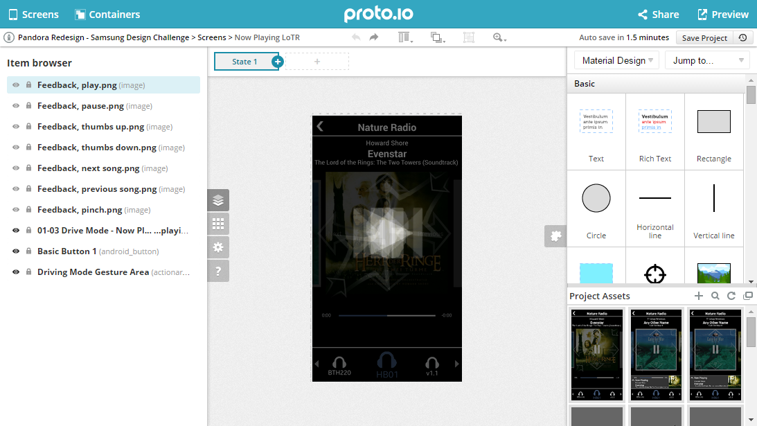
Exploring and working in Proto.io. A particularly nice feature--rare at the time amongst the tools I'd considered--was that any single area could register more than one interaction (tap, swipe, pinch, etc.).
With the clickable prototype created, I wanted to create more artifacts that could be useful in showcasing the design, so I created a demo video of the the prototype.
Driving Mode video demo: getting into driving mode, rating tracks, swiping to jump to the previous and next tracks, tapping from the song to the "radio" channel, pinching to zoom out to a carousel of channels, where a user can swipe and tap to change the channel. Also seen at the bottom of the song display screen is a carousel of the output devices available to the phone--note the intentionally larger tap targets and swiping based interaction implied by the carousel design pattern.
Before And After
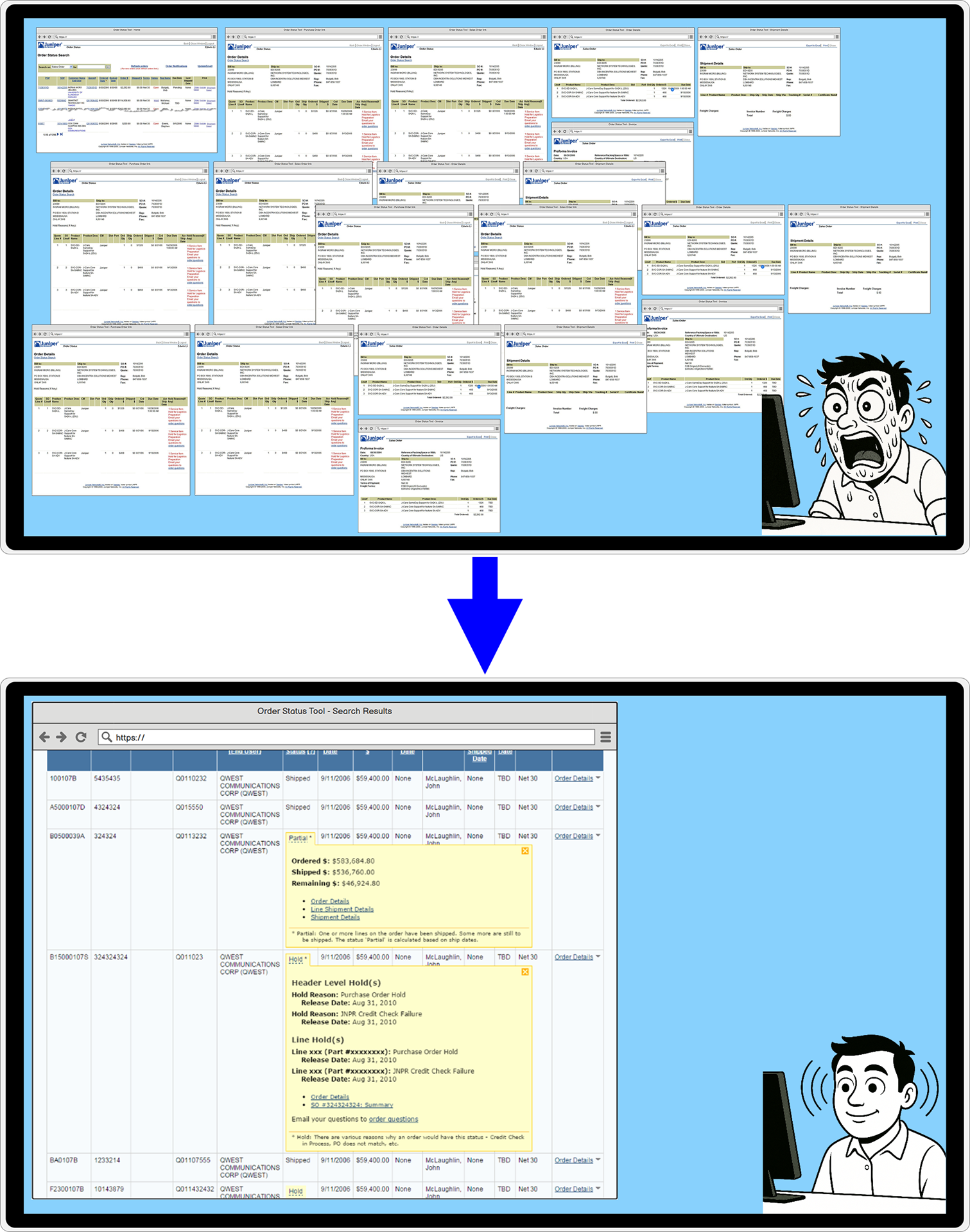
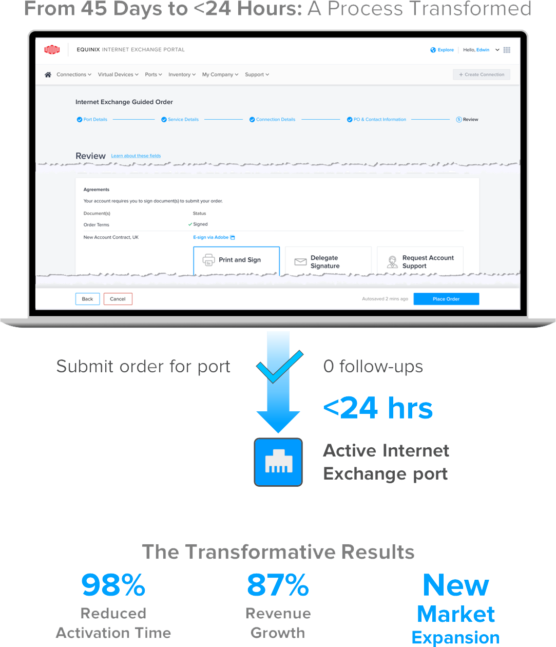
Prior Design. A single page for collecting the order information--lots of dropdowns, many whose selections invisibly change the content of later questions. The form ultimately did not cover all ordering scenarios, usually requiring account representatives to follow up many times, resulting in the average of 45 days of ordering to activation time.
New Design. Users go through a wizard comprising at least 5 screens, of which this illustrative one is the second. Adding in some sub-flows, this wizard covers almost all the ordering scenarios, allowing an order to activation time of less than 24 hours versus the prior average of 45 days.
Using tiles for 1-of-n choices, progressive disclosure to add questions onto the page as users go through the questions, we made question dependencies more visible and relationships between different choices and their consequences salient. We also added real-time messaging and in-context help for more detailed info when it might be needed.
Future Directions
Constraints can be opportunities for innovation and powerful, specialized solutions.
Here, the goal of reducing demand for visual attention and precision led to the an exploration of, use of, and emphasis on gestures, large interaction areas, and large, high contrast, visual feedback.
This increased use of gestures and avoidance of icons could also come in handy for designing UX on watches, on whose limited screen area, icons large enough to see and tap with fingers, even with concentrated visual attention, would require a huge percentage of the available screen real estate.
With those constraints in mind,gestures and even the larger visual feedback for gestures approach explored here may worth considering when designing UX for watch interactions, which will most likely tend towards being very short in duration.
What Would I Do Differently
One of the drawbacks of a UX dependent on gestures can be both discoverabilty and learnability. Without icons to see and afford interaction, how might a user even know that an interaction is available?
One approach I considered in my design was some ability for the phone to recognize a hand or finger hovering over the screen. This is probably a challenge and likely unreliable, even though phones do have proximity sensors to know when to turn off their screens and their screens' sensitivity to touch when users hold their phones to their ears to talk on the phone. That said, I did design an instruction screen emphasizing the the available gestures' iconography for that hover state:
Still, whether that hover state is ultimately feasible or not, there should probably be another way to bring it to users' attention other than that hover state, and I didn't design that in.
In looking back, I'd have spent some time exploring other possibilities:
- A little tour when initiating Driving Mode for the first time
- An icon on the Driving Mode row of the hamburger menu that could lead to a version of that hover state screen or a help page about it
- An icon or something on the Driving Mode screen, perhaps a relatively deemphasized question mark icon somewhere on the Driving Mode screen that would invoke that or some other explanatory screen. The icon should be relatively deemphasized so as to decrease the its prominence and likelihood of use or accidental invocation while driving.
Selected Works
Transforming Order Management Web App: UX Research & Design to Eliminate 32-Window Workflows → 8x System AvailabilityUX Research, UX Design, Product Design, UX Strategy, Low Fidelity Prototypes, High Fidelity Prototypes, Interactive Prototypes, Visual Design, Web Application
Research & UX Strategy to Expand Market: Order Data Center Network Port via Web, 45 Days → <24 Hours, 187% RevenueUX Design, Product Design, UX Strategy, Product Strategy, Low Fidelity Prototypes, High Fidelity Prototypes, Interactive Prototypes, Visual Design, Web Application
Design Processes, Artifacts, and Work StyleUX design, UX research, UX process, UX artifacts, Sketches, Maps, flows, and models, Low fidelity, High fidelity, Interactive prototypes
Pandora App: Driving ModeMobile, High Fidelity, Interactive Prototype, Demo Video, Personal Project