Design Processes, Artifacts, and Work Style
How does Edwin work, and what is he like to work with?
Working with Edwin
What's Your Process?
"It depends." On the company, team, project, etc.--whatever UX techniques we can fit in to get to the goal: a design that fits users' needs, task, tool, and social ecosystems and empowers them to do better.
UX Artifacts
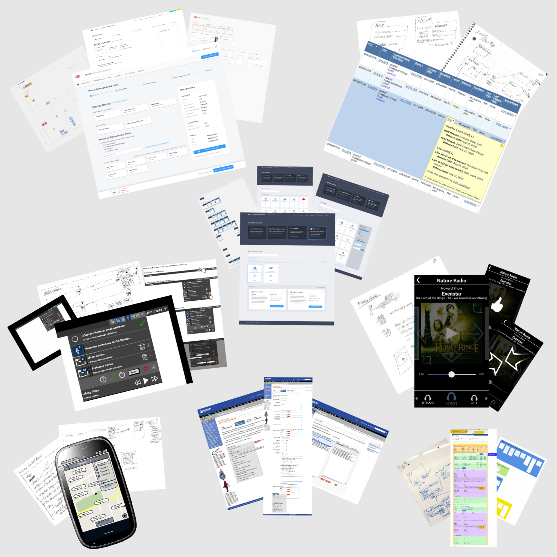
Low to high fidelity, as best for team effectiveness: abstract models, task flows, paper sketches, Balsamiq Wireframes, Sketch, clickable prototypes, UX specifications, even HTML/CSS for illustration, from design patterns to design systems.
UX On the Product team
I prefer collaboration with team members of all disciplines, from other interaction designers and UX professionals to product management, developers, other business stakeholders, marketing, legal, and whomever else might be available to help us improve the UX of our products.
What is Edwin like as a UX Designer?
How does Edwin work, and what is he like to work with?
There are many ways to answer that, and here are a few, more focused questions to shed light on that overall question:
- With what UX design processes are you conversant, how flexible are you with those processes, and how do you make choices amongst them when necessary?
- What artifacts do you typically produce in your design work?
- How do you work with those around you, from other interaction designers and UX professionals to your management, product management, user researchers, developers, business stakeholders, marketing, legal, etc.?
I'll use those questions to structure the sections below.
Design Process: Doing the Best You Can
I believe that there is no One True User Experience Design process, but, rather, many different approaches and tools with the same goal—a design that “fits” with and empowers users’ behavior and how they think about their domain of activity.
There are quite a number of processes, models, frameworks, and tools that have been developed and articulated to get to that goal. These include Norman and Draper’s User-Centered Design, Constantine and Lockwood’s Usage-Centered Design (described in their "Software for Use"), the Double Diamond model of design, Alan Cooper’s Goal-Directed Design (which pioneered the use of personas for UX design), Beyer and Holzblatt’s Contextual Design, and various versions of "Design Thinking."
I’ve used many of these, and I am familiar with them to varying degrees, but which one, if any single one, is the best to use?
As with so many UX questions, the answer is, “It depends.”
It depends on things like the UX team’s skills and background, the project’s timeline, the corporate environment (whether and how fully management prioritizes product UX), access to users, the type of project or product, and many other factors.
So the best approach is familiarity and expertise in as many of these approaches and tools as possible, then choosing the tools and techniques that fit the opportunities of any given situation.
Design Process: Aspirations
Ideally, an ongoing and iterative UX process will be grounded in ongoing observations and evolving knowledge about users and their behavior in the context of their social, task, and tool ecosystems.
This is best served by a company whose culture--in all of its various departments--believes in an outside-in design philosophy in which decisions of what should be built and when can be driven by or grounded in understanding users' needs.
Within any given project of at least moderate complexity, the UX process will generally have some subset of these general stages:
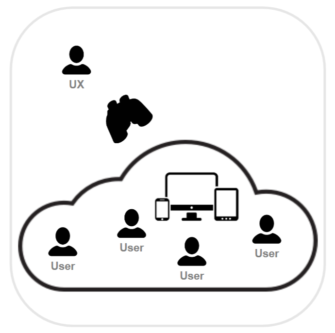
0. Domain and User Research. Ongoing observation of users in their social, task, and tool ecosystem to understand user behaviors and to identify unmet user or domain needs, usability issues, or opportunities to help.
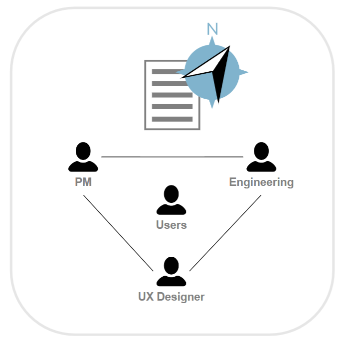
1. Understanding the Problem. Once an opportunity for improvement has been identified, create and develop product, user, and domain requirements with key stakeholders

2. Understanding the Problem: User Research. Refine requirements and understandings as necessary with more targeted user research in their current ecosystems
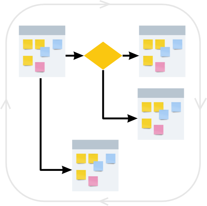
3. High Level Designs and Abstract Models. Digest into flows, maps, and abstract models - UX foundations
4. Low Fidelity Designs. Quick and low-investment to explore before committing to designs. Output: sketches, mockups, wireframes, and prototypes
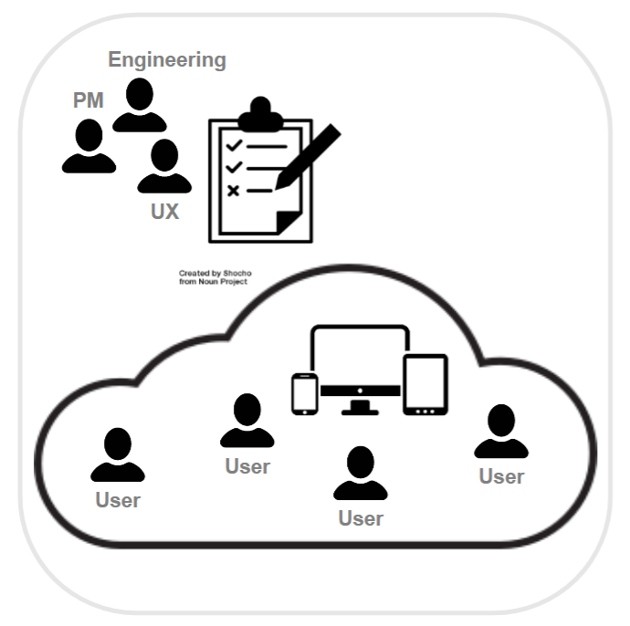
5. User Testing and Iterating. Conduct user research using the low fidelity design artifacts to identify issues with the metaphors, flows, general layout, etc. Iterate designs as to address issues.
6. Higher Fidelity Designs. Using design systems and other high fidelity tools - create, iterate, and polish. Output: screens, specs, clickable prototypes, HTML/CSS

7. User Testing and Iterating. Conduct user research using the high fidelity design to hone in on issues, especially those around the higher fidelity details like colors/shades, icons, specific terms, fine layout, etc. Iterate designs as to address issues.
8. Develop Application. Work with development to catch and smooth out any wrinkles
9. User Testing and Iterating. Conduct user research using the developed builds to hone in even further on issues, taking metrics like time on task as the implementations stabilize.

10. Release the product to benefit users!

11. Look For Usage Data And Feedback. Ongoing user research to identify and assess less obvious usability issues and effects of the new design on user needs, user behaviors, and further domain opportunities.
Design Guidance: Triangulating To Understand Users
Cognitive Science at UC San Diego is an interdisciplinary approach to understanding how we think--using any discipline, evidence, or level of analysis as part of a holistic effort to triangulate and learn everything we can about cognition.
In the same way, understanding our users can and should be approached from many levels, not just direct observation in their natural environments using your specific tool to do exactly the tasks of specific interest to your project. While that approach has a high potential to provide the most directly relevant design inspiration, guidance, and constraints, other approaches can also provide relevant design input.
I think of all the sources of design input as situated in a User Insight Pyramid.
User Insight Pyramid
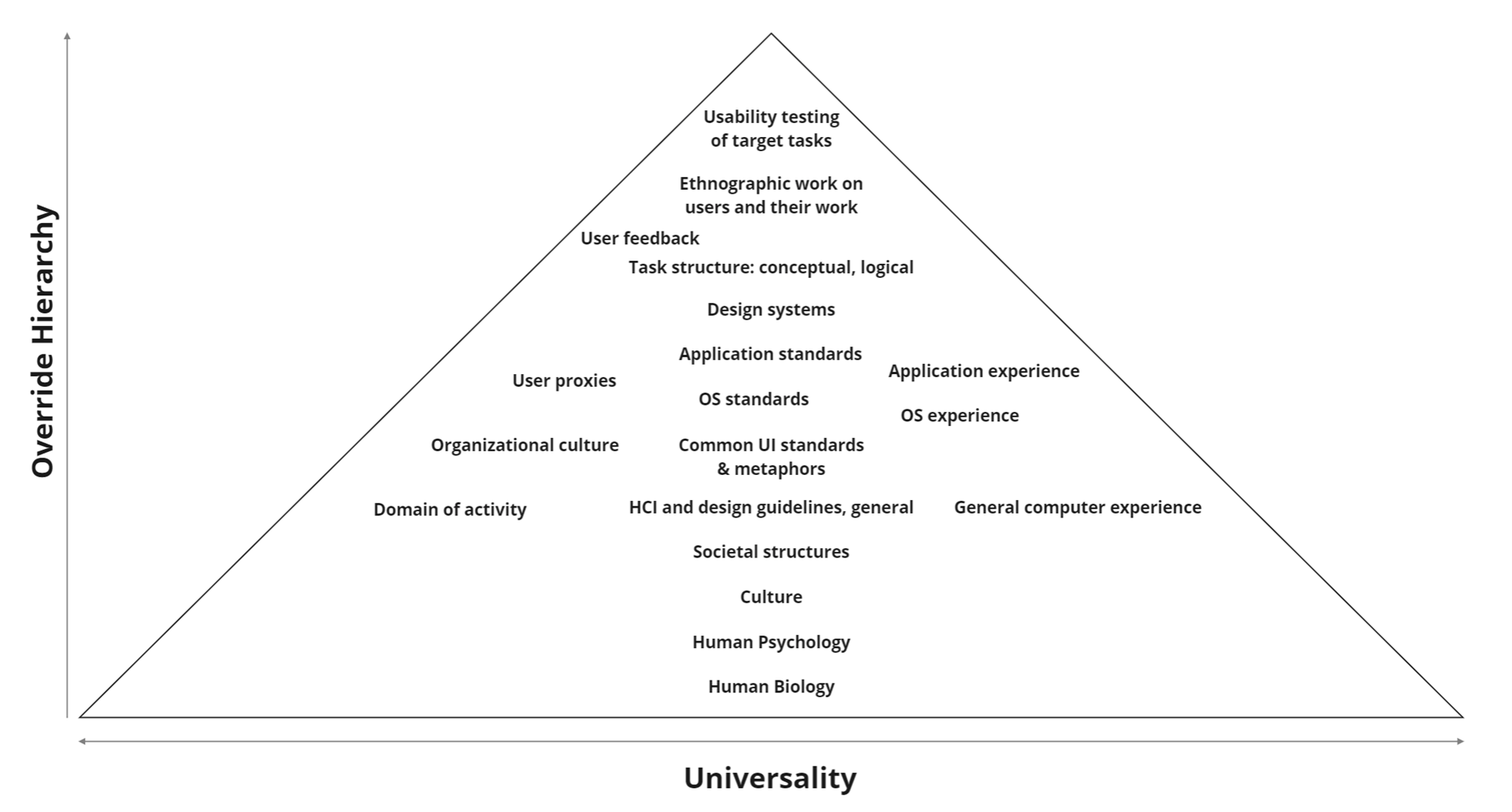
The approaches listed in the pyramid graphic are, of course, not a complete list of all possible approaches. Some of the ones mentioned have sub-categories that merit recursive examination. Their placement is also not meant to be exact. Rather, they are meant to be markers of neighborthoods and approximate levels, some more certain than others.
The universality dimension is meant to reflect the variety of "user populations" to which that level or topic's insight would apply. Thus, insights gained from the base of the pyramid, human biology, such as width of foveal attention and timescales of visual perception would be applicable to any design that depends on the human visual system, regardless of whether this was a first person shooter video game or a Google Home Hub screen. On the other hand, insights from usability tests done on with a participant who is drawn from a carefully identified sub-population of doctors who have x condition, trying to do a specific task with a specific medical device would be much less obviously generalizable to an internet exchange port ordering web application.
The specificity dimension is mean to suggest a hierarchy for any refinement or resolving of any conflicting or uncertain data. If, for instance, the human biology level suggested a range of reaction time, but your usability tests for a new cockpit item for US Air Force stealth fighter pilots found that they generally were on the fastest end of that human reaction time range to a statistically significant enough degree, then one could reasonably design to that smaller, faster reaction time range if your new cockpit item were to be designed exclusively for those fighter's use.
That said, the pyramid is also a rubric for understanding how one can proceed in a design effort when some of these levels of insight are not available in a project.
For the question of what is the best UX process, this User Insight Pyramid is the crux of the answer, "it depends"; the best process is the one that uses whatever sources of design insight that are available within the constraints of this particular project at this particular company--the more you can of the ones with greater specificity to your users and domain, the better.
The Nielsen Norman Group suggests something in a similar spirit in their September 10, 2021 video, "Triangulation: Combine Findings from Multiple User Research Methods" (opens in a new window).
Step 0: Ongoing Observation For Opportunities And Problems

In the best cases, the entire company has an outside-in orientation--believing in the importance of understanding users, their behavior, and their challenges for driving the direction of its products.
That understanding should be created and evolved by ongoing observation of users in their social, task, and tool ecosystems to understand user behaviors and to identify unmet user or domain needs, usability issues, or opportunities to help.
In this study of users in their domain of activity, here are a few different areas to which I aim to pay particular attention:
- Domain research
- User behavior research
- Market and competitive research
These ongoing activities are the best way to build, maintain, and evolve your company's understanding of your users; one way in which that understanding is embodied is in user personas.
Domain Research
Are there aspects of the domain that may be identified as domain structure or constraints that may influence or be taken advantage of in the ultimate design? This is a area of research in which the UX team learns about the things that matter in the domain for which they are designing the product. What things matter, how can they be used/interacted with, how they influence each other, who has what rights to see, use, or edit what, how are these things and activities related to other tools, products, or processes that will be outside the scope of your product?
User Behavior Research
How can users current behavior in the current domain-state be described? Does that behavior suggest positives or negatives with respect to accomplishing their goals within the domain? Are there regularities that may be taken advantage of when positive or done away with when negative? What tools do they use now? How are those tools embedded in the fabric of their activity or their activity “ecosystem”?
The organizational, social, and cultural fabric around users and their tools can also be important to consider.
Are there different groups of users, stakeholders, or contituencies who are involved in this domain or tool? How are they all related, and how do they interact with each other?
Market and Competitive Research
Are there solutions already out there? What’s out there that is related? How well do they support users in their activities and goals? How are they strong or weak with respect to your design and experience goals?
If your company already has a product meant for these users, what do we already know about its UX issues? What more can the UX folks and the stakeholders learn about those issues?
This might be a stage of reviewing backlogs and UX debt, conducting heuristic evaluations, etc.
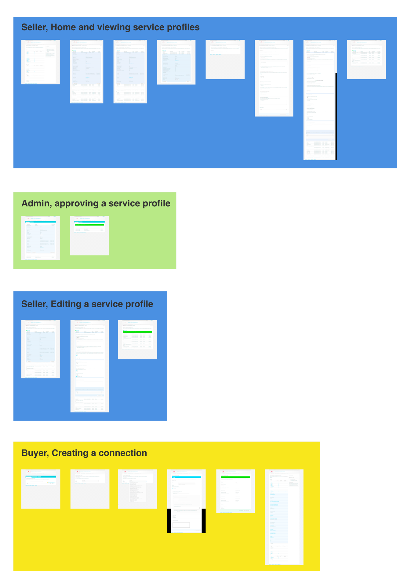
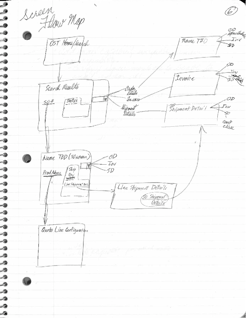
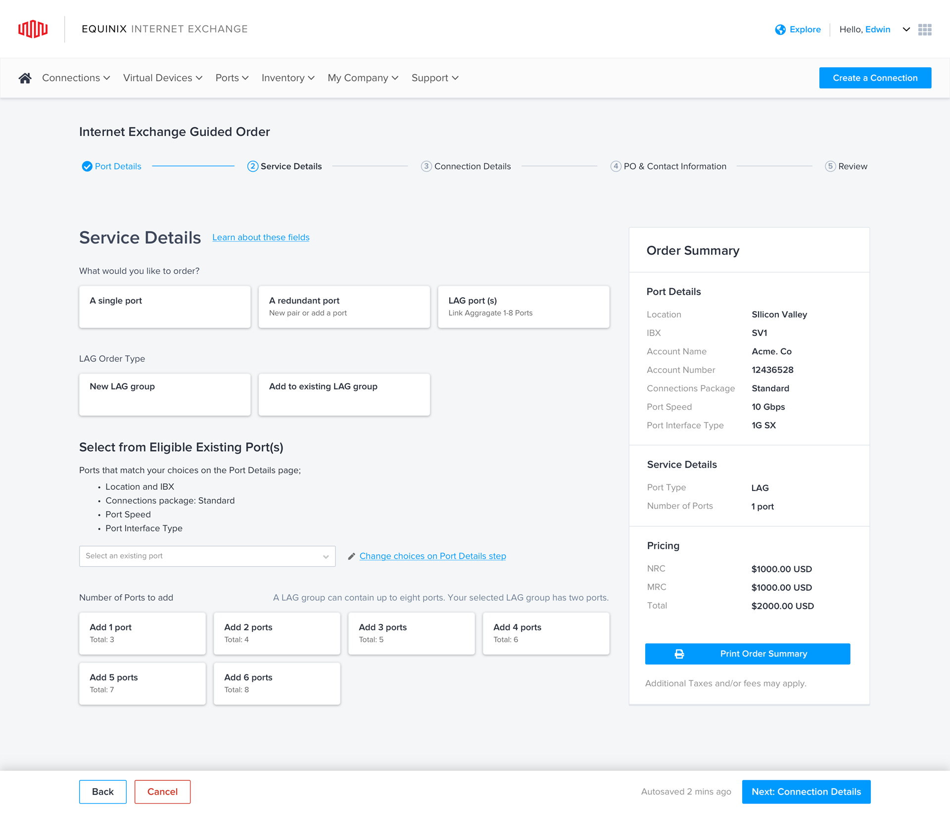
Understanding an existing application. What does a user's journey through an existing application look like? What tasks do they perform, and which screens do they go through in order to complete those tasks?
When you as a UX designer are new to a application, domain, or competing applications, these are questions that are probably worth mapping out.
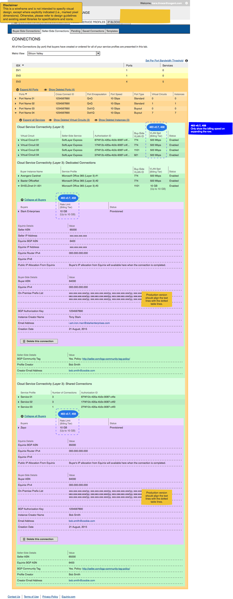
This is a map of users' journeys through our network virtualization infrastructure management application (Equinix's "Cloud Exchange" product, 2015) in the order of its principle tasks. I was the sole UX designer assigned to support it for two years.
Digesting The Data Into Design-Useful Artifacts
Since we are aiming to produce or improve a new product, we do all this research with the goal of enabling us to produce better designs.
So we need to analyze and digest the data from all this research in ways that feed our ability to produce better designs. These methods may include diagramming, card sorting, Post-It note affinity diagrams/sorting, task models (e.g., Constantine and Lockwood's "essential use cases" described in their Software for Use (commission-free Amazon link)), and otherwise re-representing any relevant data on users' needs to seek better insight into how best to empower our users in their tasks and environments.

Good designers never start by trying to solve the problem given to them: they start by trying to understand what the real issues are.
Don Norman
The Design of Everyday Things: Revised and Expanded Edition (p. 218). Basic Books. Kindle Edition.
Step 1: Understanding The Problem(s) To Solve

From domain research, user research, market research, competitive research, product backlogs, known UX issues, etc., etc., I strive to work with stakeholders in Product Management and Engineering to identify the set of issues we might want to address.
In some of the most effective organizations, UX designers share ultimate responsibility and authority over a product or project with a Product Manager and an Engineering lead, each keeping their attention on the product to enable the trio to be aware of the potential contributions and constraints from their respective areas of expertise.
In companies without an ongoing and continuous user research--which, according to some UX statistics, is most companies--this second "step" in this idealized UX process is often the stage at which products or product planning begins in most company projects.
This highlights the importance of Don Norman's quote about designers never starting by trying to solve the problem given to them. Most of the time, any problems brought to a UX designer are symptoms rather than the roots of the problems, so a big part of a UX designer's job is almost that of a detective in trying to investigate the presented problem as a clue to the roots of the problem--which turns out often to be involve the tool, task, and social ecosystems in which users try to use the company's product.
Ultimately, as a UX designer, I aim to work with PM, Engineering, and any other key stakeholders to come to a shared understanding of our UX and other goals for the project. These can include brainstorming about the usage scenarios, , drawing up "requirements," design directions, UX metrics and criterion targets for those metrics, etc.
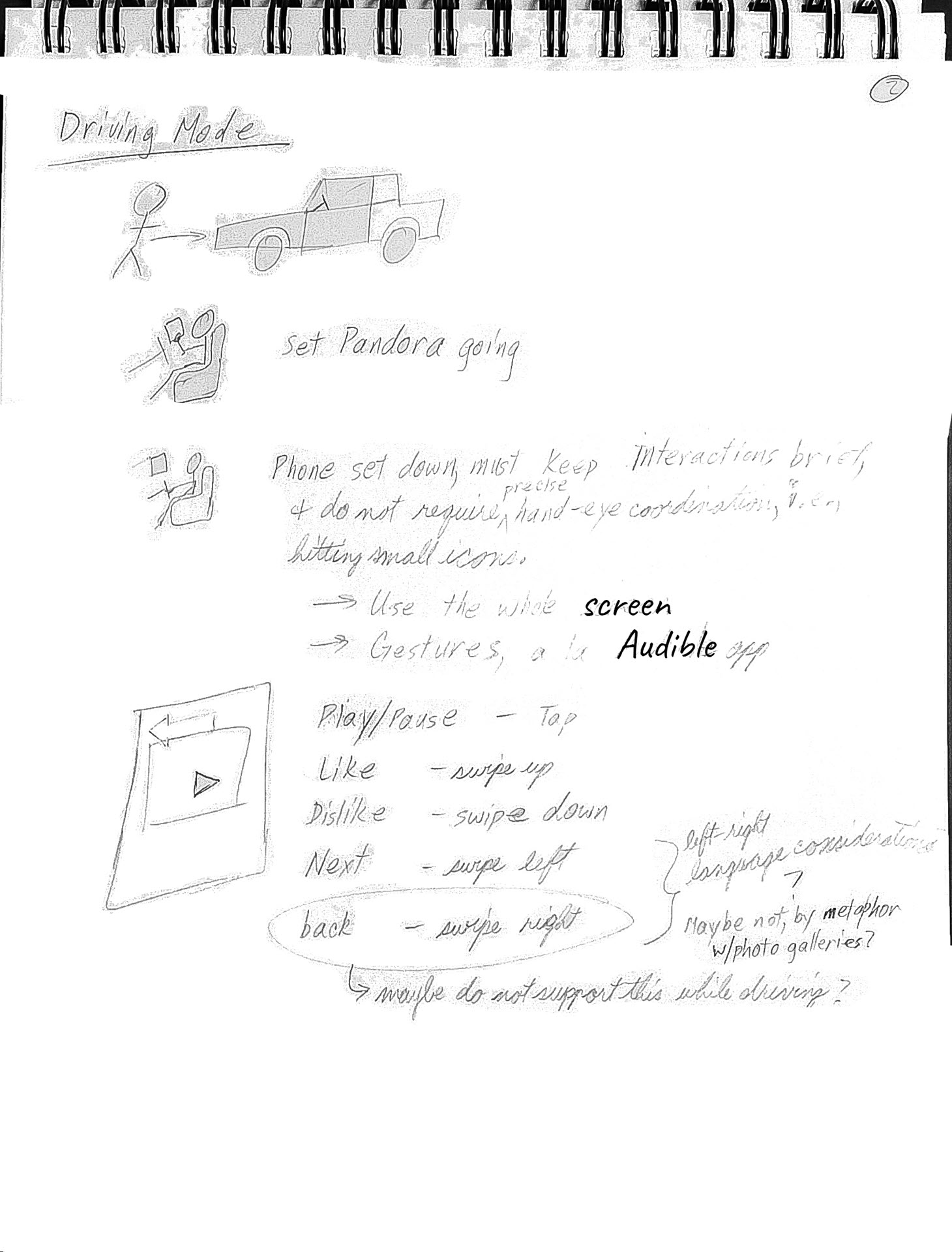
Storyboarding. Sometimes, you have the chance to start with a brand new idea--a chance to imagine what a new usage scenario might be like.
Here, I was imagining what it might be like if the Pandora app had a driving mode, inspired by Audible's driving mode.
To get a sense of its usage, I started with storyboarding a scenario, noting usage implications and constraints from the imagined context.

...solving a problem simply means representing it so as to make the solution transparent.
Herbert A. Simon
The Sciences of the Artificial (The MIT Press) (p. 132). The MIT Press. Kindle Edition.
Designing
Designing starts by continuing to the problem-solving of exploring the problem, brainstorming about ways in which the problem(s) might be solved.
Of particular inspiration to me a this stage is a quote by Herbert Simon (from his book, Sciences of the Artificial, 3rd Edition): “solving a problem simply means representing it so as to make the solution transparent.”
This means trying many different approaches, framing and reframing the problem that you’re trying to solve in search of different ways to present the problem or task, choosing promising ones and iterating upon those, going as deeply as you need to to explore their strengths and weaknesses before later choosing the most promising designs.
In the double diamond and similar models of design processes, these are the "widening" and "narrowing" halves of the diamonds.
Once properly into the design phase, I usually approach designing at a few different levels:
- High level workflows and abstract models
- Low fidelity designs for key screens and others as necessary
- Incresingly higher fidelity designs to whatever level enables the easiest collaboration with developers
Foundations - High Level Workflows, Abstract Models

Identifying opportunities to improve user experience requires identifying regularities in the task structure and its context that can be taken advantage of and generalized across users and contexts, distinguishing those from less-generalizable details and variations that might be idiosyncratic to a particular instance, user, etc.
This effort to focus on generalizable regularities over idiosycratic detail is part of the reason to design using "abstract models" of the UX. Described in Constantine and Lockwood's Software for Use (commission-free Amazon link), two types of abstract models that I've found to be very useful are content models and navigation maps.
The strength of those models are that they allow thorough explorations of functionality and workflow without commitment to particular UI idioms or implementations.
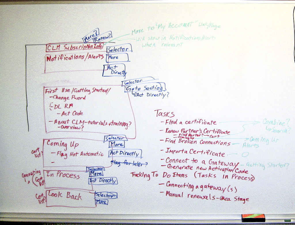
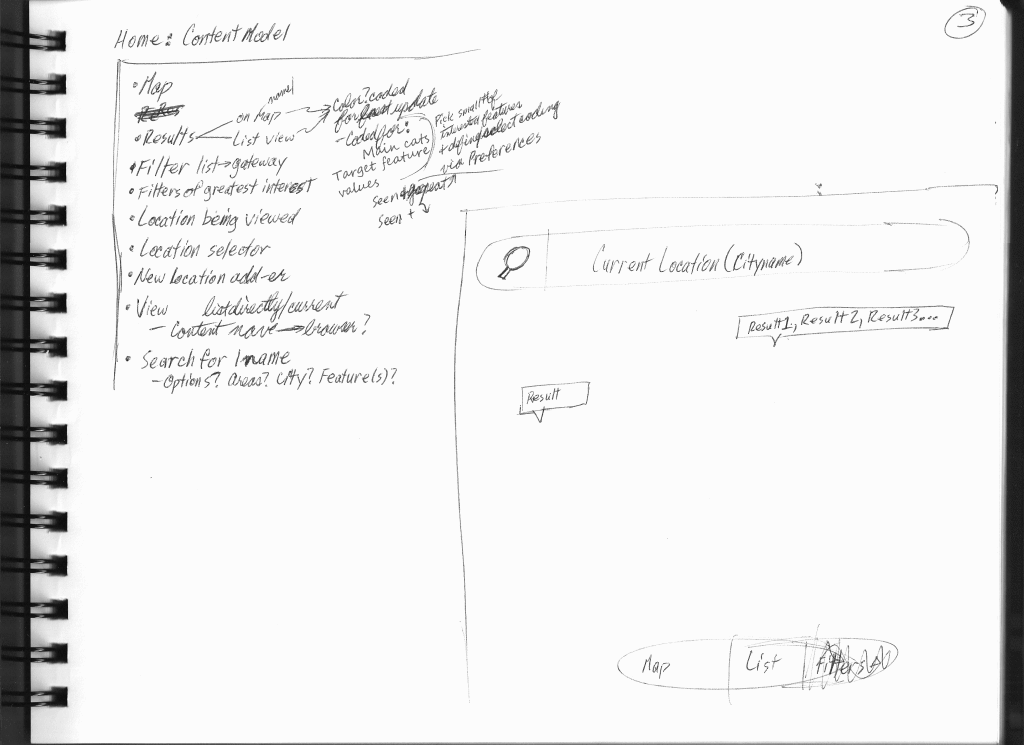
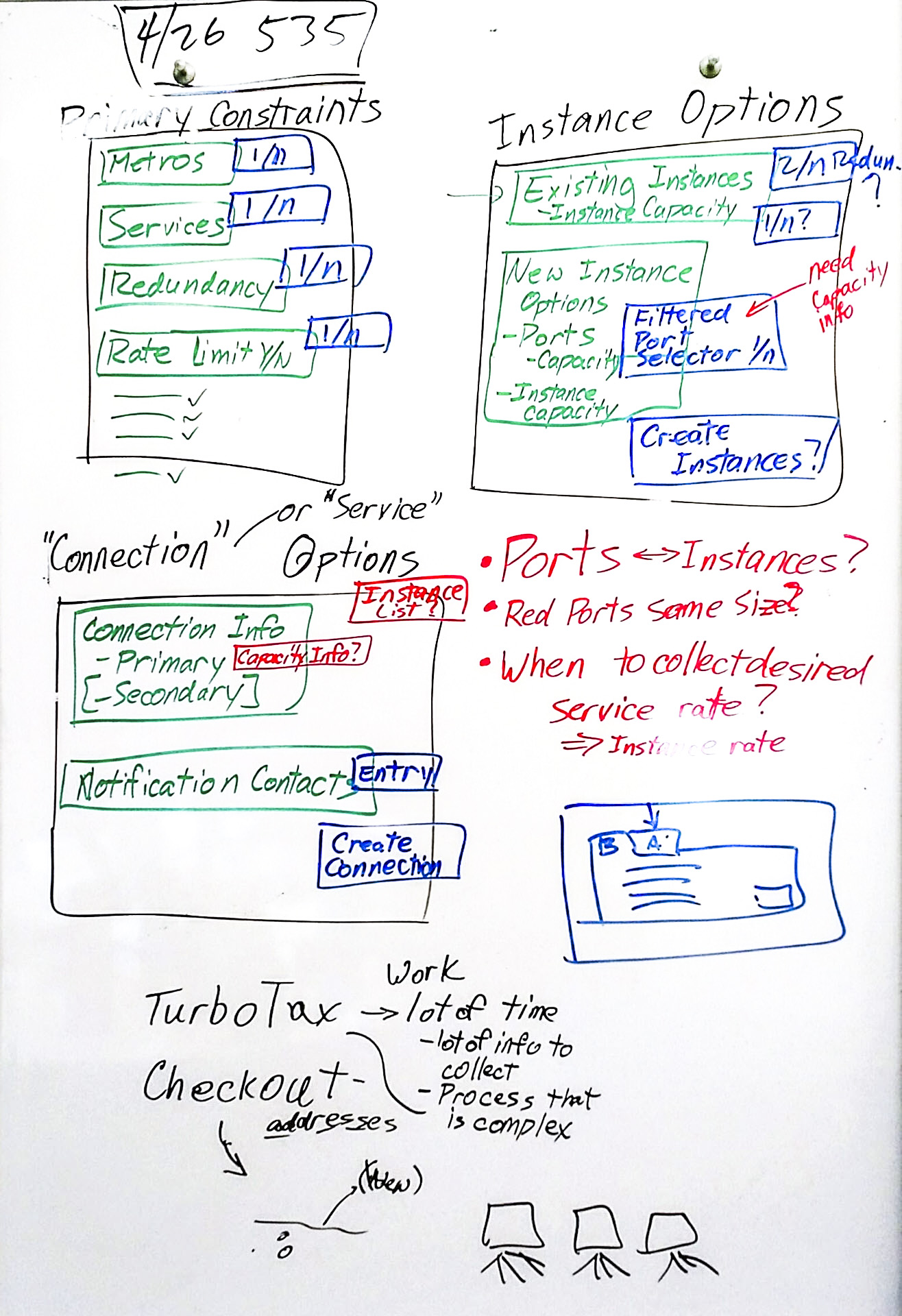
Content models are used to explore and plan what belongs in each "interaction context" (e.g., page, dialog box, screen): system checks, system data, questions, content, user data, interaction widgets (e.g. one-of-n selectors, submit command, navigation), validation checks, help functions, and other such abstractions.
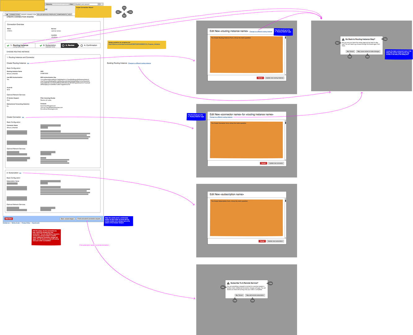
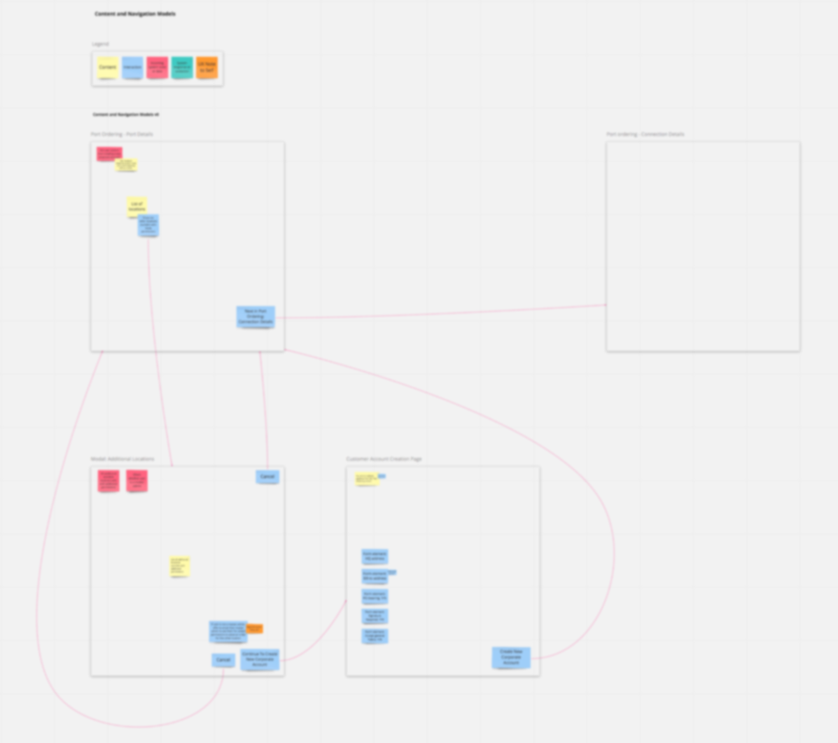
Navigation maps are used to map out how the interaction contexts should be connected and how users navigate between them.
Content Models And Navigation Maps
Boxes and arrows. Abstract models don't have to fancy. Whether paper, whiteboard, or digital, the key is that they support quick editing and relatively unconstrained creativity.

Look For Patterns In Design System
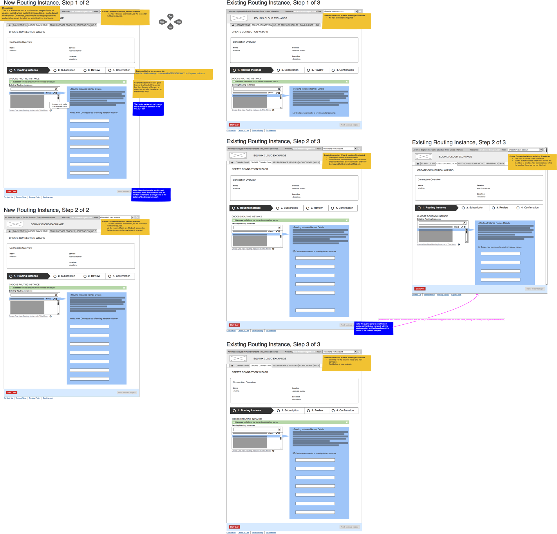
Images blurred to protect the innocent. ;-)
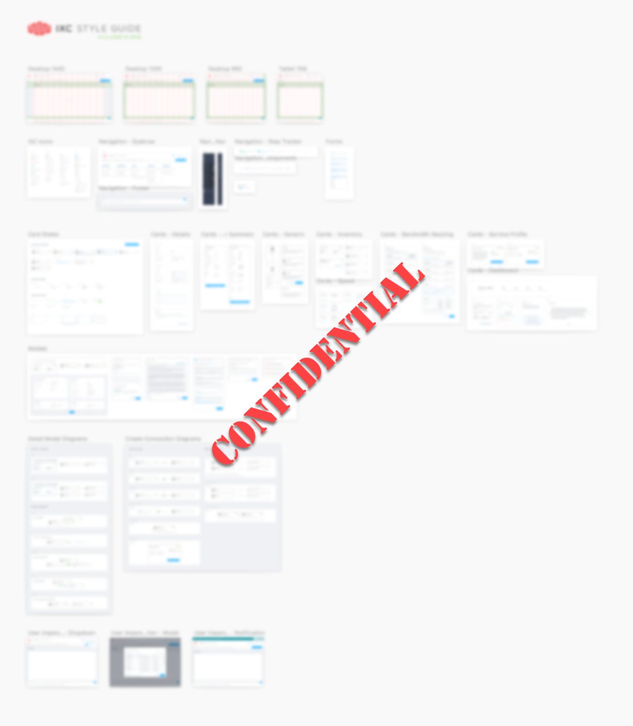
Abstract models can reveal new or unusual UX needs. If you're lucky enough to have a design system or design pattern library to draw from, check them for patterns that might cover those needs. If there are any needs that aren't covered, you're likely to need to spend extra time to design pattern extensions or whole new patterns to cover them. That's a huge part of the benefit of those models; they help identify where designers will need to focus.
Step 4: Low Fidelity Prototypes

Content and navigation models allow a designer to identify all the places where a designer might need to focus their attention, whether it is because new pages or UI elements might be needed, or whether new combinations of existing UI patterns might be needed.
This can provide better foresight into which parts of the design may need deeper thought and exploration, which would have implications as to which parts will need low, medium, or high fidelity treatments to best support teammates further on in the process.
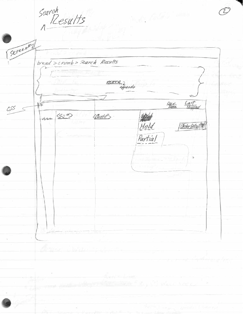
From pencil and paper sketches, allowing me to quickly explore different ways to present content.
Many iterations were tried, evaluated, and discarded, quickly and at a low cost in effort compared to higher fidelity and certainly HTML and CSS options.
Explorations and Iterations
Whiteboard sketches and paper and pencil sketches are usually the first, lowest fidelity tools that I use. They afford quick, super-low effort exploration of ideas. A digital tool that is close to those in spirit is Balsamiq Wireframes.
Just as with abstract models in the previous step, these tools support quick, abstract exploration at a low cost in effort compared to too-early higher fidelity approaches and certainly compared to HTML and CSS approaches.
Recognizing New Design Pattern Needs
As I explored different ways to arrange and present the order status information while maintaining the context that I'd observed users lacking and missing, it became clear that the elements in our existing design system could not gracefully expand to provide the benefits that I felt would be most helpful in the forthcoming application.
We had previously avoided JavaScript dependent design, and therefore had not previously used in-page layout changes, and other Rich Internet Application-style (RIA) interactions, and both of those would be extremely helpful in for our new design. In particular, I wanted to new interactions for:
- Dynamically switching the simple search form back and forth with the advanced search form, retaining the list of search results and a read-out of what had been searched for to produce those results
- Allow the retrieval of the information that we'd identified as the most frequently needed information for answering most order status inquiries, showing them dynamically on the page for each order that users might want, all while letting users stay in the context of their search results and saving them from referencing multiple sub-pages.
- These design constraints led to what I ultimately called our "zoomboxes."
Both of these solution directions led me to consider adding "rich interactions" and animation into our forthcoming application.
Low Fidelity Designs
As with abstract models, low fidelity designs are all about lower effort, speed, and creative freedom. Even better, when using existing patterns from a design system, low fidelity may be all the developers need. Or, if no novel design patterns are needed, a design system can often offer a bridge from abstract models straight to high fidelity prototypes, potentially skipping low fidelity work altogether.
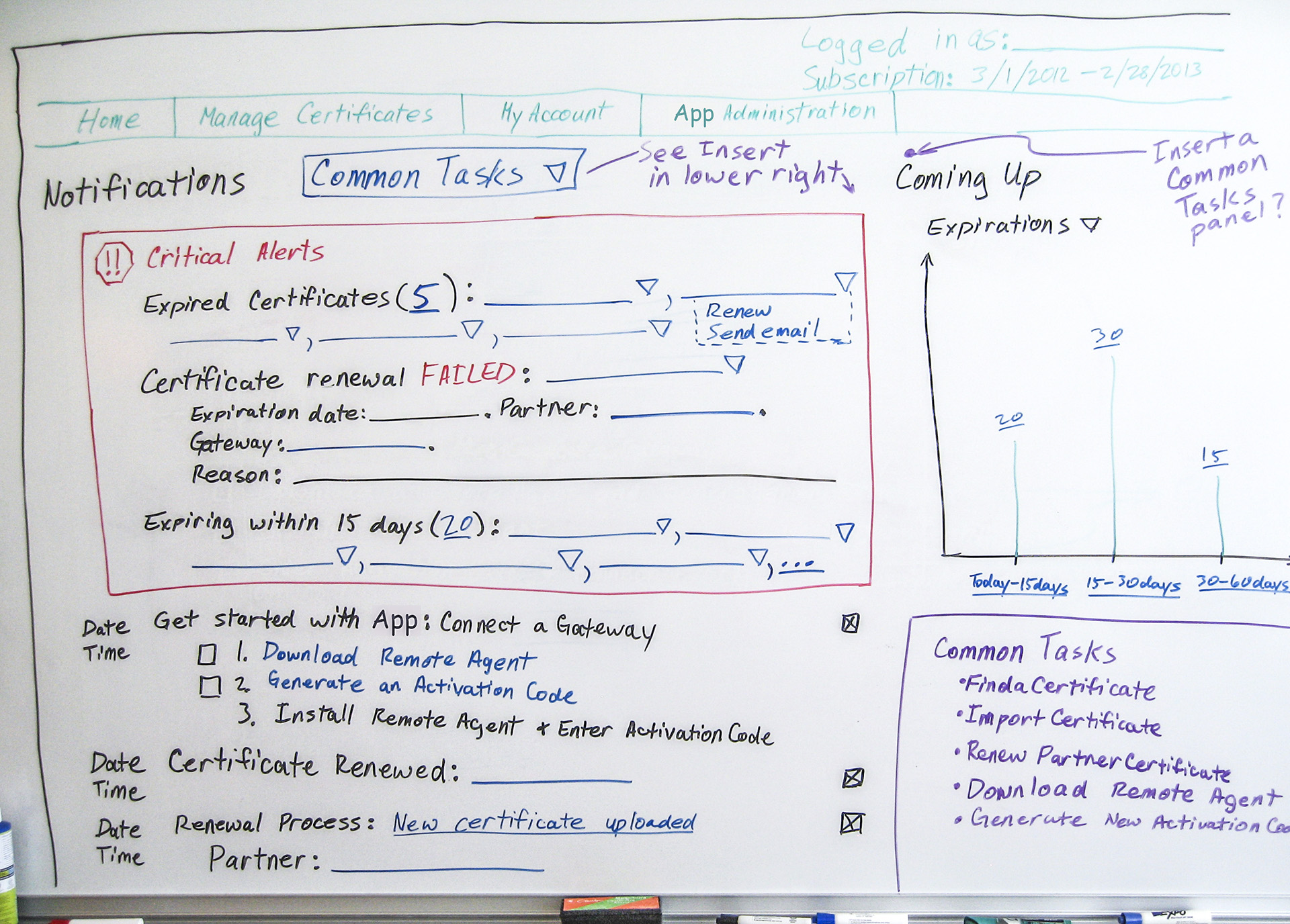
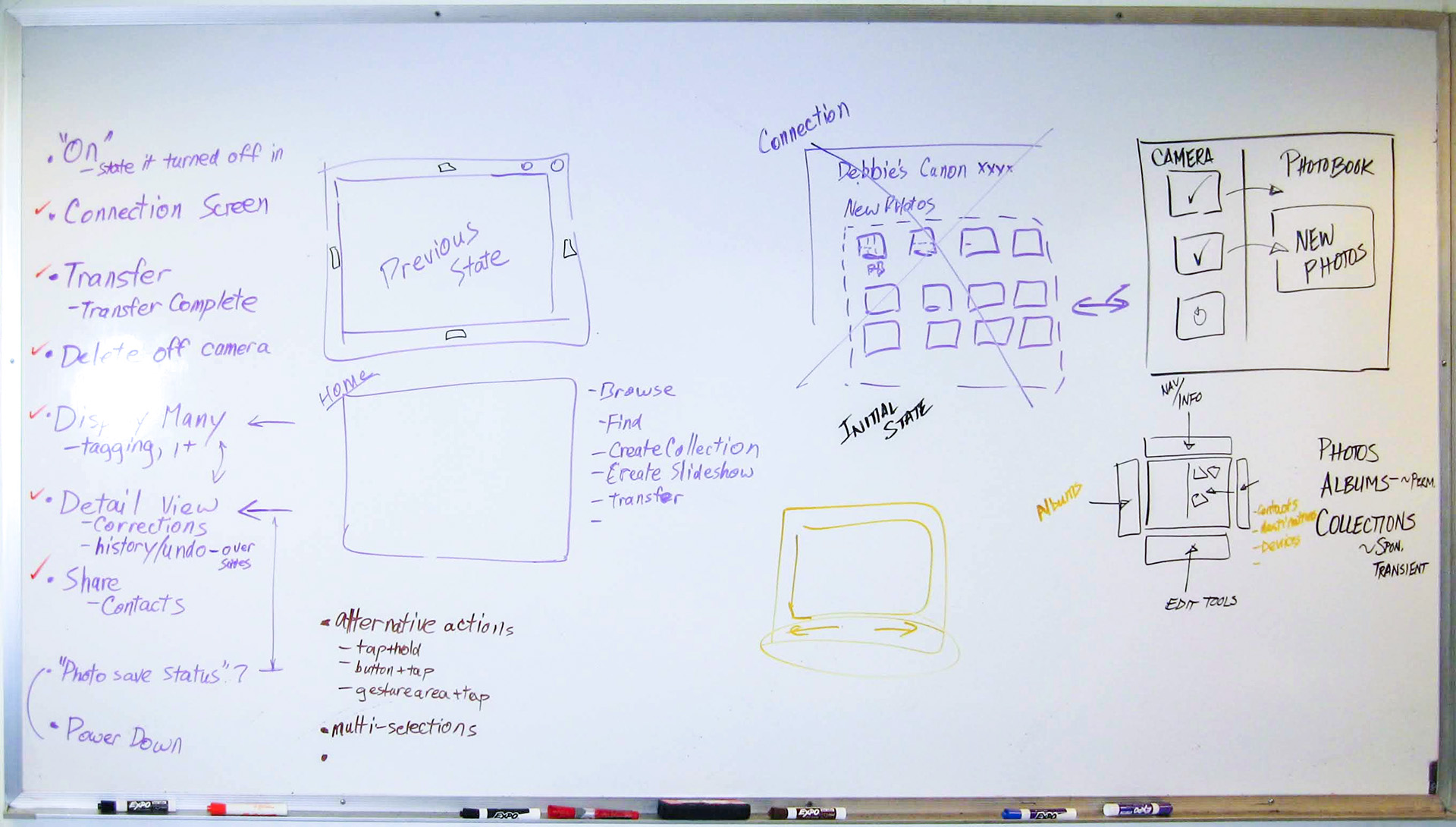
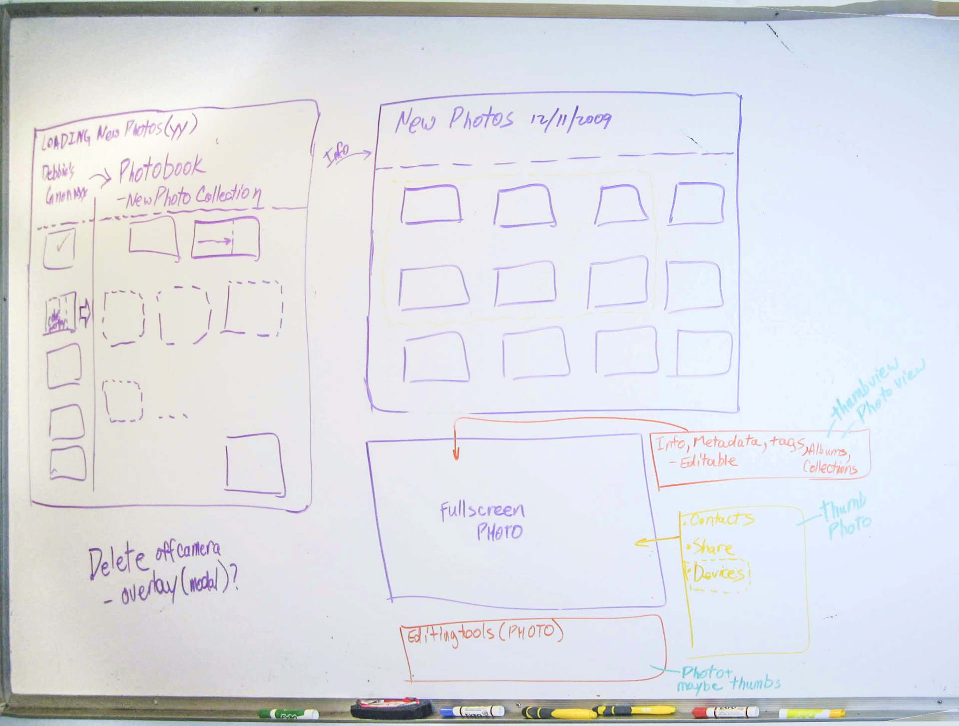
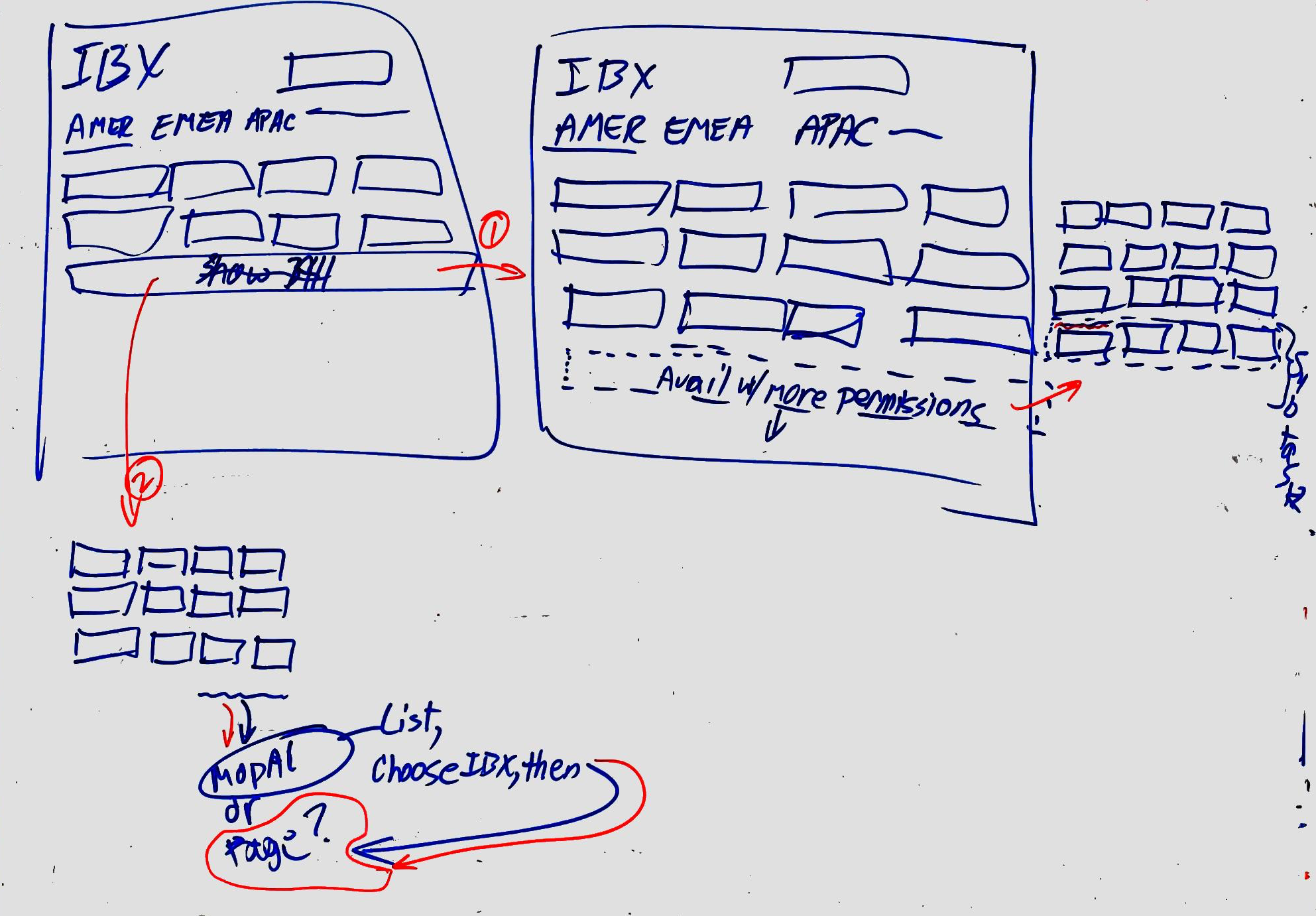
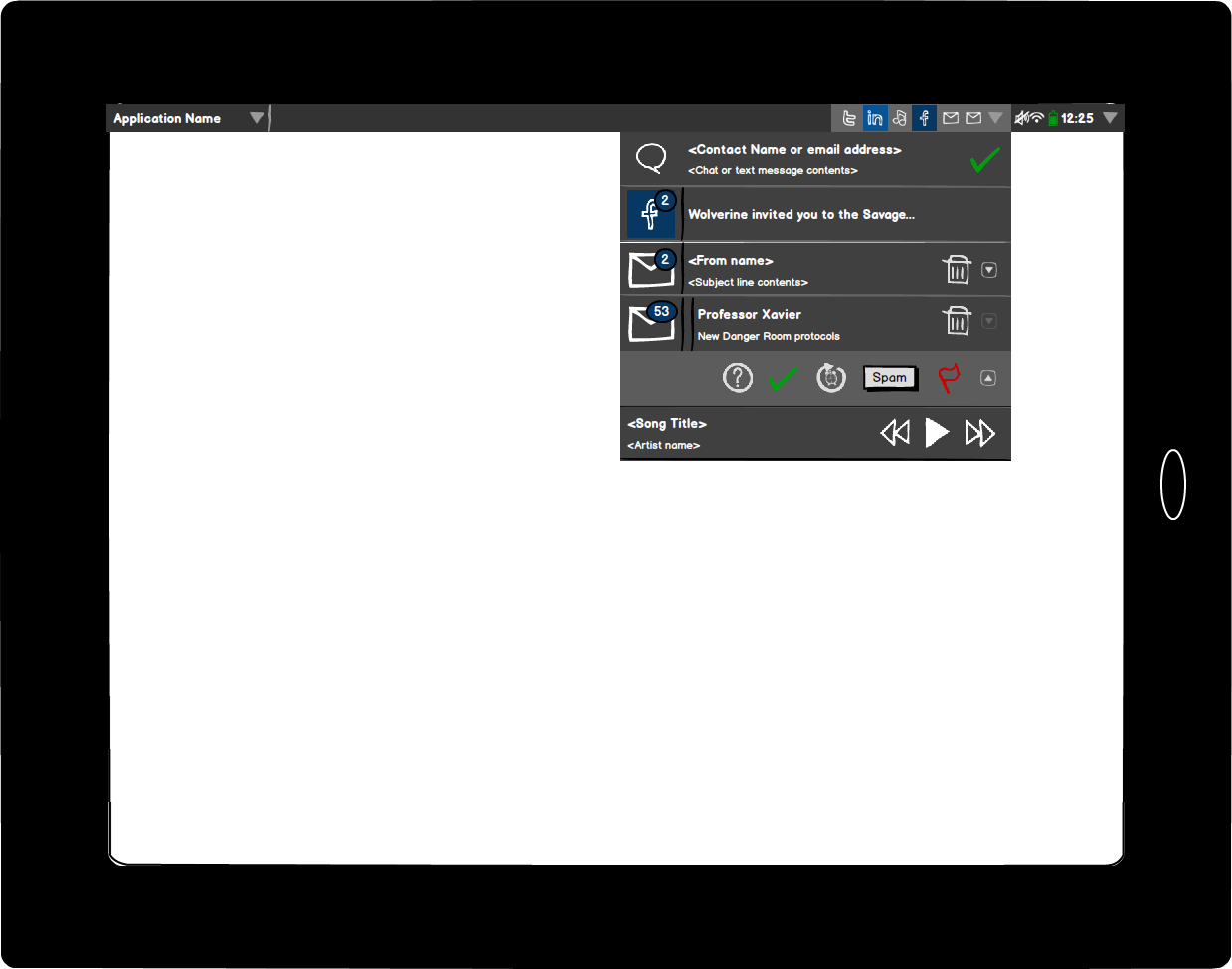
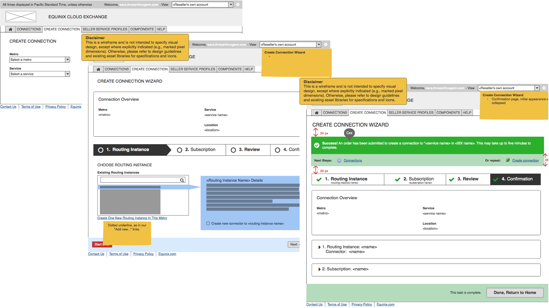
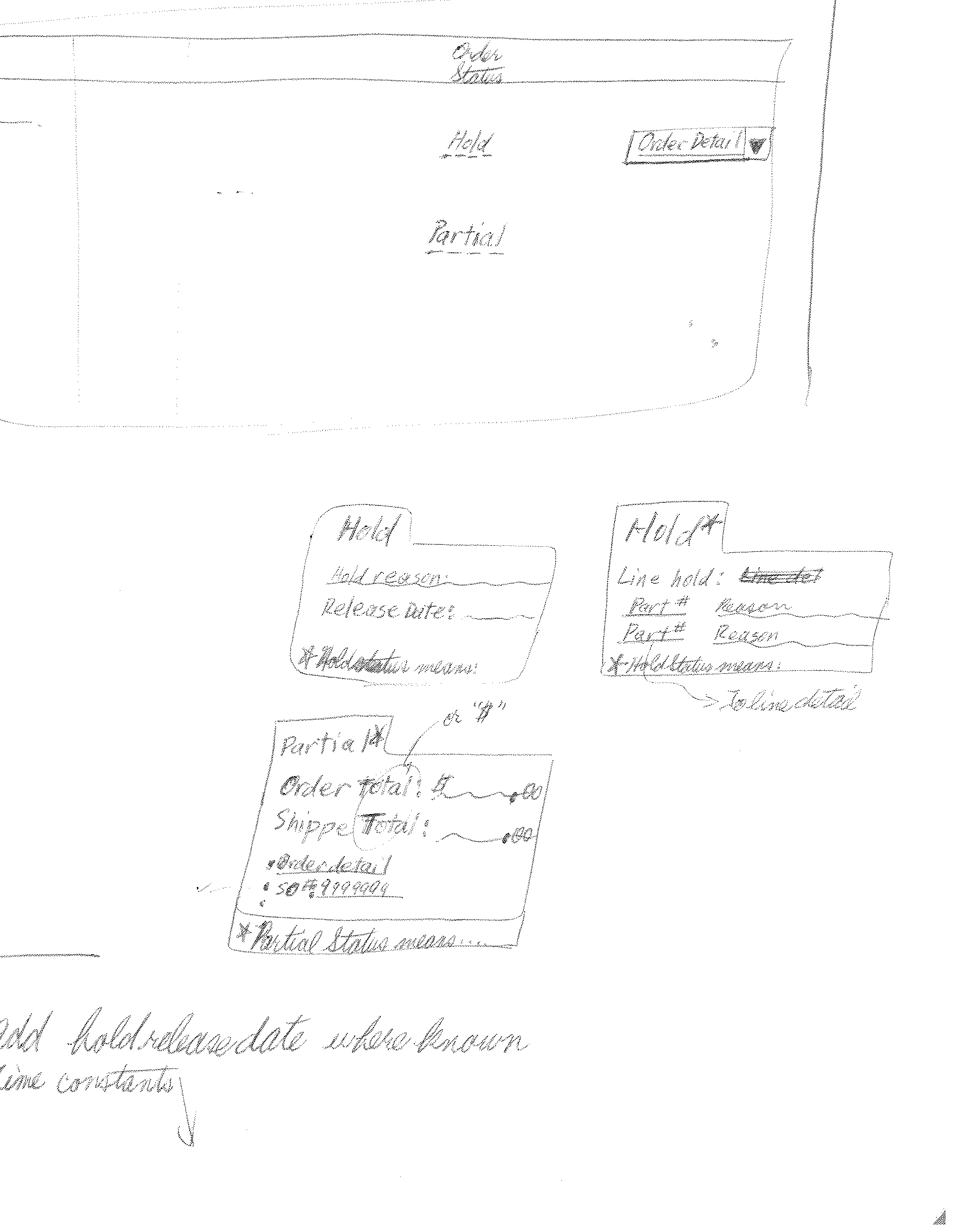
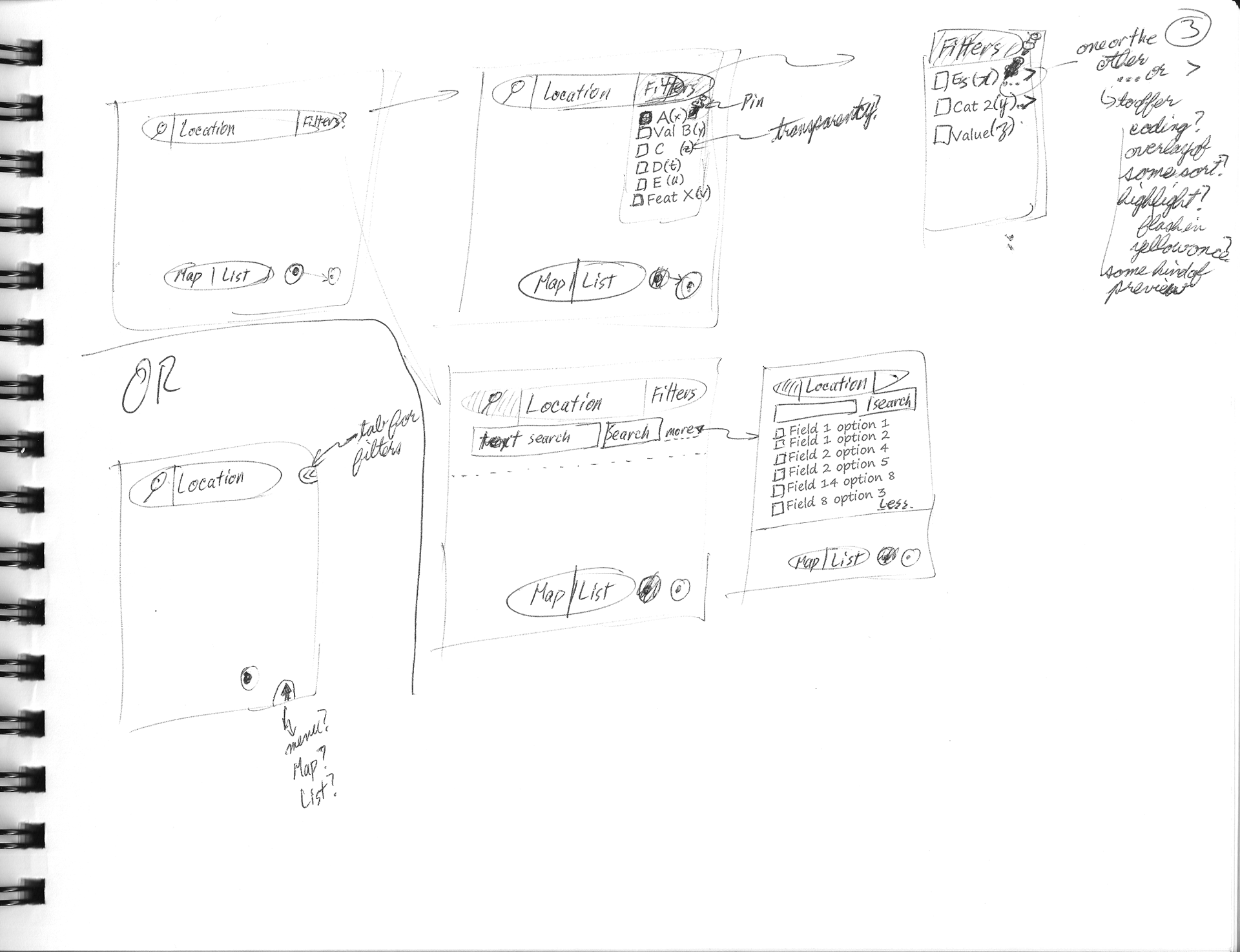
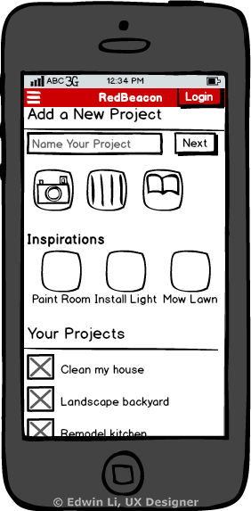
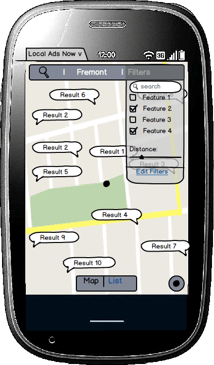
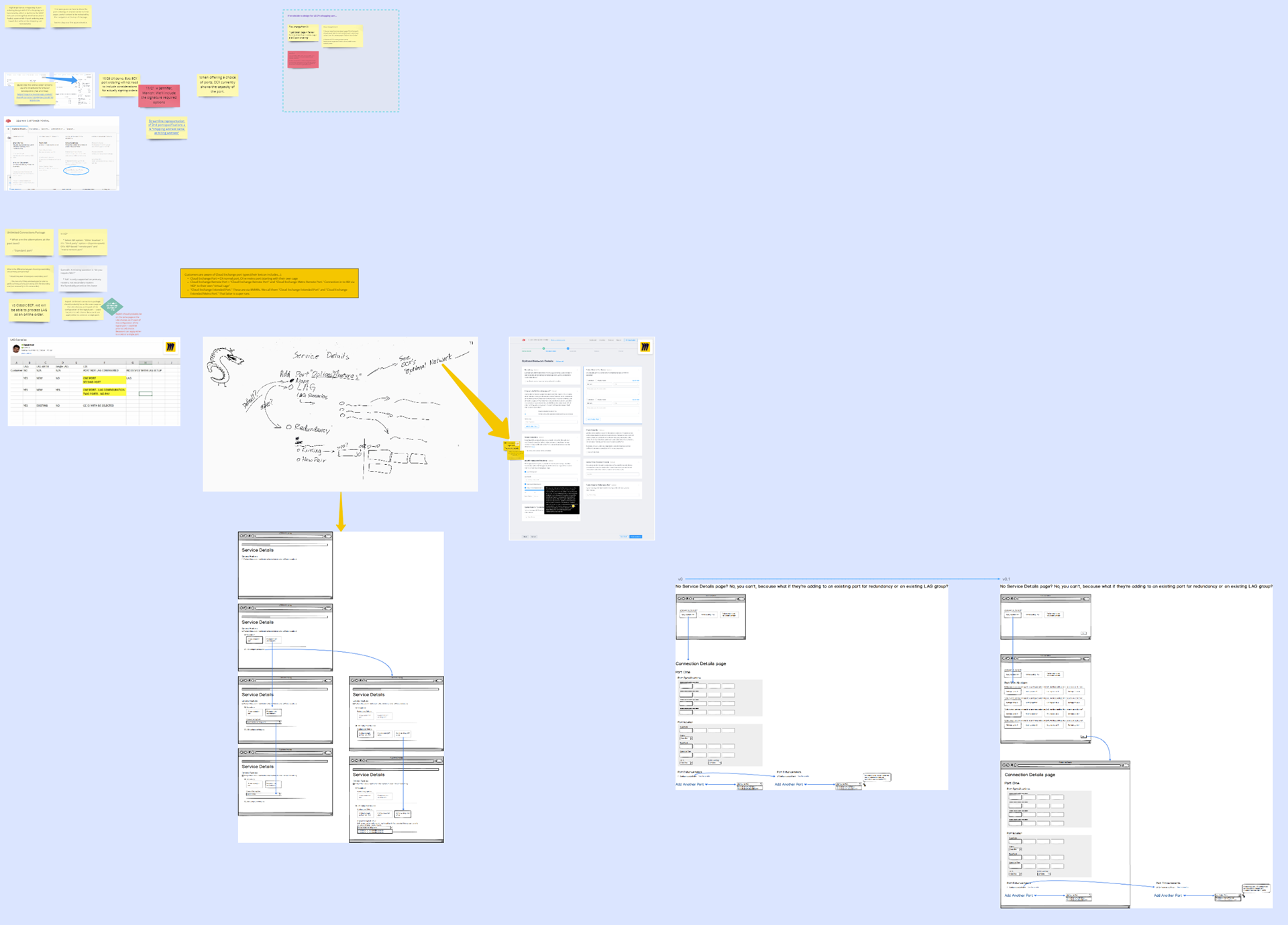
From virtual Post-It Notes to low fidelity wireframes and screen flows...With a little Trogdor along the way.
Step 5: User Testing and Iterating

All designs represent hypotheses: "we believe that these UX and UI choices collectively will present the best experience for our users."
User research and, in particular, usability testing, is a great way to test those hypotheses to discover whether any of those choices might be wrong or could benefit from adjustment.
So, as I come up with different design options and need to choose amongst different design approaches, it can be very helpful to conduct usability tests to differentiate between different choices or even just to see how single design performs for some users.
Based on those results, of course, the designers should iterate their designs to adjust for the usability findings, and, do more rounds as time permits.
An approach called RITE (Rapid Iterative Testing and Evaluation) even encourages scheduling these test-iterate cycles as quickly as two day cycles--test one day with a couple of users, iterate the next day, bring in two more users the next day, iterate the next day, and so on, splitting the canonical small numbers of users used in usability testing across multiple rounds.
Some have argued for the validity of RITE on the basis that usability testing is generally not to be considered a quantitative approach (with its emphasis on statistical significance), but, rather, a qualitative approach, depending more on the interpretive ability of the user researcher to identify issues worthy of iteration.
Step 6: To Higher Fidelity

A project's need for higher fidelity UX deliverables can vary depending on a number of factors, including whether a design system is already in place, the usage of new design patterns vs existing design patterns, the skill distribution of the development team compared to the UX team (e.g., HTML/CSS/JavaScript/etc. skills), and even language.
Higher fidelity designs carry costs--usually, this is a matter of additional time over quicker, lower fidelity work.
But sometimes, higher fidelity work is needed. Three of the most common considerations for producing high fidelity work are:
- Getting designs to a high enough fidelity that a design can be unambiguous enough for the designers to fully flesh out how the design works and looks
- Getting designs to a high enough fidelity that a design can be unambiguous enough for the stakeholders to envision the intended experience and to consider it for feedback and collaboration.
- Getting designs to a high enough fidelity that a design can be unambiguous enough for the developers to work their magic
The highest level of fidelity indicated between these three considerations is almost certainly the minimal level of fidelity needed for the project.
Put another way--prototypes and these designs are ultimately needed as tools for collaboration and creating shared understandings of the experience to be created.
I aim to be flexible enough in my deliverables to provide whatever is needed to best support that collaboration between designers, stakeholders, and development teams.
Higher Fidelity Designs
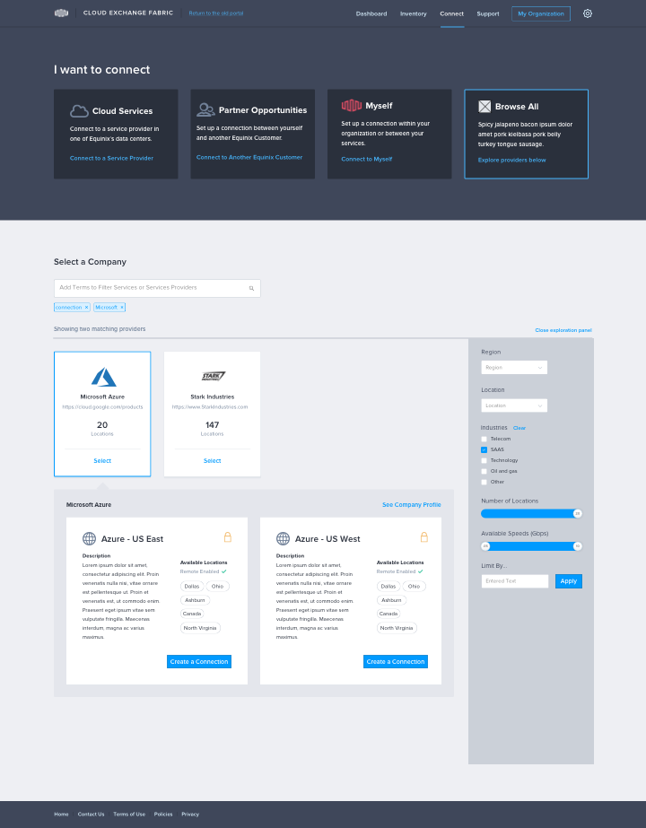
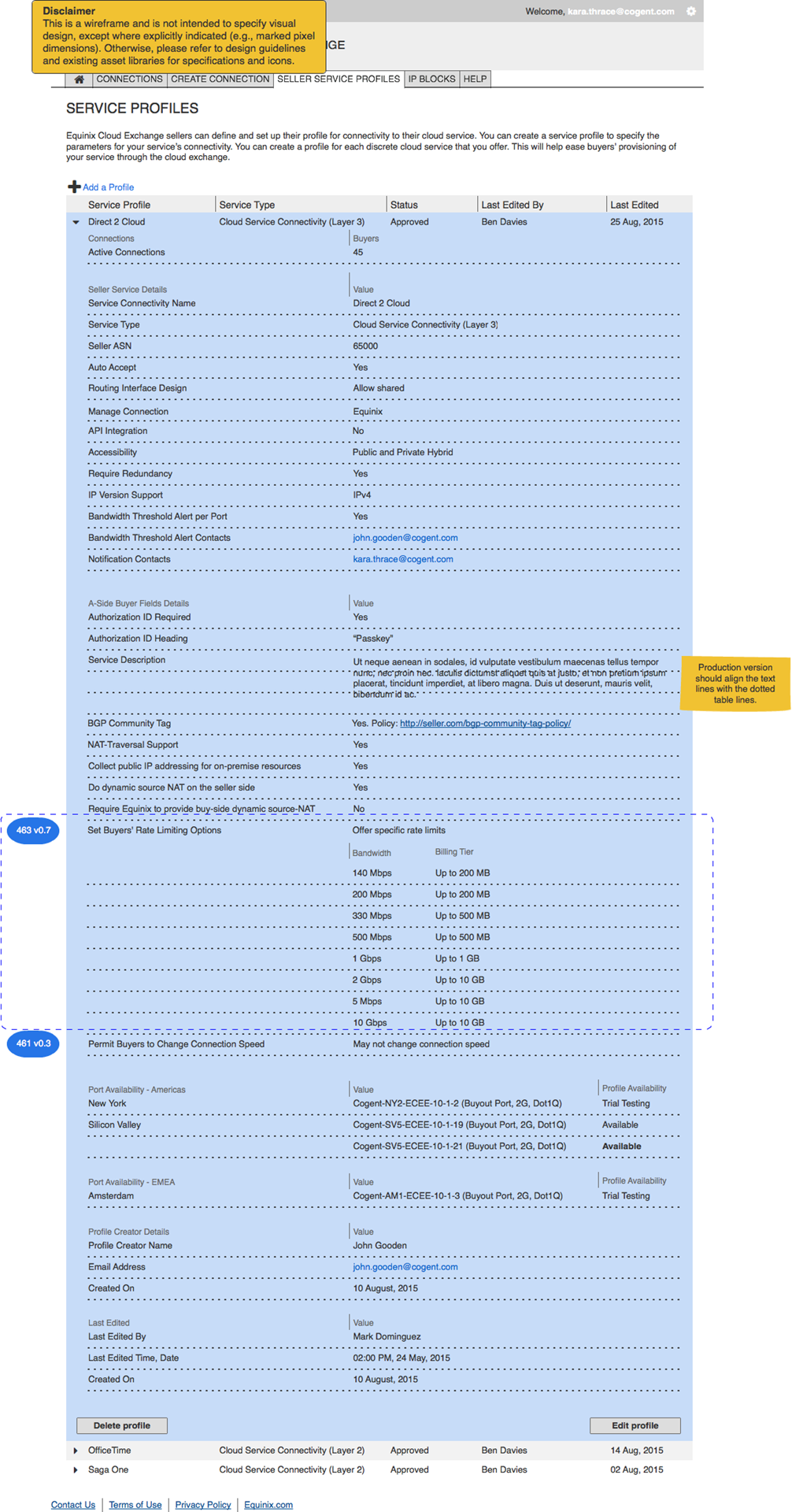
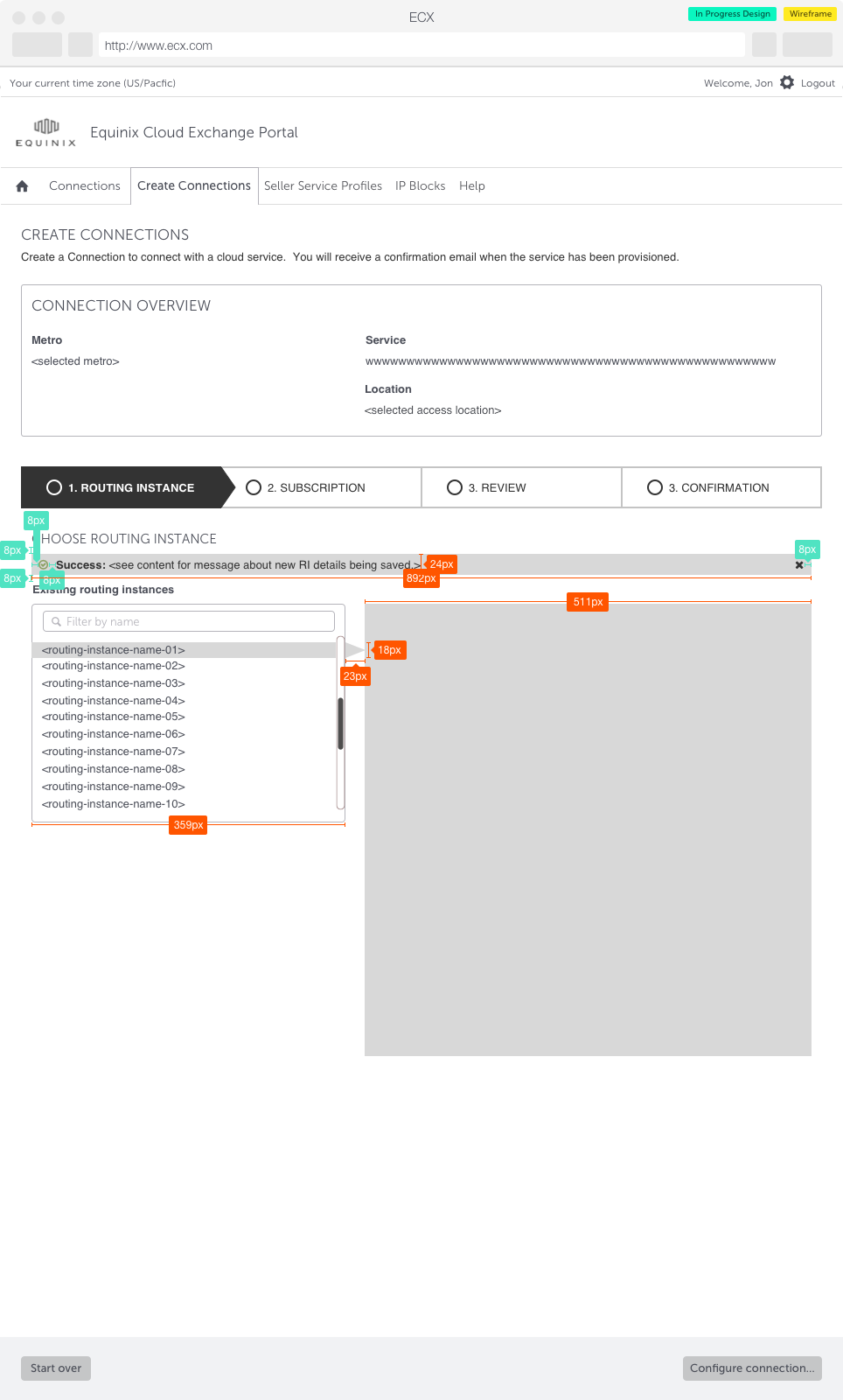
The main goals of design artifacts and prototypes are to facilitate collaboration, understanding, and testing. So, different projects, project teams, and testing goals will require different levels of fidelity. These are higher fidelity artifacts collected from across many varied projects and teams--appropriately, of varying levels of high fidelity.
From pixel level accuracy for layouts to pixel-perfect mockups of screens to animations to illustrate micro-interactions to interactive prototypes to show or test those interactions, the needs of collaboration, research, and testing, balanced against the time required to make them is the best guide to the appropriate level of fidelity.
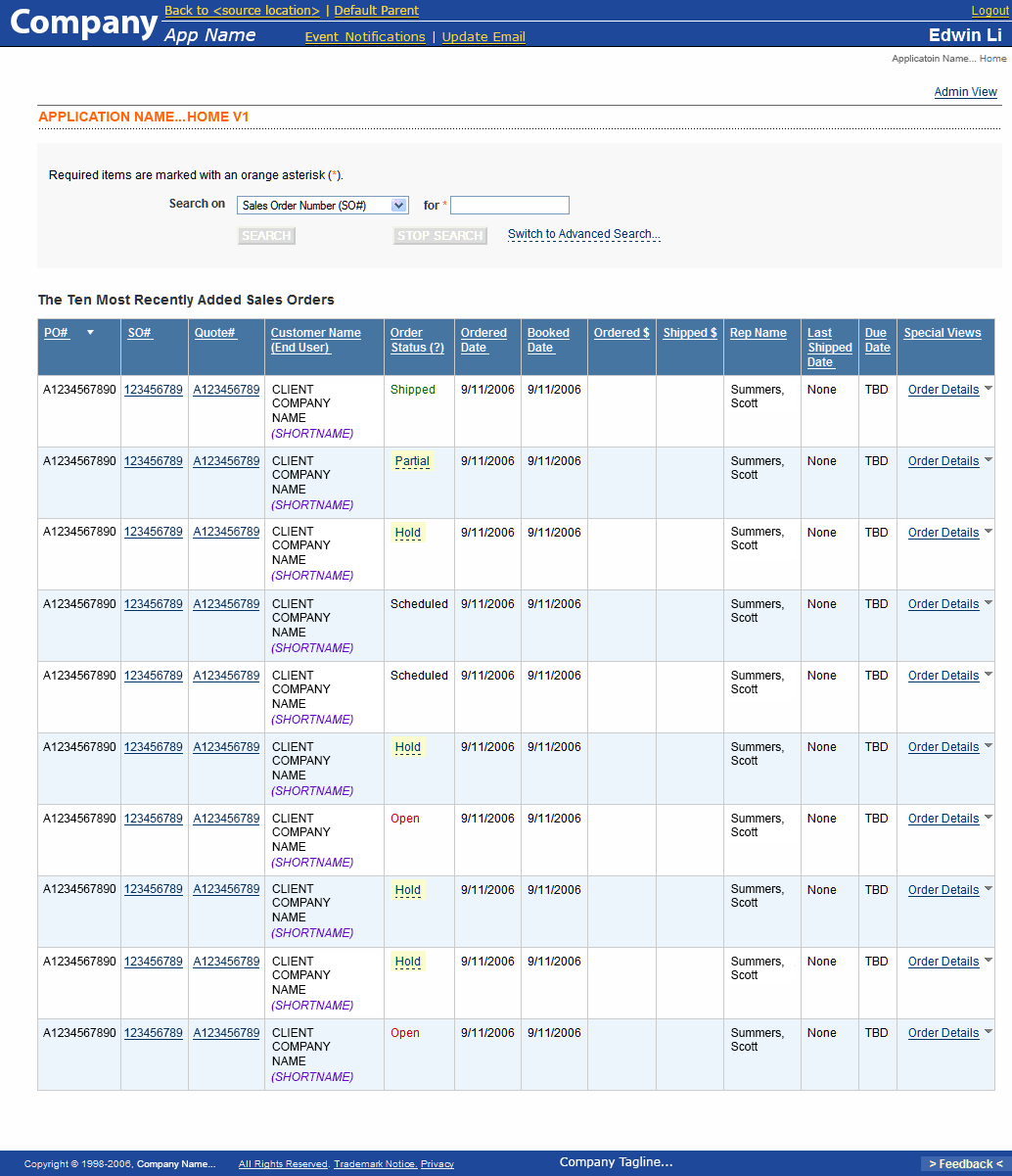
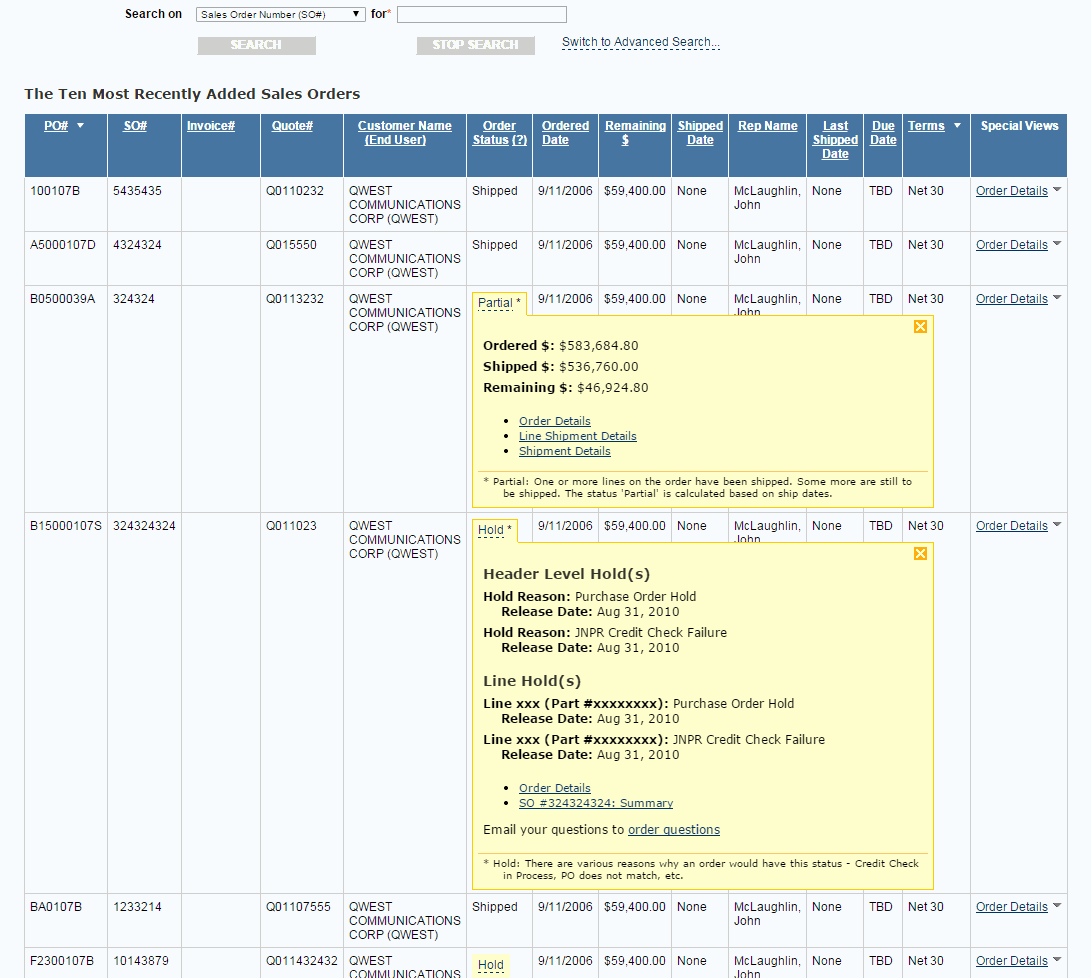
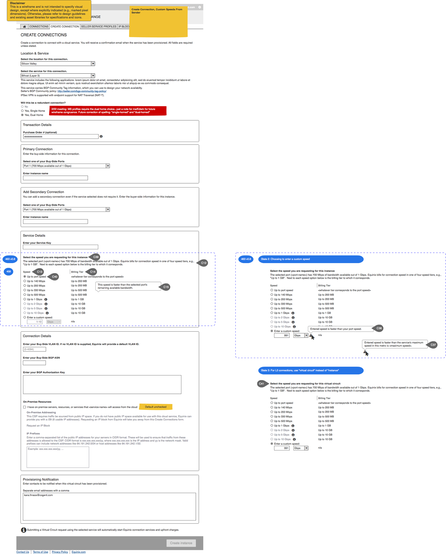
High Fidelity With Interactivity: A Driving Mode For Pandora
For a personal project, I designed a "Driving Mode" for Pandora's Android app (2014) that uses gestures instead of buttons and to which I added lateral navigation between stations from the Now Playing screen. When considering the possibilities for a smartwatch app, these changes seemed potentially even more beneficial.
Working with Photoshop and Proto.io, it definitely took some time, but it was a fun exploration of those applications' strengths and weaknesses as design tools.
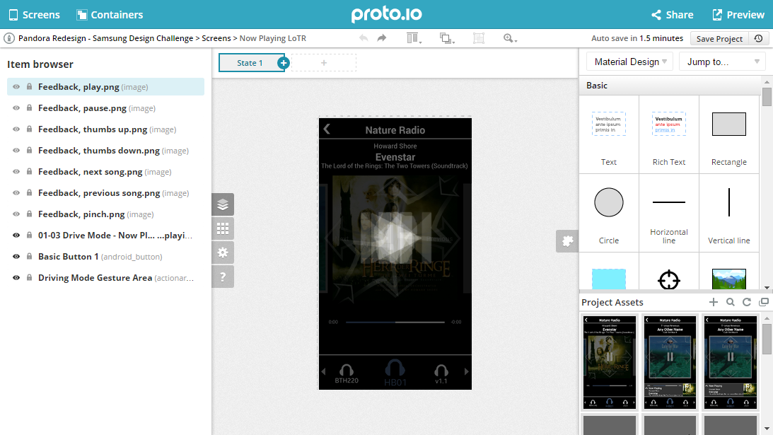
Exploring and working in Proto.io. A particularly nice feature--rare at the time amongst the tools I'd considered--was that any single area could register more than one interaction (tap, swipe, pinch, etc.).
This is a commentary-free demo video illustrating the interactions within Driving Mode: getting into driving mode, rating tracks, swiping to jump to the previous and next tracks, tapping from the song to the playlist/"radio," pinching to zoom out to a list of playlists/"radio" channels, where a user can swipe to change the playlist/channel Also seen at the bottom of the song display screen is a carousel of the output options available to the phone--note the intentionally larger tap targets and swiping based interaction implied by the carousel design pattern. A 7 minute 25 second version of this demo with commentary is also available: http://youtu.be/LyH6Gl580OY
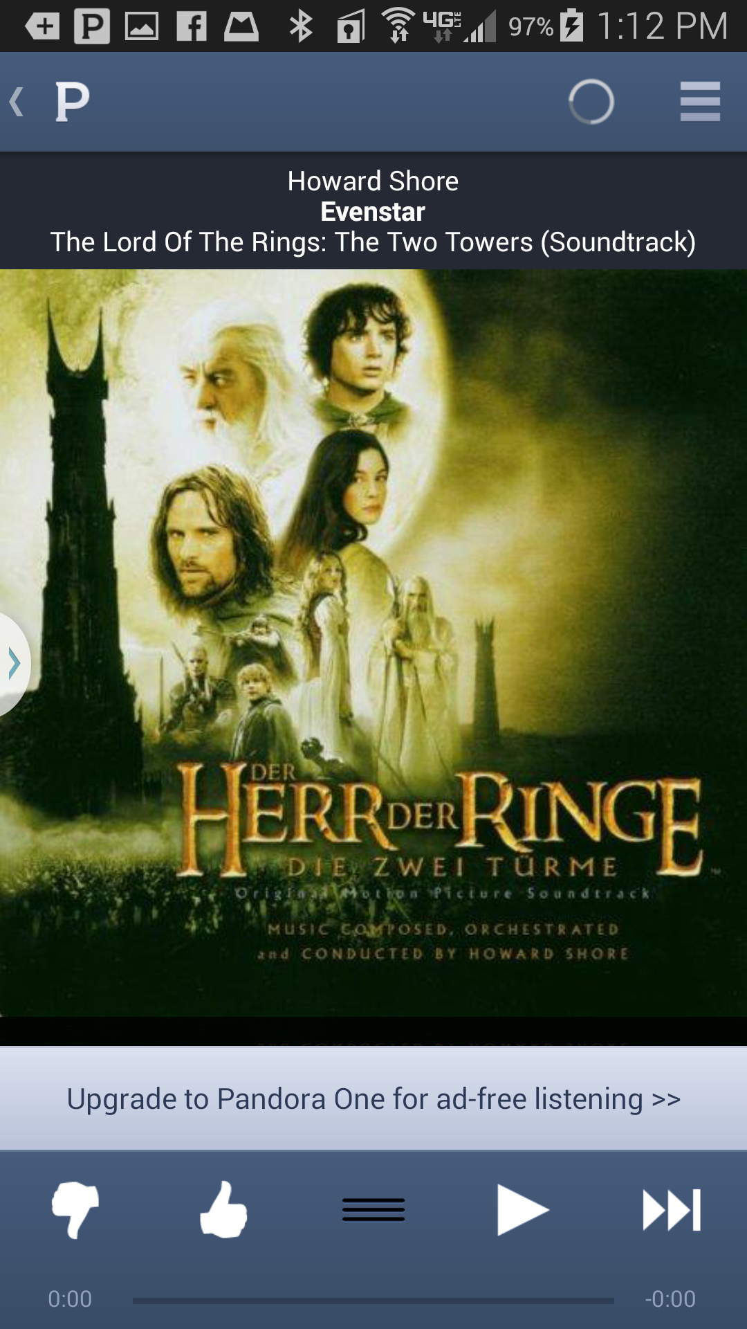
Existing Design, "Before": Interactions here are based on tapping on icons and other such targets. The tap targets are small, requiring not only visual attention, but careful visual attention not only to first see the targets, but during the whole movement to move to the targets and to tap on them.

In this driving mode design, most of the interactions are intended to be gestures with large zones for interaction. Rating songs is done by swiping up or down anywhere on the song's artwork image, easing precision requirements for both visual target acquisition and hand-eye coordination for the gesture's location. Navigation to go from the song to the playlist view is a matter of a pinch gesture, again anywhere on the song's artwork image. Swiping to change the output device is made explicitly available at the bottom of the screen rather than being left as task that involves going to a separate settings screen. And although the choosing of an output device does require a tap, the icons and the tap target sizes are maximized in that carousel space, again to lighten the demand for visual attention, critical while driving. Also, hopefully, changing output devices is a less common user task.


Compare the before and after.
Step 7: User Testing and Iterating

As we iterate our designs, whatever their level of fidelity, we are evolving our hypotheses as to how best to empower and/or delight our users.
As we create new versions of our designs, we can gain more insight into whether our new versions could be better adjusted for our users by doing further rounds of usability testing.
In particular, as we increase the fidelity of our designs, and even as we move towards implementing them, we can test and learn new things, moving towards more concrete metrics like time to task--though that last is probably best to wait on implementations...
Of course, as we get insight from our testing, we should follow that up with iterating our designs. That's a cycle we should repeat as often as the schedule allows and as long as significant questions about our designs remain.
Step 8: Develop Application

With engineering as part of the trio of UX designer, Product Manager, and Engineering lead all along, the transition from designing being the primary project activity to developing being the primary activity should hopefully involve a lot of overlap and shared context.
Often, development can get started while design is still being done--especially for parts of the application that may not be surfaced in the UX or for parts of the application for parts of the UX whose design has been stabilized.
Iterations: Tuning
As engineering develops the application, it is almost inevitable that questions or concerns will arise, even with engineering having been part of the discussions from the beginnings of the project.
For this reason, the UX designer should be available to consult, clarify, troubleshoot, and rework the design as the development team encounters UX questions and issues.
In Agile teams, this can be seen as the UX designers being available to meet with designers as these things come up and/or attending development team stand-ups with frequency varying by anticipated need.
Step 9: User Testing--Benchmarks And Metrics

Conduct user research using the developed builds to focus on any UX issues highlighted or made possible by the implementation, like using metrics like time on task as implementations stabilize.
Step 10: Release

Time for a little celebration!
...and maybe some UX documentation...
New UX Elements: Update Design System
If you extended or tweaked any existing patterns, of if you created any new ones or new variations, take some time to document them and submit them into the maintenance or governance processes of your system, as appropriate, so that your entire team can benefit from them.
Step 11: Ongoing Study of Users, Usage, and Feedback

Ideally, we end as we began--in ongoing observational research of our users and their usage of our product in their social, task, and tool ecosystems--to maintain and evolve your company's understanding of our users.
We should assess the changes that we've introduced into the product and the effects those have on users and their work ecosystems.
Ongoing observation and research provides not only the opportunity to see what might need fixing and what new or continuing opportunities there might be for improving UX for our users, but also the chance to expand and deepen our understanding of our users.
We should use that understanding to evolve and deepen the user personas that the company uses to build more empathy throughout the company for its users to fuel innovation and change while keeping it aligned with users' needs.

Edwin is a wealth of knowledge, a bundle of positive energy, and a dedicated, curious learner. He has a sincere empathy towards design and has a deep understanding of the user. He is a pleasure to work with and is a valuable member of the Equinix design team.
Product Designer at Zalando SE (sourced Oct 25, 2021).
Testimonial from January 21, 2018. Coworker in the same group at Equinix
Testimonials
Selections from my LinkedIn profile
Edwin's research-focused approach to interaction design, his attention to detail, and his ability to ask the big questions at the right time, are among the reasons he's been a valuable part of my design team at Equinix. He's always happy to share his knowledge with colleagues, and at the same time, eager to learn and grow. I've seen him drive design for complex projects with nebulous requirements, and do it with grace and tenacity. And, on top of it, he's a nice guy who you'd actually want to have on your team. That's sometimes hard to find.
Scott Garsed-Donnelly
Design Leader + Creative Technologist (sourced 10/25/2021).
Testimonial from January 2, 2018. Direct manager at Equinix
I’ve had the pleasure to work with Edwin since I started working at Equinix, and it’s been a great experience. Edwin has a great understanding of the overall user experience design process. In particular, he takes his time understanding who the users are, and what they want so that he can turn complex problems into elegant, user-centric, and user-driven designs. It’s always a pleasure to ideate and collaborate with Edwin.
His calm presence and his great way of articulating his UX knowledge put the team and the users at ease whether we are in team meetings, user interviews, or white-boarding sessions. Edwin is a team player and is very dedicated to self-improvement, always asking questions and staying up-to-date with industry news. He is also dedicated to expanding the team’s knowledge and founded the UX Book Club within the UX team at Equinix. The UX Book Club is open to all teams and members who seek to add to their knowledge or know more about User Experience and User Centered Design.
I value working with him at Equinix very much and won’t hesitate in working with him again in the future, wherever his professional journey will take him.
Abdalla Emam
Product Design Leader | Founder @Quam (sourced 10/25/2021).
Testimonial from February 27, 2018. Coworker in same group at Equinix
Having Edwin as part of a UX team helps keep things fun and stimulating. He brings user experience best practices and philosophy to the table for productive discussions and into his design wireframes and prototypes for development. Edwin is a pleasure to work with, bringing a can-do yet reflective perspective to new workflows, product features, and design guidelines while balancing business requirements and keeping user experience at the forefront of everything he contributes.
Greg Martin (he/him)
Helping digital transformation succeed by leading teams focusing on product content design, messaging strategy, enterprise CMS and translation management for building software products and customer portals (sourced 10/25/2021).
Testimonial from January 2, 2018 Coworker in the same group.
Edwin is an experienced usability professional with knowledge of many user-centered research and design methodologies. He has been an integral part of many project teams to ensure the tool is successful for the end user. His deep knowledge and empathetic approach wins him fans whenever he works with a new team. He is sought after as a resource for new projects because of his track record of making insightful and important observations and improvements to the interface. In addition, he's an accomplished competitive dancer and a dance teacher.
Bill Skeet
Information Design • CX • UXD Ethics & Strategy • Cognitive Psychology • Journalism and Mass Communications (sourced 10/25/2021).
Testimonial from June 5, 2009. Bill was a direct manager, and, later, a consulting client
Edwin is an asset to any design team. He is thorough with this research about any small or large design challenge he is given. I had the pleasure of working with him at Equinix, where we started on the same day. Though we worked on different products, we always interacted/brainstormed together to find the perfect design solutions. Edwin is highly collaborative and communicated his ideas with strong reasons. Highly recommended to any design team.
Pranjal Ranka
Senior Staff Product Designer at ServiceNow (sourced 10/25/2021).
Testimonial from February 23, 2018. Coworker in the same group
I had the pleasure of working with Edwin during my tenure at Juniper. Edwin was assigned to our project to develop the GUI for a customized, web application for retrieving status and information on orders placed with Juniper. Edwin is a creative, out-of-the-box thinker, who assisted us in designing an interface that was both functional and user-oriented. He added some additional "flash" to our application by suggesting some new technology for pop-up boxes and drop-down menu selections. He worked with the project team collaboratively, remained open to our suggestions, and retained his flexibility under pressure. Our project was a success, and Edwin's expertise was invaluable. The application is still in use at Juniper today, and is heralded as one of the most frequently used and relied-upon tools across Sales, Finance, Order Management, and Operations groups. I would highly recommend Edwin for any project!
Deanna Walls
Information Technology and Services Professional (sourced 10/25/2021)
Testimonial from October 28, 2010. Worked in different groups, she was project manager on the Order Status Tool project.
I've worked with Edwin on numerous official projects as well as consulted with him on many miscellaneous issues, and have always found him to be not only a very disciplined interaction designer, but also a great advocate of the user. He is always considering 'common sense' interactions, and will try to guide a user through an interface with as little friction as possible. Edwin brings a fun attitude to a team and works hard at creating a great working environment. I highly recommend Edwin.
Paul Rodrigues Gilliham
Driving collaborative content and guidance systems for global enterprises (sourced 10/25/2021).
Testimonial from June 11, 2009. Paul was senior to Edwin but didn’t manage directly.
Selected Works
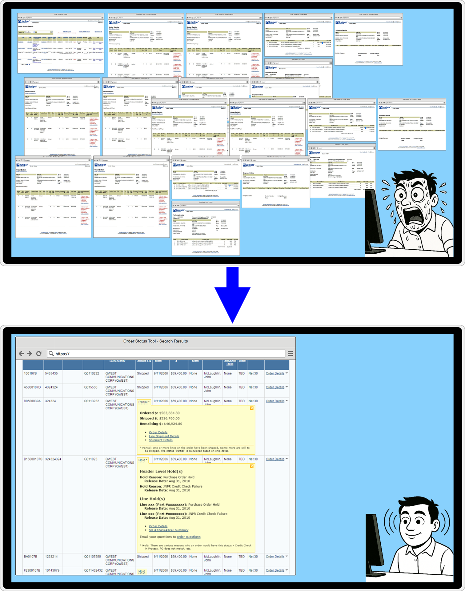
Transforming Order Management Web App: UX Research & Design to Eliminate 32-Window Workflows → 8x System AvailabilityUX Research, UX Design, Product Design, UX Strategy, Low Fidelity Prototypes, High Fidelity Prototypes, Interactive Prototypes, Visual Design, Web Application
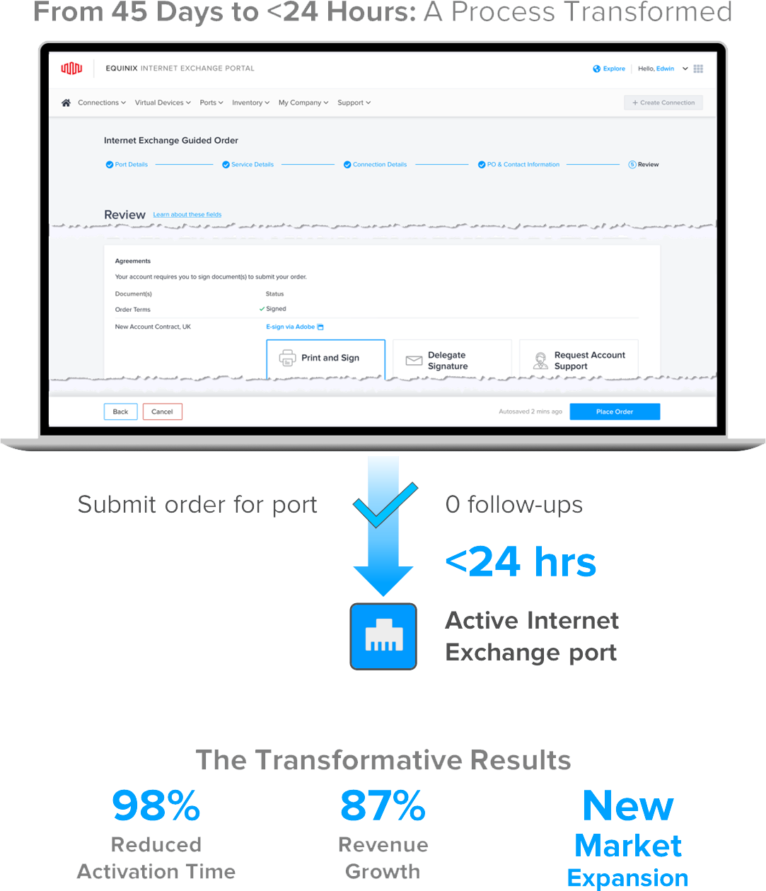
Research & UX Strategy to Expand Market: Order Data Center Network Port via Web, 45 Days → <24 Hours, 187% RevenueUX Design, Product Design, UX Strategy, Product Strategy, Low Fidelity Prototypes, High Fidelity Prototypes, Interactive Prototypes, Visual Design, Web Application
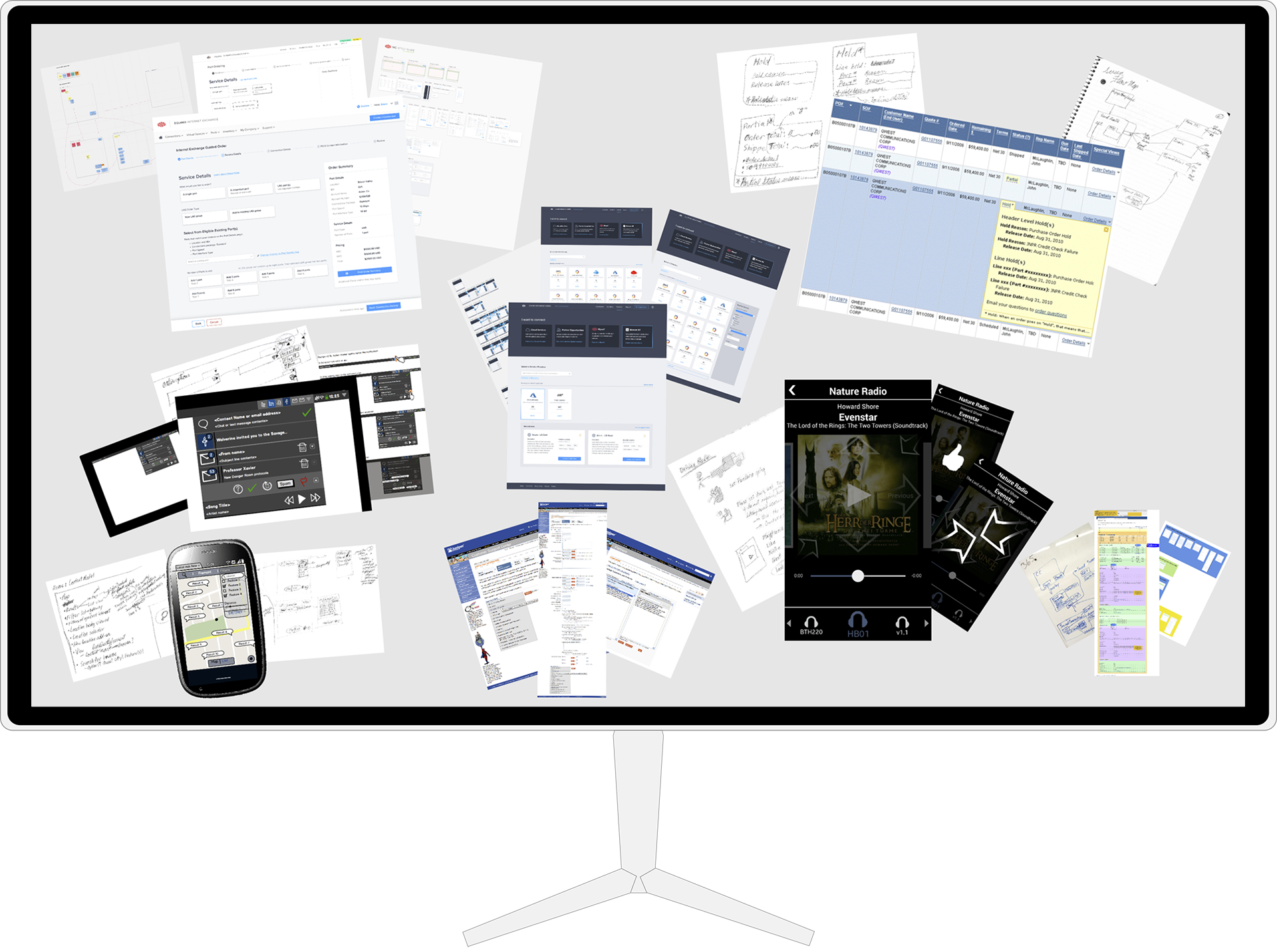
Design Processes, Artifacts, and Work StyleUX design, UX research, UX process, UX artifacts, Sketches, Maps, flows, and models, Low fidelity, High fidelity, Interactive prototypes
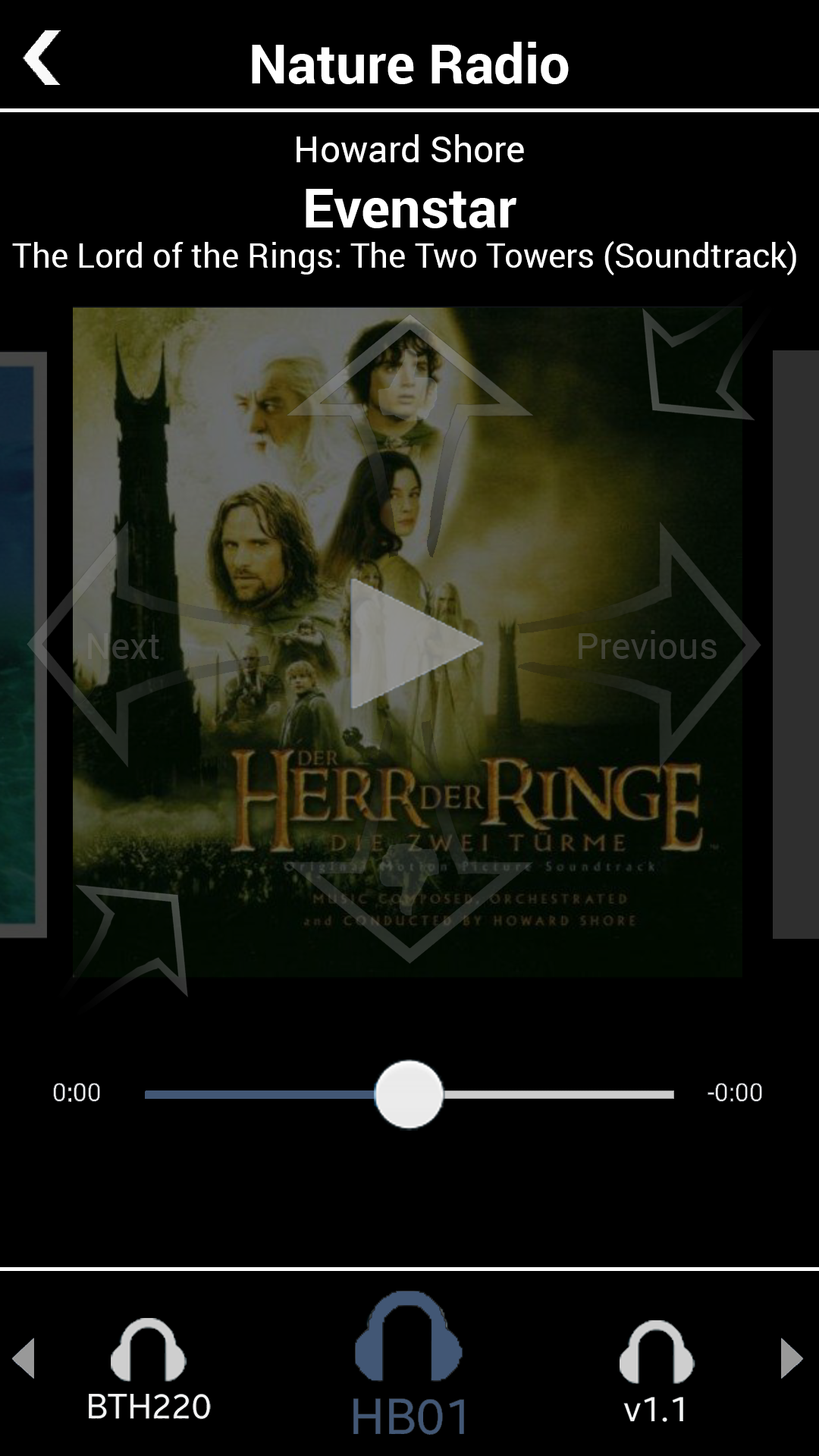
Pandora App: Driving ModeMobile, High Fidelity, Interactive Prototype, Demo Video, Personal Project