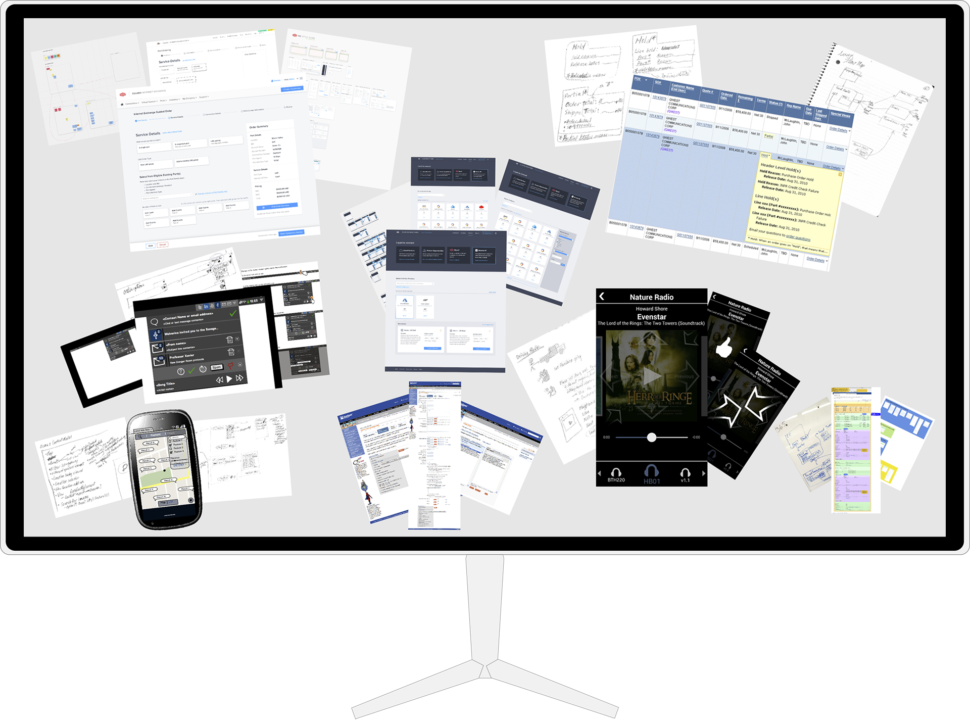
Order Status Tool Redesign: Juniper Networks
Research & Experience Design to optimize internal web app for finding customers’ order status
A new design pattern, low fidelity on the left to high on the right: focus + context--surfacing deep, frequently-used information
Role & Contribution
UX Designer
End-to-end design for redesigning an existing web application, from research to high fidelity mockups and UX specifications
Stakeholders
Product manager / user team manager, remote engineering team, internal users
Additional Responsibilities
UX researcher:
Conduct heuristic analysis of existing tool
Conduct observational studies of existing tool use
Project Goal
The goal of this project was to improve the design of a critical internal tool.
The order status tool is an internal tool developed some years before that Juniper Network's Order Status team used to support sales and fulfillment teams in tracking and reporting the progress of all orders (to millions of dollars), providing insight into billing and fulfilment processes and milestones.
Frustrations and issues had been mounting with the operation of the tool, and a redesign of it was engaged.
My goal with the project to was 1) identify UX issues, and 2) provide a design that allowed users to do their job more quickly and easily.
Key Results
800%
System availability
Improved
Response time
Improved
Resolution time
"Much easier to use"
User testimonial
Summary of Process
Ideally, a UX practice is grounded in ongoing observations and data about user behavior in the actual context of their social, task, and tool ecosystems.
This project was a better example than most in using user research as a critical foundation in identifying needs and opportunities for our new tool to better support users' work.
These were the main process steps in our project, each done in collaboration with cross-functional stakeholders:
- Understanding The Problem(s): Domain Research. Review existing product, user, and domain opportunities and requirments with key stakeholders
- Understanding The Problem(s): User Research. Observation of users in their social, task, and tool ecosystem to understand user behaviors and to identify unmet user or domain needs, usability issues, or opportunities to help.
- High Level Designs and Abstract Models. Digest into flows, maps, and abstract models
- Low Fidelity Designs. Quick and low-investment to explore before committing to designs. Output: sketches, mockups, wireframes, and prototypes
- Higher Fidelity Designs. Using design systems and other high fidelity tools - create, iterate, and polish. Output: screens, specs, clickable prototypes
- Develop Application. Work with development to catch and smooth out any wrinkles
- Release the product to benefit users!
- Look For Usage Data And Feedback. Watch for data indicating how the design is doing

Good designers never start by trying to solve the problem given to them: they start by trying to understand what the real issues are.
Don Norman
The Design of Everyday Things: Revised and Expanded Edition (p. 218). Basic Books. Kindle Edition.
Understanding The Problem(s)
Step 1: Domain Research
The project started with a series of meetings with the project manager.
I started with questions about the users from the project manager's perspective. My initial goal was to understand its users, the work context of the tool, and its ecosystem of use as well as the context and timeline of the project.
The primary users were members of the Order Management team.
The team's manager also had a list of issues with the tool that she had collected, including:
- The application took too long to load
- The application often crashed on loading and sometimes as they were using it
I then conducted a heuristic analysis of the tool to identify any additional usability concerns.
A heuristic evaluation identified usability challenges with respect to navigation, context cues, and window management.
So many clickable links for one order; some--but not all--went to the same screens.
There were four main pages with details for each order, each with some overlapping but also distinct information.
So, before observing users using the tool, I had a list of possible issues to address:
- Application stability
- There were multiple, similar screens of information for any single order, with some common information, but each with both overlapping and distinct information
- The tool didn't maintain much context for each order's various views or show how the multiple screens were related.
- Users might have to check multiple screens to find all the information they need to answer inquiries about any single order
Step 2: User Research
The best picture comes from observing users in their work.
Owing to team locations, I conducted some remote ethnographic sessions with members of the order management team using screen sharing and video conferencing.
Key usability issues observed:
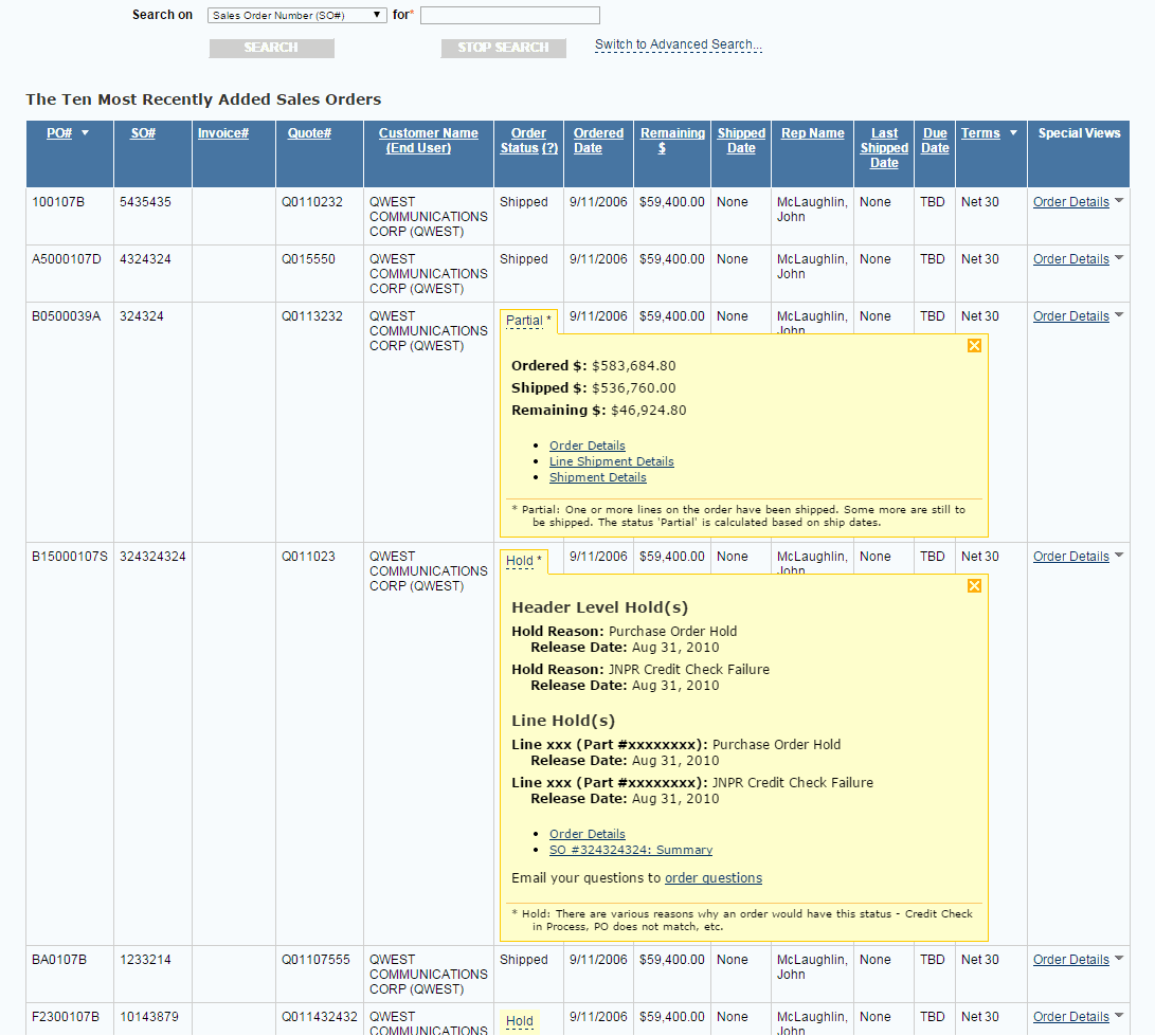
- When conducting a search, search results were not labeled with the search parameters; that information simply persisted in the search form.
- Simple and advanced search were two separate pages. Navigating between them did not retain existing sets of search results.
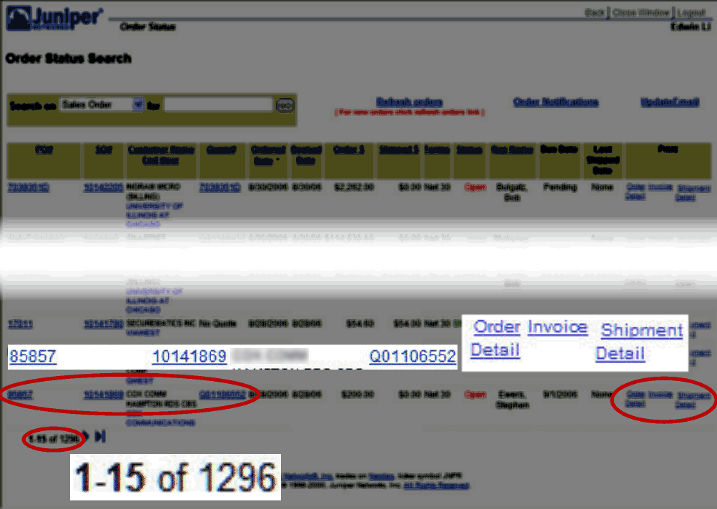
- When clicking to view any of the four detail pages related to any order from the search results, as is normal for web browsing, the browser would load the new page, replacing the page of with the search result set. Users often opened search items in new windows to retain the search result set.
- Users often opened multiple windows to answer questions about a single order. Information that they needed to answer most questions required referencing and/or comparing information across the four related order detail pages.
- Users often lost track of which windows they needed at any given time.
- Users often lost track of which windows were related to which other windoows and how they were related.
- Users often lost track of which windows they needed at any given time.
- From interviewing: Users reported minimizing their use of the tool each day for its instability and slowness.
Picking The Right Problems: Setting Design Directions
Working with key stakeholders to come to a shared understanding of our goals for the redesign, I proposed a small set of key problems to address:
- Reduce the data loaded when starting the application; keep the data load under danger thresholds for crashing
- Navigation, context, and window management
- Reduce the average number of windows needed to address order status requests
- Ease the management of multiple windows when necessary
- Reduce the cognitive load of working with the app; have the tool maintain state and context relevant to users' tasks. A salient example: keep the context of search results, especially when switching from simple to advanced search, but also as much as possible as users seek the information they need to address order status requests
...solving a problem simply means representing it so as to make the solution transparent.
Herbert A. Simon
The Sciences of the Artificial (The MIT Press) (p. 132). The MIT Press. Kindle Edition.
Designing
I usually approach designing at a few different levels:
- High level workflows and abstract models
- Low fidelity designs for key screens and others as necessary
- Increasingly higher fidelity designs to whatever level enables the easiest collaboration with developers
Step 3: High Level Design And Abstract Models: Foundations
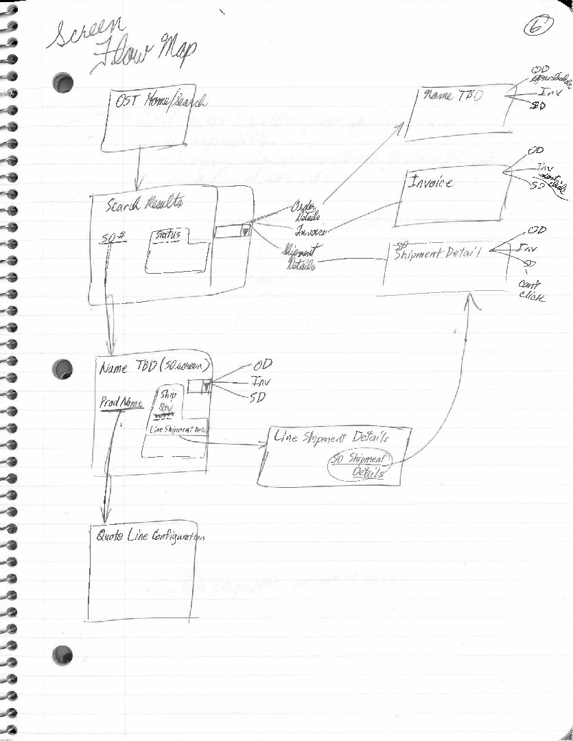
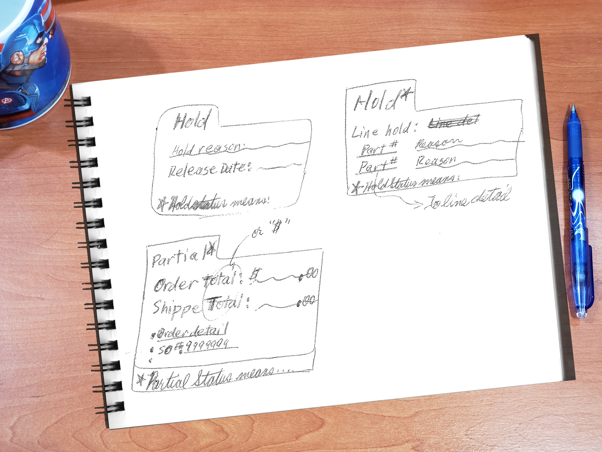
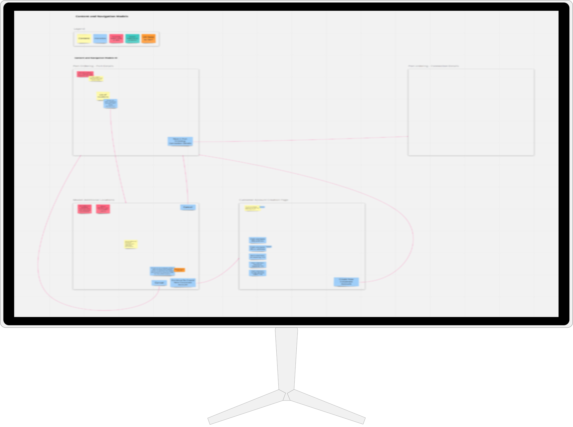
I build abstract models (content and navigation models, described in Constantine and Lockwood's Software for Use (commission-free Amazon link)) and task flows as the foundation of any designs with any task complexity.
Abstract models don't have to be fancy. Here's a navigation map from this project that is literally sketched out in a notebook. Of course, digital tools like Miro can also be used.
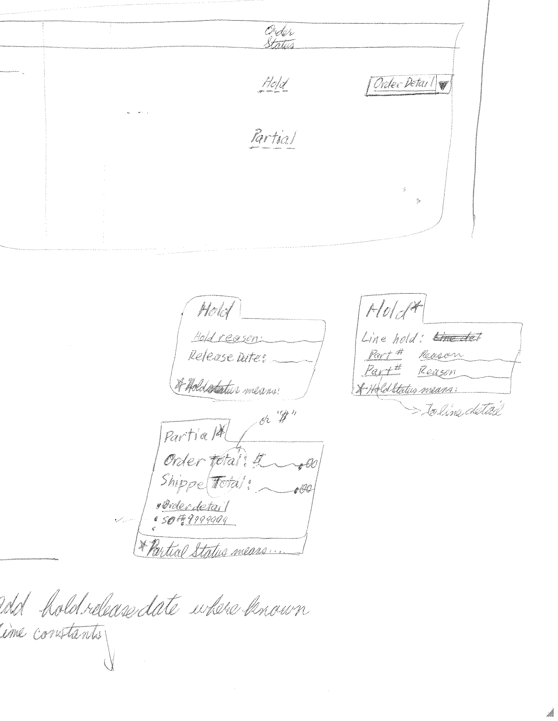
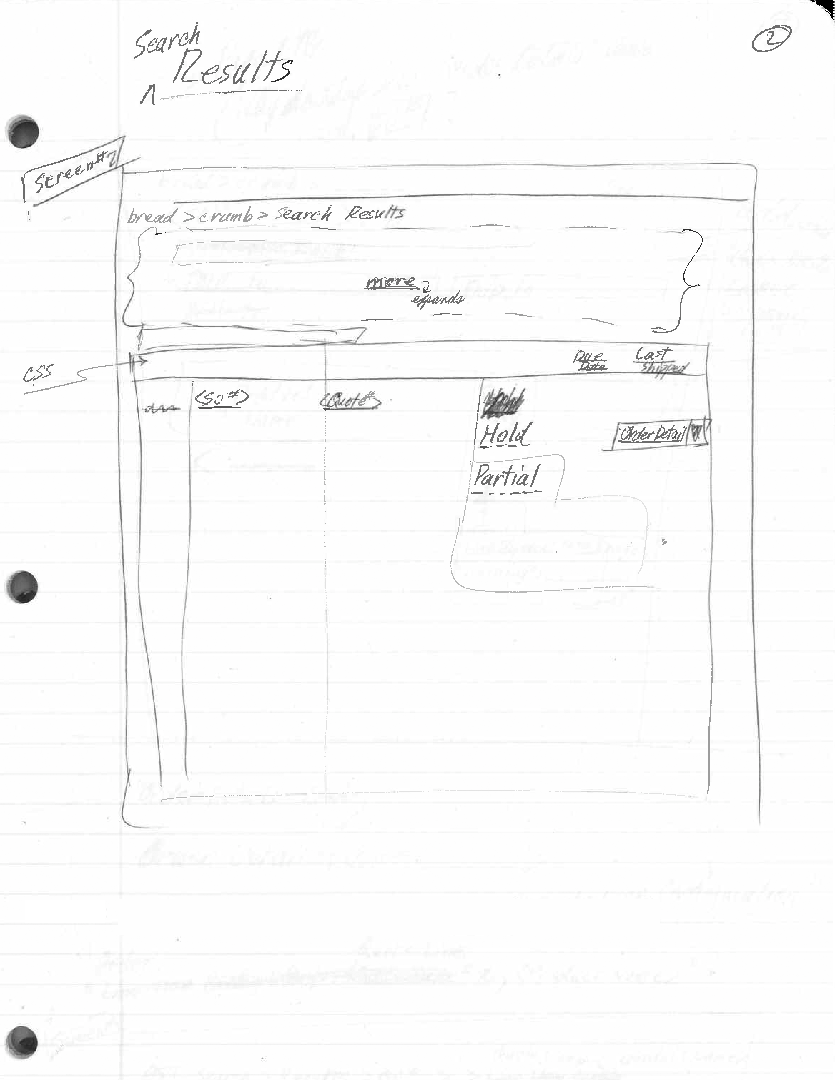
Step 4: Low Fidelity Prototypes
Low fidelity designs are quick and low-investment to better support exploring possible designs without premature commitment to any particular design. Output: sketches, mockups, wireframes, and prototyping.
Explorations and Iterations
Rather than force the users to go to the right information, I felt the tool should bring the right information to them.
So, following up on my intial user research, I worked with the team members to identify which information they needed most frequently to address most of the inquiries that they managed each day.
We started with a brainstormed, shared list. Then, over the course of a week and a half, each volunteer user evolved their own copy of that list as they went about their duties, editing their lists to best reflect their work.
At the end of that time, I collated the data and used that to further guide my design choices, checking in with my users over the following iterations.
"Rather than force users to go the right information, I felt the tool should bring the right information to them."
Recognizing New Design Pattern Needs
I realized that the elements in our existing design system could not gracefully expand to provide what our users needed--the richer interactions of Rich Internet Applications (RIAs).
That meant a new level of interactivity for our patterns.
In particular, our users needed new interactions for:
- Dynamically switching the simple search form back and forth with the advanced search form, retaining the list of search results and a read-out of what had been searched for to produce those results
- Allow the retrieval of the information that we'd identified as the most frequently needed information for answering most order status inquiries, showing them dynamically on the page for each order that users might want, all while letting users stay in the context of their search results and saving them from referencing multiple sub-pages.
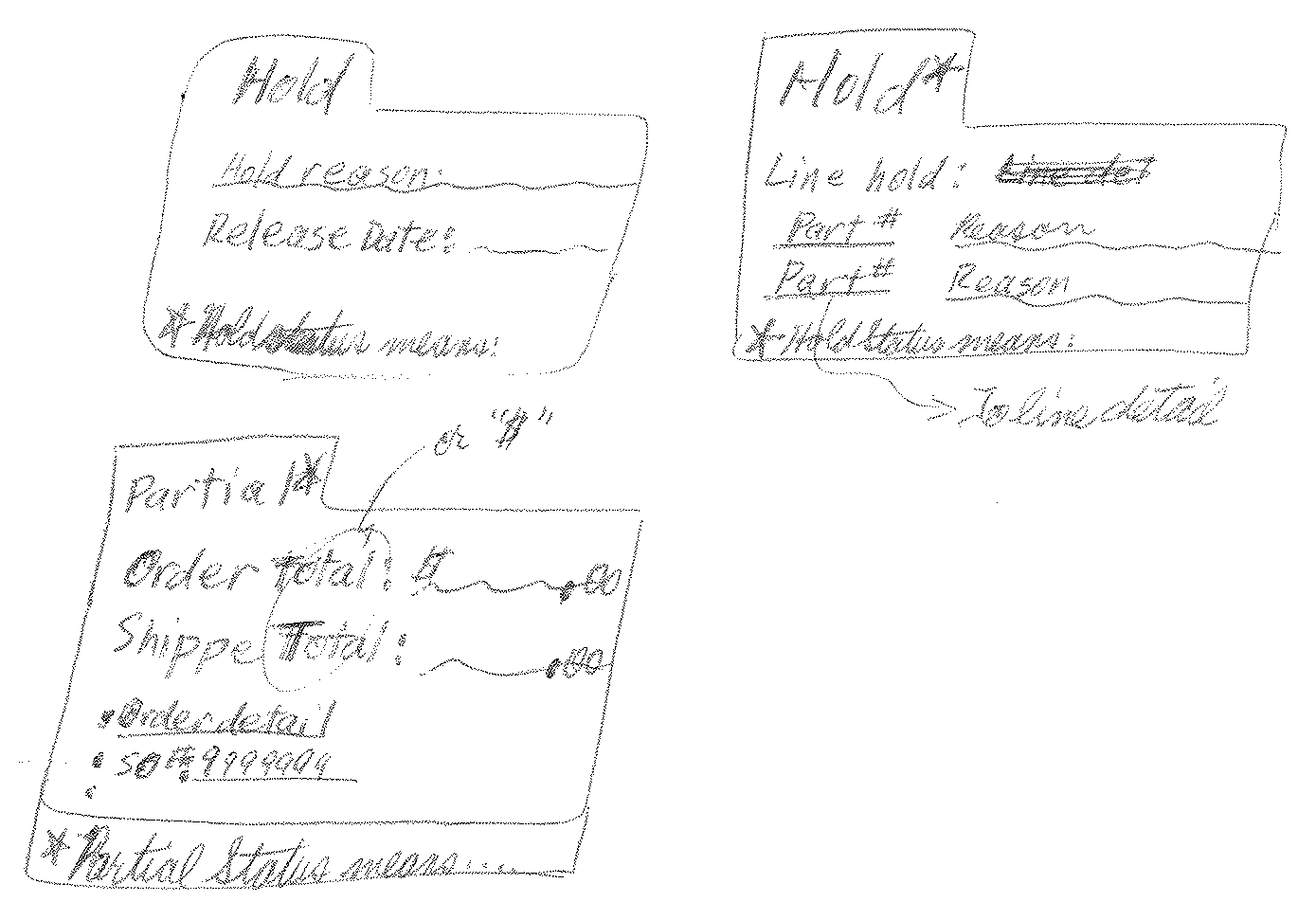
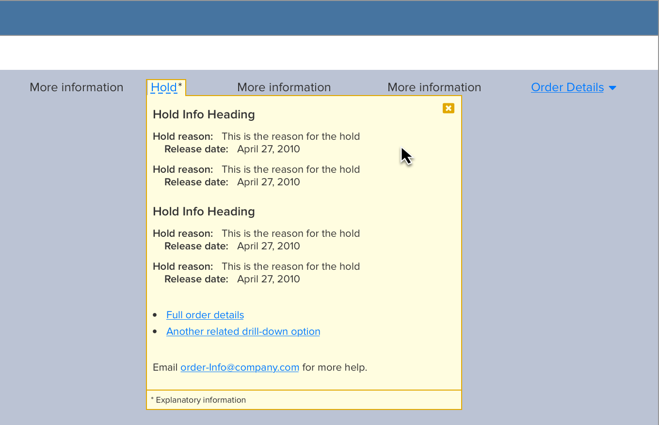
- These design constraints led to what I ultimately called our "zoomboxes."
Look For Patterns In Design System
I needed a way to surface and present the most frequently needed information collected from across all their source screens into one information bubble and to show it in the context of the search results table. There was nothing in our pattern library that could cover this. I would need a new pattern, one that would use animation--which would be a new dimension for our design language. These became our "zoomboxes."
To show the collected information in the context of the search results table, but to also enable users to see the context of their search results, I needed to introduce a new, expansion behavior to the table--allowing a single table row to expand and allow the developing zoombox design to show and not occlude other search results. The size of the layout change suggested the need to soften the transiton and guide the eye, a perfect use for animation. This row expansion behavior would add a second new pattern to our design language that involved animation.
Step 5: Higher Fidelity Designs
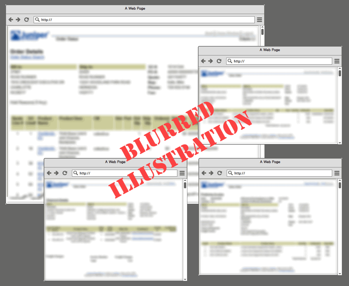
I developed high fidelity designs only for the new design patterns, producing pixel-perfect, clickable prototypes in HTML and CSS as well as additional reference materials via Photoshop as seemed helpful.
I also produced annotated UX specifications, with particular attention paid to describing the new, richer interactions and the details of the animation (timing, easing, etc.).
For the parts of the UX and UI that composed of existing design patterns, our developers were happy to be guided by low fidelity designs.
I coordinated with stakeholders and developers for feedback through all the design iterations.
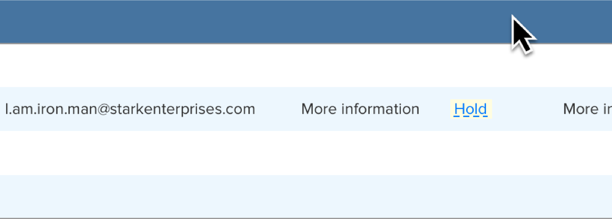
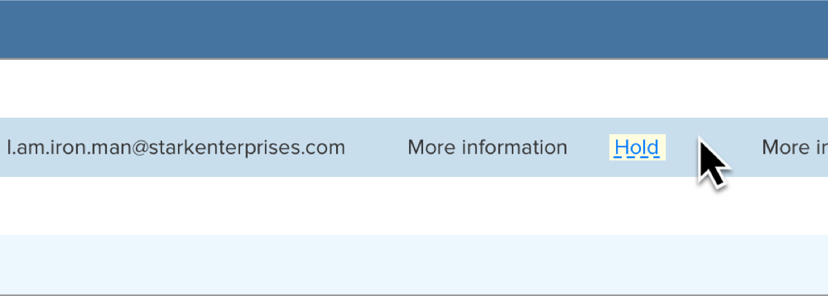
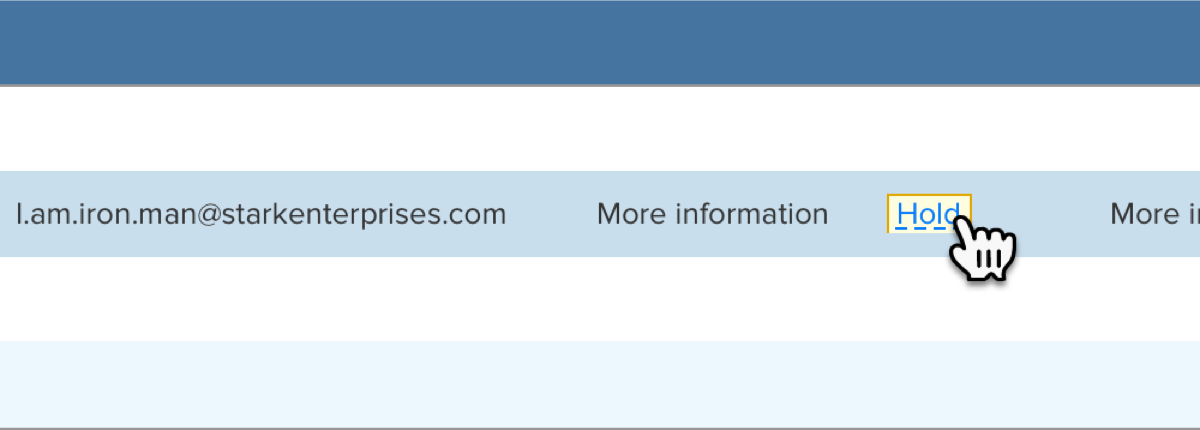
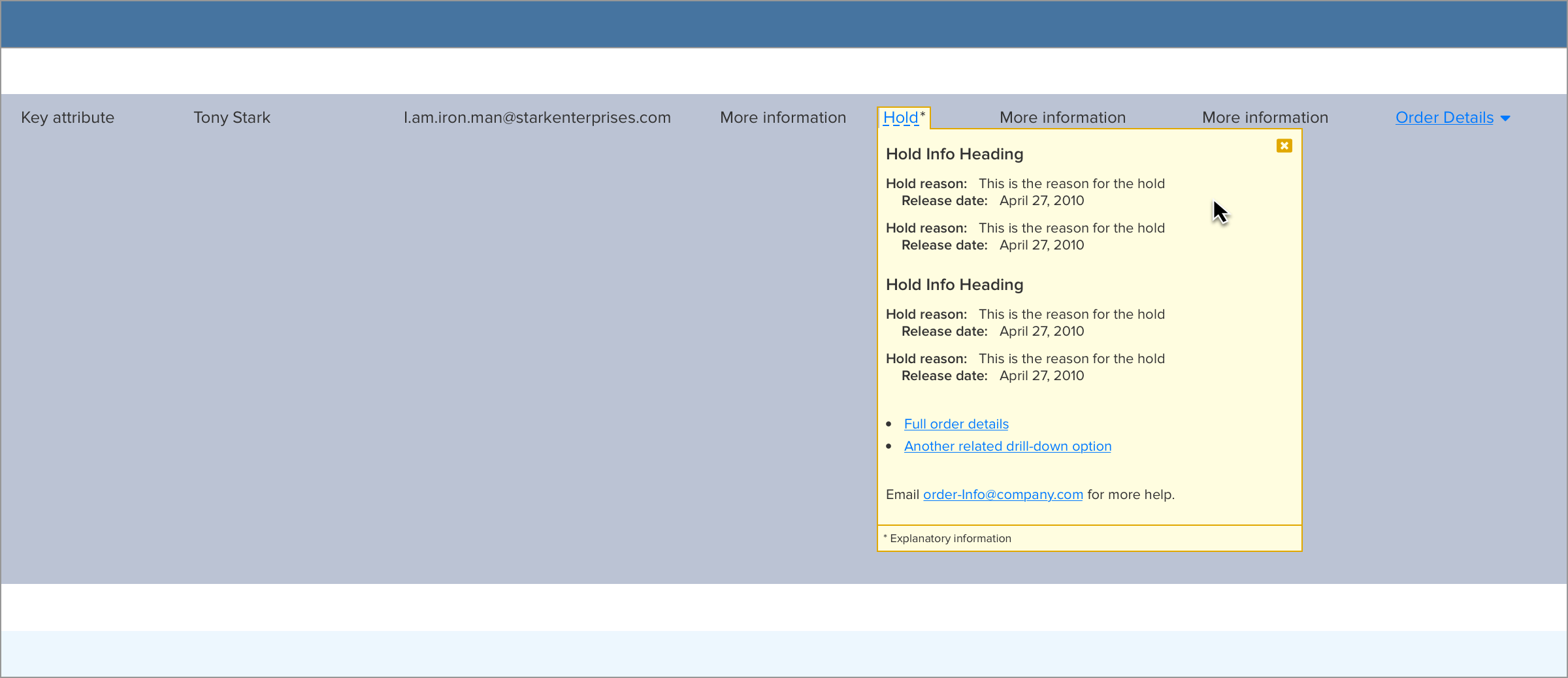
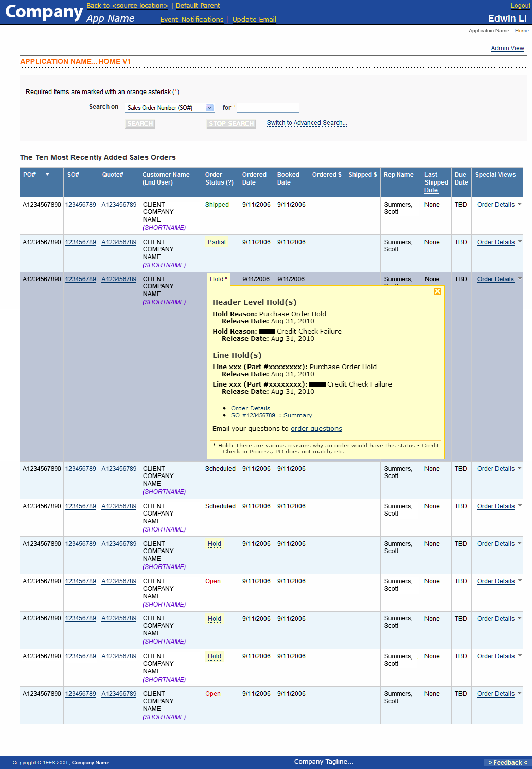
Left column: The four key states of interacting with the new zoomboxes (here, the information is genericized): 1) the default state of the row striping and the Post-It-reminicsent yellow-backed "Hold" stub, 2) the mouseover highlighting of the row, 3) the mouseover state of the "Hold" stub, gaining a 1 px golden yellow border and with the cursor changing to the "clickable cursor" and 4) the open zoombox, open within the search results with that order's key information, formerly scattered across multiple pages.
These were delivered as HTML and CSS, rendered on a staging server, and Photoshop assets.
Right column: An excerpt of the UX specification and style guide for the zoomboxes and the application--blurred, of course, to protect proprietary content.
Step 6: Develop Application
We'd coordinated with our Belarus development team from the beginning, so there was considerable overlap between development feedback, development work, and the design work.
Working With Remote Development Team
While working across big time zone differences can be a challenge, we found a good combination and cadence of voice, email communications, and file deliveris that benefited from the differences in time zone. Feedback was often processed and incorporated seemingly, if not literally, overnight.
Iterations: Tuning
The back and forth between UX and development gave both the design and implementation of the application the opportunity to benefit from continued iteration and tuning.
Together, the team in Belarus and I iterated the design and implementation as questions came up, continuing to work with our stakeholders to refine the vision and execution.
A prototype from the end of our iterations, showing a zoombox in the search results on the simple search form page, with content redacted and genericized.
Step 7: Release
As development and testing came to a close, we introduced the tool to the order status team and provided some light training on the new design.
The release went smoothly, and users seemed to take to the new design well.
Time for a little celebration!
...and maybe some UX documentation...
New UX Elements: Update Design System
Zoombox: Perhaps the most significant new UX element in the redesign was the "zoombox." Inspired by the UX precept of providing "details in context," these make deep, focused information available to users while allowing them to stay in the context of their search results table. And, because more than one can be open at a time, band because the zoombox's table row expands to accomodate it so that the zoombox doesn't occlude other table rows. With the zoomboxes, users are able to compare order hold information from multiple orders in a single window.
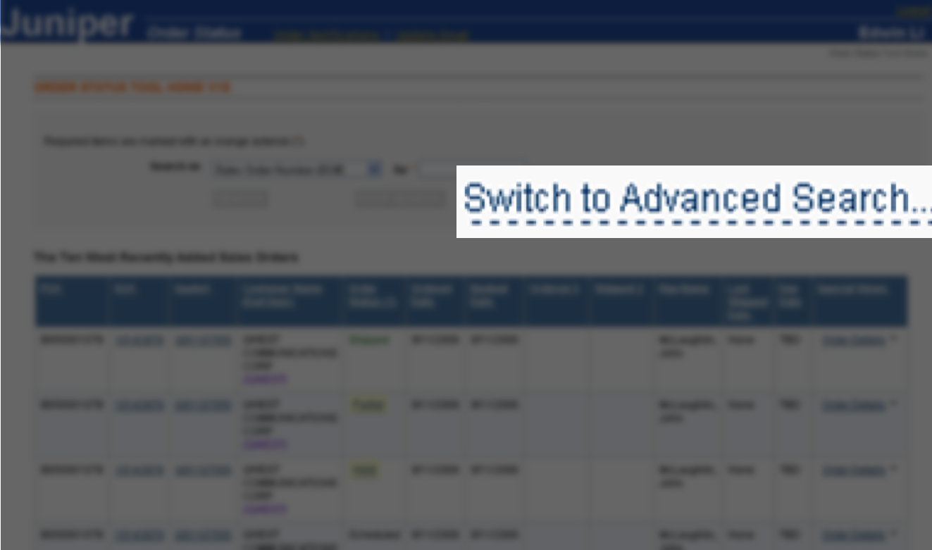
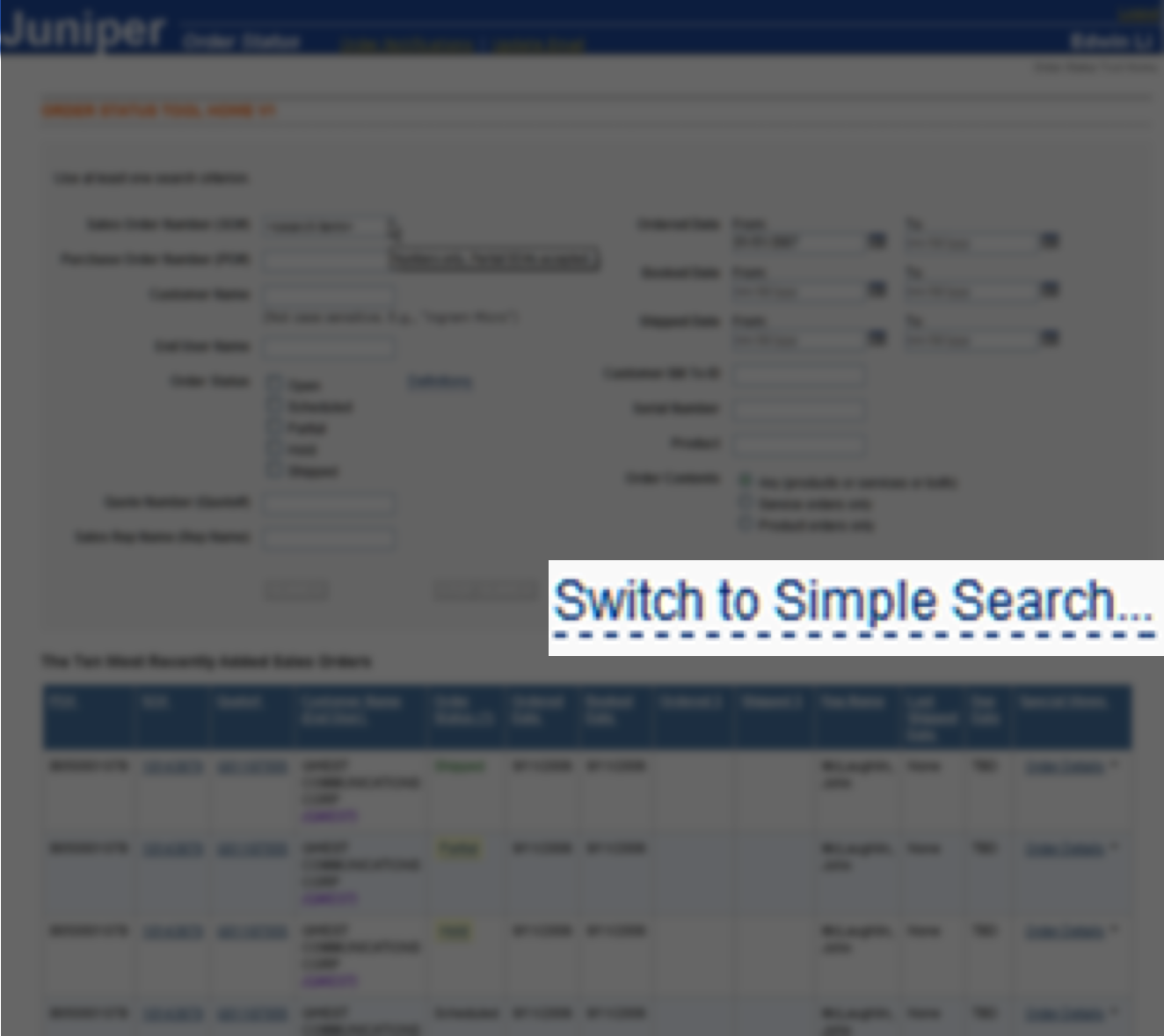
Simple/Advanced Search: Rather than switching pages between a simple and advanced search page and treating each page as a new start (losing both the search results and search terms used), I designed the new application to switch between the simple and advanced forms without reloading the page and smoothing out the layout transition using animation. This let users retain the context of both any search terms that they've already used and any result set that they might already have.
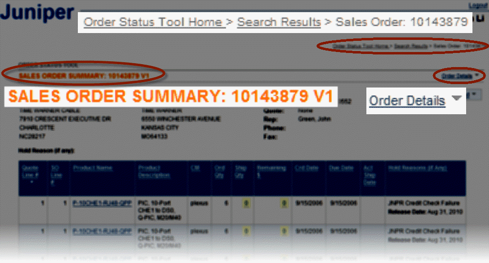
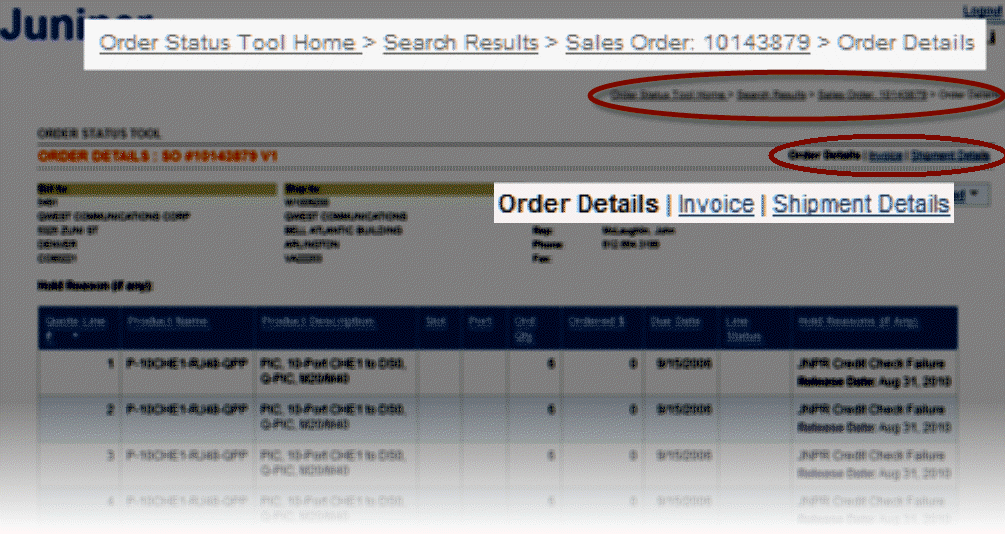
Rigorous Navigation Cues: To help with window management, I designed each page to rigourously and clearly identify itself (via new page titles), where they are in the users journey and information architecture (via newly introduced breadcrumb) and to clearly offer navigation to other, related pages, making clear their relationship by offering either a dropdown list of child pages, or a pipe-delimited list of sibling pages.
Step 8: User Feedback
We didn't have a formal feedback collection process, but I kept in contact with the project manager, the team manager, and occasionally, the order management team.
The project manager assumed the task of collating the feedback with the plan that, eventually, we might be able to address any feedback that came up with subsequent projects.
Before And After
Prior Design In Use (Illustration). Use of the previous design often led to opening multiple windows to find, collect, and compare information, and users had to keep track of how the windows were related to each other.
New Design In Use (Illustration). The new zoomboxes collected the most commonly needed order information and made them available within the search results, so no windows needed, and comparing between order numbers was possible while staying within the context of the search results. Multiple windows were much less necessary, but even when used, their navigation and relationships were much more clearly indicated using breadcrumbs and other such cues.
Our project was a success, and Edwin's expertise was invaluable. The application is still in use at Juniper [two years later], and is heralded as one of the most frequently used and relied-upon tools across Sales, Finance, Order Management, and Operations groups. I would highly recommend Edwin for any project!

Deanna Walls (Project Manager)
Selected Works
Research & Experience Design To Optimize Internal Web App For Finding Juniper Networks Customers’ Order Status → 800% availabilityUX research, UX design, Workflow optimization, Enterprise (B2B), Web application
Experience Design To Create Equinix's 1st Turnkey Web App Checkout For Ordering Ports → 98% Faster, 187% RevenueUX Research, UX Design, Enterprise (B2B), Web application
Design Processes, Artifacts, and Work StyleUX design, UX research, UX process, UX artifacts, Sketches, Maps, flows, and models, Low fidelity, High fidelity, Interactive prototypes
Pandora App: Driving ModeMobile, High Fidelity, Interactive Prototype, Demo Video, Personal Project